Bienvenido a Fuentes Destacadas — donde se encuentran popularidad y calidad. Aquí están las fuentes más descargadas y utilizadas del año. Si buscas opciones seguras para logos, web o social, empieza aquí.
Cada fuente top destaca por su equilibrio, legibilidad y versatilidad. Encontrarás sans serif modernas, scripts elegantes, serifs vintage y displays minimalistas.
-
( Fonts by Baka - Kyakirun - bakafonts.kyakirun.com )
A whimsical, hand-drawn font inspired by traditional Japanese hiragana.
 Descargar 114 Descargas@WebFont
 -
( Font by Eric Wirjanata. All of my font are donation based. You can support by buying something from here. http://society6.com/EricWirjanata )
A playful, handwritten font with irregular, whimsical strokes.
![killerpanda Fuentes Gratis Descargar]() Descargar 114 Descargas@WebFont
Descargar 114 Descargas@WebFont -
( Sean Dalton - seandalton.com.au )
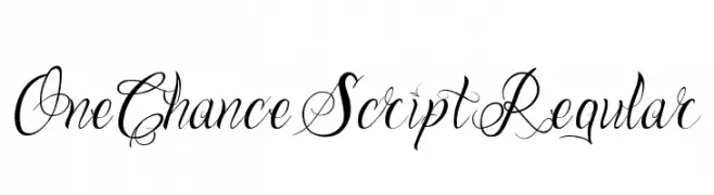
An elegant script font with intricate swirls and flourishes, perfect for sophisticated designs.
![One Chance Script Regular Fuentes Gratis Descargar]() Descargar 114 Descargas@WebFont
Descargar 114 Descargas@WebFont -
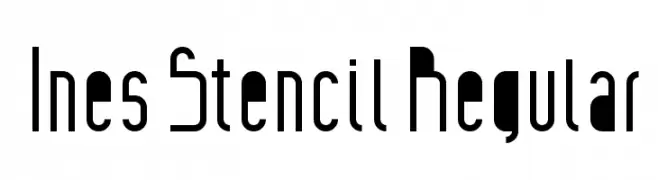
![Ines Stencil Regular Fuentes Gratis Descargar]() Descargar 114 Descargas@WebFont
Descargar 114 Descargas@WebFont -
( Fonts by Vunira Design - Personal-use only. For commercial use please contact owner. )
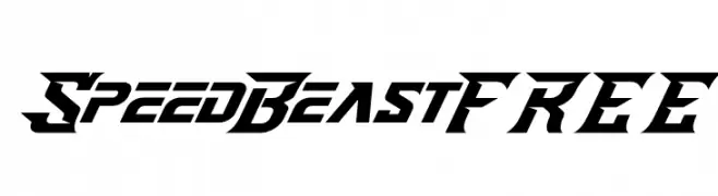
A bold, angular font with a futuristic and sporty design.
![SpeedBeastFREE Fuentes Gratis Descargar]() Descargar 114 Descargas@WebFont
Descargar 114 Descargas@WebFont -
-
( Fonts by twinletter - Rozikan - Personal-use only. For commercial use please contact owner. )
A playful, bold script font with a handwritten style.
![Battiest Personal Fuentes Gratis Descargar]() Descargar 114 Descargas@WebFont
Descargar 114 Descargas@WebFont -
![Progoty Cow Fuentes Gratis Descargar]() Descargar 114 Descargas@WebFont
Descargar 114 Descargas@WebFont -
( Awan Studio - creativemarket.com/Awan_S )
A playful, handwritten font with an artistic and dynamic style.
![Hector-Regular Fuentes Gratis Descargar]() Descargar 114 Descargas@WebFont
Descargar 114 Descargas@WebFont -
( Fonts by Midfont Studio )
A bold, slab serif font with a vintage and textured appearance.
![Food Secret regular Fuentes Gratis Descargar]() Descargar 114 Descargas@WebFont
Descargar 114 Descargas@WebFont -
( Fonts by Des Gomez )
A playful, casual handwritten font with rounded, smooth letterforms.
![BetterThanPixel Fuentes Gratis Descargar]() Descargar 114 Descargas@WebFont
Descargar 114 Descargas@WebFont


¿Cuáles son las fuentes más populares ahora?
Poppins, Roboto, Montserrat, Open Sans y Lato son muy usadas por su forma limpia y su amplia aplicabilidad — desde identidad de marca hasta landing pages y carteles.
¿Qué fuentes se usan para logotipos?
Las sans serif geométricas (p. ej., Poppins, familias al estilo Gotham) se eligen a menudo para un branding limpio y escalable. Para un toque personal, scripts y estilos manuscritos siguen siendo clásicos. Combina un display contundente para titulares con un cuerpo neutral para reconocimiento y equilibrio.
¿Con qué frecuencia se actualiza la lista?
Se actualiza regularmente según descargas y actividad real. Vuelve a menudo para descubrir las próximas favoritas.
💡 Consejo: guarda esta página — las tendencias cambian rápido y las fuentes top de hoy podrían inspirar el rebranding de mañana.