Bienvenido a Fuentes Destacadas — donde se encuentran popularidad y calidad. Aquí están las fuentes más descargadas y utilizadas del año. Si buscas opciones seguras para logos, web o social, empieza aquí.
Cada fuente top destaca por su equilibrio, legibilidad y versatilidad. Encontrarás sans serif modernas, scripts elegantes, serifs vintage y displays minimalistas.
-
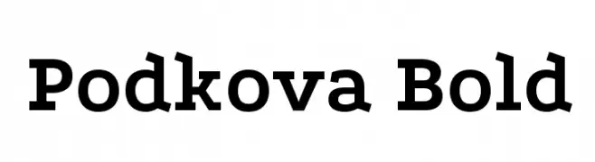
( Copyright 2011 The Podkova Project Authors (contact@cyreal.org) )
A bold, slab serif font with strong, thick strokes and prominent serifs.
 Descargar 2311 Descargas@WebFont
 -
( Fonts by Have Fun with Fonts )
A tall, narrow, and bold font with tight spacing and a modern aesthetic.
![HFF Jammed Pack Fuentes Gratis Descargar]() Descargar 2311 Descargas@WebFont
Descargar 2311 Descargas@WebFont -
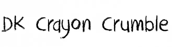
( Fonts by David Kerkhoff - www.hanodedphotography.com )
A playful, crayon-like font with a hand-drawn, textured appearance.
![DK Crayon Crumble Fuentes Gratis Descargar]() Descargar 2311 Descargas@WebFont
Descargar 2311 Descargas@WebFont -
( Fonts by Ingo Zimmermann - www.ingofonts.com )
A modern sans-serif font with balanced weight and excellent readability.
![FaberSansPro-Halbfett Fuentes Gratis Descargar]() Descargar 2311 Descargas@WebFont
Descargar 2311 Descargas@WebFont -
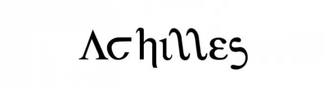
( Fonts by Daniel Zadorozny - www.iconian.com )
A classic serif font inspired by ancient Greek letterforms, offering elegance and readability.
![Achilles Fuentes Gratis Descargar]() Descargar 2311 Descargas@WebFont
Descargar 2311 Descargas@WebFont -
-
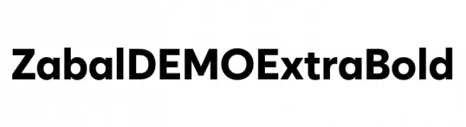
( Fonts by Font People - Personal-use only. For commercial use please contact owner. )
A bold, modern typeface with clean lines and strong presence.
![Zabal DEMO ExtraBold Fuentes Gratis Descargar]() Descargar 2310 Descargas@WebFont
Descargar 2310 Descargas@WebFont -
( Fonts by Hector Gatti & Omnibus-Type (original fonts) / Cristiano Sobral (main changes and remastering) - Personal-use only. For commercial use please contact owner. )
A bold, modern sans-serif font with clean lines and a robust structure.
![Azeri Sans Bold Fuentes Gratis Descargar]() Descargar 2310 Descargas@WebFont
Descargar 2310 Descargas@WebFont -
![Mega Team Fuentes Gratis Descargar]() Descargar 2310 Descargas@WebFont
Descargar 2310 Descargas@WebFont -
( Fonts by Dieter Steffmann )
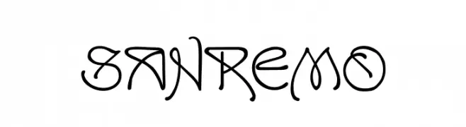
An artistic and decorative font with intricate letterforms and a calligraphic influence.
![SanRemo Fuentes Gratis Descargar]() Descargar 2310 Descargas@WebFont
Descargar 2310 Descargas@WebFont -
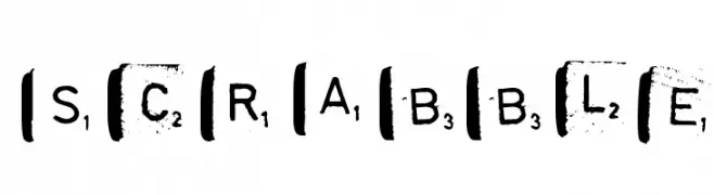
![scrabble Fuentes Gratis Descargar]() Descargar 2310 Descargas@WebFont
Descargar 2310 Descargas@WebFont


¿Cuáles son las fuentes más populares ahora?
Poppins, Roboto, Montserrat, Open Sans y Lato son muy usadas por su forma limpia y su amplia aplicabilidad — desde identidad de marca hasta landing pages y carteles.
¿Qué fuentes se usan para logotipos?
Las sans serif geométricas (p. ej., Poppins, familias al estilo Gotham) se eligen a menudo para un branding limpio y escalable. Para un toque personal, scripts y estilos manuscritos siguen siendo clásicos. Combina un display contundente para titulares con un cuerpo neutral para reconocimiento y equilibrio.
¿Con qué frecuencia se actualiza la lista?
Se actualiza regularmente según descargas y actividad real. Vuelve a menudo para descubrir las próximas favoritas.
💡 Consejo: guarda esta página — las tendencias cambian rápido y las fuentes top de hoy podrían inspirar el rebranding de mañana.