Bienvenido a Fuentes Destacadas — donde se encuentran popularidad y calidad. Aquí están las fuentes más descargadas y utilizadas del año. Si buscas opciones seguras para logos, web o social, empieza aquí.
Cada fuente top destaca por su equilibrio, legibilidad y versatilidad. Encontrarás sans serif modernas, scripts elegantes, serifs vintage y displays minimalistas.
-
( Fonts by Manfred Klein. Free for private and charity use. Free for commercial with donation to organizations )
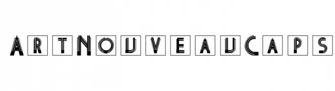
A bold, decorative Art Nouveau font with intricate line work and geometric patterns.
 Descargar 127 Descargas@WebFont
 -
![Madrid2ExpItal Fuentes Gratis Descargar]() Descargar 127 Descargas
Descargar 127 Descargas -
( Jaduger Design Studio - www.jaduger.com )
A bold, vintage typewriter-style slab serif font with a rugged, mechanical feel.
![Silk Remington-SBold Fuentes Gratis Descargar]() Descargar 127 Descargas@WebFont
Descargar 127 Descargas@WebFont -
Fuentes por Eitiqad. For commercial use please contact the owner.
( Drexs is a simple, thin and futuristic display font. Whether you use it for designs related to web or sci-fi projects, this font will easily stand out from the crowd. Great for branding, wordmark, logotype, logo design, header, ui design, etc Hello, Tha )
A bold, modern font with clean lines and geometric structure.
![Drexs Fuentes Gratis Descargar]() Descargar 127 Descargas
Descargar 127 Descargas -
![Egypt0 Fuentes Gratis Descargar]() Descargar 127 Descargas@WebFont
Descargar 127 Descargas@WebFont -
-
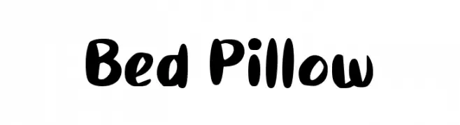
( Fonts by wep - Wahyu Eka Prasetya - Personal-use only. For commercial use please contact owner. )
A playful, bold font with rounded, hand-drawn strokes.
![Bed Pillow Fuentes Gratis Descargar]() Descargar 127 Descargas@WebFont
Descargar 127 Descargas@WebFont -
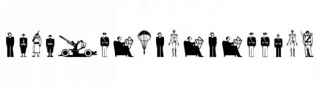
( Fonts by Manfred Klein. Free for private and charity use. Free for commercial with donation to organizations )
Bold pictogram dingbats depicting military and war-related imagery.
![FightersForFreedom Fuentes Gratis Descargar]() Descargar 127 Descargas@WebFont
Descargar 127 Descargas@WebFont -
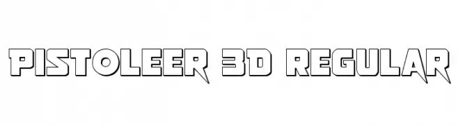
( Fonts by Daniel Zadorozny - www.iconian.com )
A bold, 3D outlined font with sharp, angular edges and a modern, futuristic style.
![Pistoleer 3D Regular Fuentes Gratis Descargar]() Descargar 127 Descargas@WebFont
Descargar 127 Descargas@WebFont -
![Dysfunctional Regular Fuentes Gratis Descargar]() Descargar 127 Descargas@WebFont
Descargar 127 Descargas@WebFont -
![Scritzy X Fuentes Gratis Descargar]() Descargar 127 Descargas@WebFont
Descargar 127 Descargas@WebFont


¿Cuáles son las fuentes más populares ahora?
Poppins, Roboto, Montserrat, Open Sans y Lato son muy usadas por su forma limpia y su amplia aplicabilidad — desde identidad de marca hasta landing pages y carteles.
¿Qué fuentes se usan para logotipos?
Las sans serif geométricas (p. ej., Poppins, familias al estilo Gotham) se eligen a menudo para un branding limpio y escalable. Para un toque personal, scripts y estilos manuscritos siguen siendo clásicos. Combina un display contundente para titulares con un cuerpo neutral para reconocimiento y equilibrio.
¿Con qué frecuencia se actualiza la lista?
Se actualiza regularmente según descargas y actividad real. Vuelve a menudo para descubrir las próximas favoritas.
💡 Consejo: guarda esta página — las tendencias cambian rápido y las fuentes top de hoy podrían inspirar el rebranding de mañana.