Bienvenido a Fuentes Destacadas — donde se encuentran popularidad y calidad. Aquí están las fuentes más descargadas y utilizadas del año. Si buscas opciones seguras para logos, web o social, empieza aquí.
Cada fuente top destaca por su equilibrio, legibilidad y versatilidad. Encontrarás sans serif modernas, scripts elegantes, serifs vintage y displays minimalistas.
-
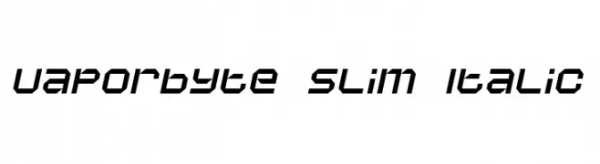
( Fonts by dustBUST - Andreas Nylin )
A futuristic, angular, and italicized font with a digital aesthetic.
 Descargar 138 Descargas@WebFont
 -
![WBX_lucidite Mangled Fuentes Gratis Descargar]() Descargar 138 Descargas@WebFont
Descargar 138 Descargas@WebFont -
( modblackmoon.narod.ru/ )
A bold, textured font with a rugged, geometric style.
![MB-Element Standard Fuentes Gratis Descargar]() Descargar 138 Descargas@WebFont
Descargar 138 Descargas@WebFont -
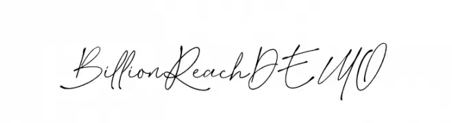
( Fonts by Letterhend Studio - Hendry Juanda - Personal-use only. For commercial use please contact owner. )
A modern, handwritten font with fluid, elegant strokes.
![BillionReachDEMO Fuentes Gratis Descargar]() Descargar 138 Descargas@WebFont
Descargar 138 Descargas@WebFont -
( Fonts by www.fenotype.com )
A bold, geometric font with a modern, futuristic style.
![Valimo Fuentes Gratis Descargar]() Descargar 138 Descargas@WebFont
Descargar 138 Descargas@WebFont -
-
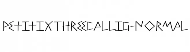
( Fonts by Manfred Klein. Free for private and charity use. Free for commercial with donation to organizations )
A modern, angular font with sharp edges and geometric style.
![PetitixThreeCallig-Normal Fuentes Gratis Descargar]() Descargar 138 Descargas@WebFont
Descargar 138 Descargas@WebFont -
( Free for a personal use. For a commercial use please visit www.kevinandamanda.com )
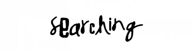
A bold, hand-drawn display font with an artistic and eclectic style.
![Searching Fuentes Gratis Descargar]() Descargar 138 Descargas@WebFont
Descargar 138 Descargas@WebFont -
( Fonts by Epta )
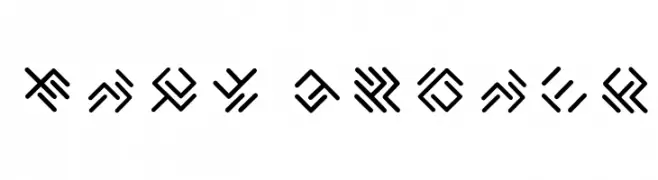
A geometric, abstract font with angular, intersecting lines.
![EPTA GLYPHS Fuentes Gratis Descargar]() Descargar 137 Descargas@WebFont
Descargar 137 Descargas@WebFont -
( Fonts by Vladimir Nikolic )
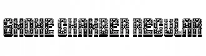
A bold, decorative font with a 3D effect and textured circle pattern.
![Smoke Chamber Regular Fuentes Gratis Descargar]() Descargar 137 Descargas@WebFont
Descargar 137 Descargas@WebFont -
( Fonts by Jacob Fisher - www.pizzadude.dk )
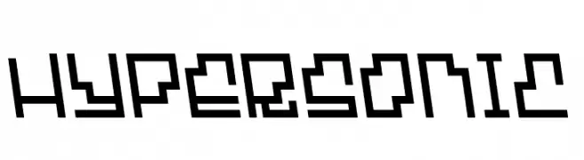
A bold, geometric font with a futuristic, digital aesthetic.
![Hypersonic Fuentes Gratis Descargar]() Descargar 137 Descargas@WebFont
Descargar 137 Descargas@WebFont


¿Cuáles son las fuentes más populares ahora?
Poppins, Roboto, Montserrat, Open Sans y Lato son muy usadas por su forma limpia y su amplia aplicabilidad — desde identidad de marca hasta landing pages y carteles.
¿Qué fuentes se usan para logotipos?
Las sans serif geométricas (p. ej., Poppins, familias al estilo Gotham) se eligen a menudo para un branding limpio y escalable. Para un toque personal, scripts y estilos manuscritos siguen siendo clásicos. Combina un display contundente para titulares con un cuerpo neutral para reconocimiento y equilibrio.
¿Con qué frecuencia se actualiza la lista?
Se actualiza regularmente según descargas y actividad real. Vuelve a menudo para descubrir las próximas favoritas.
💡 Consejo: guarda esta página — las tendencias cambian rápido y las fuentes top de hoy podrían inspirar el rebranding de mañana.