Bienvenido a Fuentes Destacadas — donde se encuentran popularidad y calidad. Aquí están las fuentes más descargadas y utilizadas del año. Si buscas opciones seguras para logos, web o social, empieza aquí.
Cada fuente top destaca por su equilibrio, legibilidad y versatilidad. Encontrarás sans serif modernas, scripts elegantes, serifs vintage y displays minimalistas.
-
( Fonts by Manfred Klein - manfred-klein.ina-mar.com )
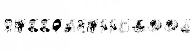
A decorative Halloween-themed font with playful, illustrated characters.
 Descargar 145 Descargas@WebFont
 -
( Fonts by www.blambot.com )
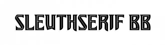
A bold, geometric serif font with sharp angles and high contrast.
![SleuthSerif BB Fuentes Gratis Descargar]() Descargar 145 Descargas@WebFont
Descargar 145 Descargas@WebFont -
( Fonts by Typodermic Fonts )
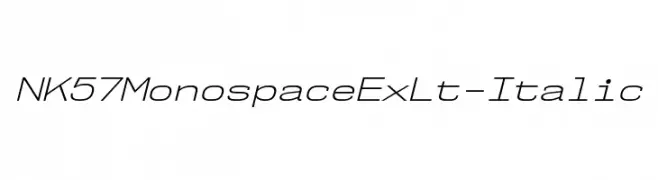
A modern, monospaced italic font with light strokes and a clean design.
![NK57MonospaceExLt-Italic Fuentes Gratis Descargar]() Descargar 145 Descargas@WebFont
Descargar 145 Descargas@WebFont -
( Fonts by twinletter )
A bold, geometric font with a modern, futuristic style.
![FLASTY Regular Fuentes Gratis Descargar]() Descargar 145 Descargas@WebFont
Descargar 145 Descargas@WebFont -
( Fonts by www.lifewithouttaffy.com )
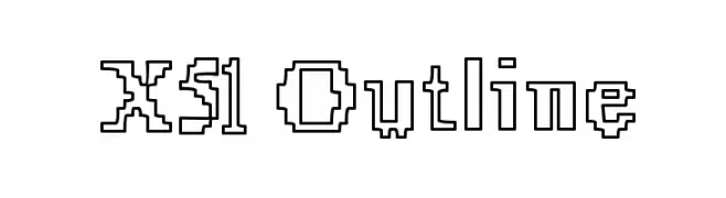
A pixelated, outline font with a bold and structured design.
![X51 Outline Fuentes Gratis Descargar]() Descargar 145 Descargas@WebFont
Descargar 145 Descargas@WebFont -
-
( Fonts by Daniel Zadorozny - www.iconian.com - Free for personal use )
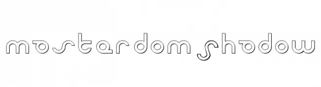
A futuristic, geometric font with clean lines and circular elements.
![Masterdom Shadow Fuentes Gratis Descargar]() Descargar 145 Descargas@WebFont
Descargar 145 Descargas@WebFont -
( Fonts by Krakenbox Std )
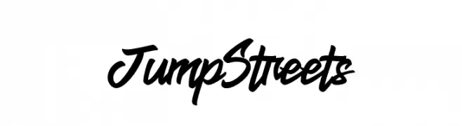
A bold, dynamic script font with a flowing, interconnected style.
![Jump Streets Fuentes Gratis Descargar]() Descargar 145 Descargas@WebFont
Descargar 145 Descargas@WebFont -
( Fonts by Daniel Zadorozny - www.iconian.com )
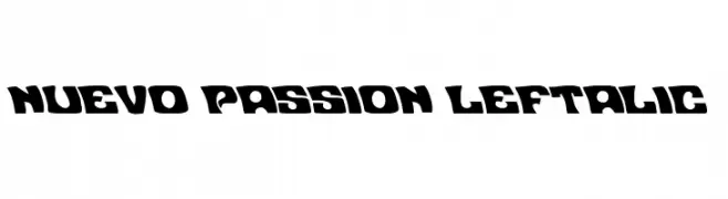
A bold, left-leaning font with a dynamic and playful style.
![Nuevo Passion Leftalic Fuentes Gratis Descargar]() Descargar 145 Descargas@WebFont
Descargar 145 Descargas@WebFont -
( Fonts by Manfred Klein. Free for private and charity use. Free for commercial with donation to organizations )
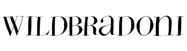
A high-contrast, elegant font with sharp serifs and dynamic curves.
![WildBradoni Fuentes Gratis Descargar]() Descargar 145 Descargas@WebFont
Descargar 145 Descargas@WebFont -
( Fonts by Des Gomez )
A playful, casual handwritten font with a friendly vibe.
![OwnThatShhhh Fuentes Gratis Descargar]() Descargar 145 Descargas@WebFont
Descargar 145 Descargas@WebFont


¿Cuáles son las fuentes más populares ahora?
Poppins, Roboto, Montserrat, Open Sans y Lato son muy usadas por su forma limpia y su amplia aplicabilidad — desde identidad de marca hasta landing pages y carteles.
¿Qué fuentes se usan para logotipos?
Las sans serif geométricas (p. ej., Poppins, familias al estilo Gotham) se eligen a menudo para un branding limpio y escalable. Para un toque personal, scripts y estilos manuscritos siguen siendo clásicos. Combina un display contundente para titulares con un cuerpo neutral para reconocimiento y equilibrio.
¿Con qué frecuencia se actualiza la lista?
Se actualiza regularmente según descargas y actividad real. Vuelve a menudo para descubrir las próximas favoritas.
💡 Consejo: guarda esta página — las tendencias cambian rápido y las fuentes top de hoy podrían inspirar el rebranding de mañana.