Bienvenido a Fuentes Destacadas — donde se encuentran popularidad y calidad. Aquí están las fuentes más descargadas y utilizadas del año. Si buscas opciones seguras para logos, web o social, empieza aquí.
Cada fuente top destaca por su equilibrio, legibilidad y versatilidad. Encontrarás sans serif modernas, scripts elegantes, serifs vintage y displays minimalistas.
-
 Descargar 17010 Descargas@WebFont
 -
( Copyright 2018 The Staatliches Authors (https://github.com/googlefonts/staatliches) )
A bold, geometric sans-serif font with a modern and clean design.
![Staatliches Regular Fuentes Gratis Descargar]() Descargar 16969 Descargas@WebFont
Descargar 16969 Descargas@WebFont -
( dccanim.deviantart.com )
A bold, distressed font with a vintage, textured appearance.
![DCC-Ash Fuentes Gratis Descargar]() Descargar 16966 Descargas@WebFont
Descargar 16966 Descargas@WebFont -
![Xpressive Fuentes Gratis Descargar]() Descargar 16947 Descargas
Descargar 16947 Descargas -
( Fonts by Kevin Christopher - www.kcfonts.com )
A bold, distressed font with a vintage, industrial style.
![Headliner No. 45 Fuentes Gratis Descargar]() Descargar 16932 Descargas@WebFont
Descargar 16932 Descargas@WebFont -
-
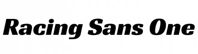
( Copyright (c) 2012, Pablo Impallari (www.impallari.com|impallari@gmail.com),Rodrigo Fuenzalida (www.rfuenzalida.com|hello@rfuenzalida.com), with Reserved Font Name Racing Sans. )
A bold, italicized font with a dynamic and energetic style.
![Racing Sans One Fuentes Gratis Descargar]() Descargar 16921 Descargas@WebFont
Descargar 16921 Descargas@WebFont -
![Quill Fuentes Gratis Descargar]() Descargar 16907 Descargas@WebFont
Descargar 16907 Descargas@WebFont -
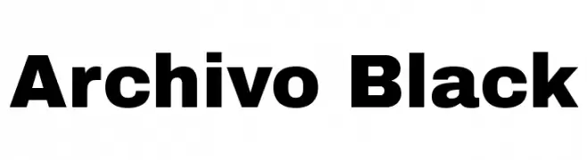
( Copyright (c) 2012, Omnibus-Type (www.omnibus-type.com|omnibus.type@gmail.com), with Reserved Font Name 'Archivo' )
A bold, impactful typeface with thick strokes and strong presence.
![Archivo Black Fuentes Gratis Descargar]() Descargar 16890 Descargas@WebFont
Descargar 16890 Descargas@WebFont -
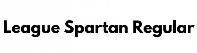
( Fonts by The League of Moveable Type - Personal-use only. For commercial use please contact owner. )
A bold, modern sans-serif font with clean, geometric lines.
![League Spartan Regular Fuentes Gratis Descargar]() Descargar 16872 Descargas@WebFont
Descargar 16872 Descargas@WebFont -
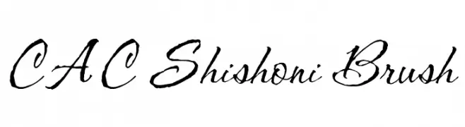
![CAC Shishoni Brush Fuentes Gratis Descargar]() Descargar 16867 Descargas@WebFont
Descargar 16867 Descargas@WebFont


¿Cuáles son las fuentes más populares ahora?
Poppins, Roboto, Montserrat, Open Sans y Lato son muy usadas por su forma limpia y su amplia aplicabilidad — desde identidad de marca hasta landing pages y carteles.
¿Qué fuentes se usan para logotipos?
Las sans serif geométricas (p. ej., Poppins, familias al estilo Gotham) se eligen a menudo para un branding limpio y escalable. Para un toque personal, scripts y estilos manuscritos siguen siendo clásicos. Combina un display contundente para titulares con un cuerpo neutral para reconocimiento y equilibrio.
¿Con qué frecuencia se actualiza la lista?
Se actualiza regularmente según descargas y actividad real. Vuelve a menudo para descubrir las próximas favoritas.
💡 Consejo: guarda esta página — las tendencias cambian rápido y las fuentes top de hoy podrían inspirar el rebranding de mañana.