Bienvenido a Fuentes Destacadas — donde se encuentran popularidad y calidad. Aquí están las fuentes más descargadas y utilizadas del año. Si buscas opciones seguras para logos, web o social, empieza aquí.
Cada fuente top destaca por su equilibrio, legibilidad y versatilidad. Encontrarás sans serif modernas, scripts elegantes, serifs vintage y displays minimalistas.
-
( - model850.deviantart.com/ )
A decorative font with a waveform-inspired design, featuring vertical line textures.
 Descargar 176 Descargas@WebFont
 -
( Fonts by Mans Greback - www.mansgreback.com - Personal-use only. For commercial use please contact owner. )
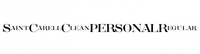
A classic serif font with elegant, sharp serifs and moderate contrast.
![Saint Carell Clean PERSONAL Regular Fuentes Gratis Descargar]() Descargar 176 Descargas@WebFont
Descargar 176 Descargas@WebFont -
( Free for personal use - www.pixelsagas.com )
The image contains symbols and icons, not a standard font.
![dPoly Hexahedron Rounded Fuentes Gratis Descargar]() Descargar 176 Descargas@WebFont
Descargar 176 Descargas@WebFont -
( Fonts by Daniel Zadorozny - www.iconian.com - Free for personal use )
A bold, futuristic italic font with sharp angles and geometric shapes.
![Dan Stargate Italic Fuentes Gratis Descargar]() Descargar 176 Descargas@WebFont
Descargar 176 Descargas@WebFont -
( Fonts by Art Martinez )
A playful, handwritten font with irregular, marker-like strokes.
![Art_Martinez_LH Fuentes Gratis Descargar]() Descargar 176 Descargas@WebFont
Descargar 176 Descargas@WebFont -
-
( Fonts by a Max Infeld - XEROGRAPHER FONTS - xerographer.blogspot.com . Personal-use only. For commercial use please contact owner. )
A bold, textured font with a fiery, dynamic appearance.
![FireBlock Fuentes Gratis Descargar]() Descargar 176 Descargas@WebFont
Descargar 176 Descargas@WebFont -
( Fonts by Aisyah )
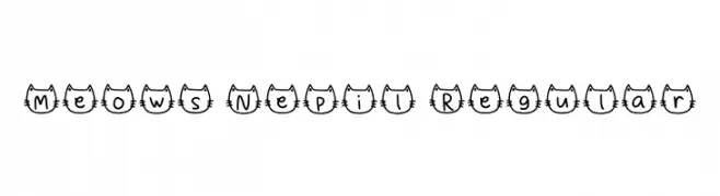
A playful font with characters enclosed in cat face outlines, ideal for fun and whimsical projects.
![Meows Nepil Regular Fuentes Gratis Descargar]() Descargar 176 Descargas@WebFont
Descargar 176 Descargas@WebFont -
( Chequered Ink - chequered.ink/ )
A bold, geometric font with high contrast and a modern, stencil-like design.
![Reach the End Fuentes Gratis Descargar]() Descargar 176 Descargas@WebFont
Descargar 176 Descargas@WebFont -
( Fonts by Zanatlija - Personal-use only. For commercial use please contact owner. )
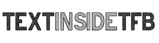
A bold, textured uppercase font with a modern and decorative style.
![text INSIDE tfb Fuentes Gratis Descargar]() Descargar 176 Descargas@WebFont
Descargar 176 Descargas@WebFont -
![Cathzulu Hollow Fuentes Gratis Descargar]() Descargar 176 Descargas@WebFont
Descargar 176 Descargas@WebFont


¿Cuáles son las fuentes más populares ahora?
Poppins, Roboto, Montserrat, Open Sans y Lato son muy usadas por su forma limpia y su amplia aplicabilidad — desde identidad de marca hasta landing pages y carteles.
¿Qué fuentes se usan para logotipos?
Las sans serif geométricas (p. ej., Poppins, familias al estilo Gotham) se eligen a menudo para un branding limpio y escalable. Para un toque personal, scripts y estilos manuscritos siguen siendo clásicos. Combina un display contundente para titulares con un cuerpo neutral para reconocimiento y equilibrio.
¿Con qué frecuencia se actualiza la lista?
Se actualiza regularmente según descargas y actividad real. Vuelve a menudo para descubrir las próximas favoritas.
💡 Consejo: guarda esta página — las tendencias cambian rápido y las fuentes top de hoy podrían inspirar el rebranding de mañana.