Bienvenido a Fuentes Destacadas — donde se encuentran popularidad y calidad. Aquí están las fuentes más descargadas y utilizadas del año. Si buscas opciones seguras para logos, web o social, empieza aquí.
Cada fuente top destaca por su equilibrio, legibilidad y versatilidad. Encontrarás sans serif modernas, scripts elegantes, serifs vintage y displays minimalistas.
-
( Fonts by Iconian Fonts )
A bold, condensed, and italic font with a dynamic and energetic style.
 Descargar 179 Descargas@WebFont
 -
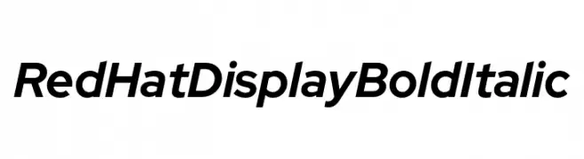
( Fonts by MCKL )
A bold, italicized font with a modern and dynamic style.
![Red Hat Display Bold Italic Fuentes Gratis Descargar]() Descargar 179 Descargas@WebFont
Descargar 179 Descargas@WebFont -
Fuentes por Qbotype. For commercial use please contact the owner.
( Fonts by www.phuxerdesigns.com.ar - Non-commercial use of any typeface free version, only buying the full version )
A bold, textured brush-style font with an artistic, hand-drawn appearance.
![Oxin Brush Fuentes Gratis Descargar]() Descargar 179 Descargas@WebFont
Descargar 179 Descargas@WebFont -
![Fedyral Fuentes Gratis Descargar]() Descargar 179 Descargas
Descargar 179 Descargas -
( Fonts by Divide By Zero! - fonts.tom7.com )
A bold, decorative font with a unique outline style and high contrast.
![Technetium Fuentes Gratis Descargar]() Descargar 179 Descargas@WebFont
Descargar 179 Descargas@WebFont -
-
( 7NTypes - Situjuh Nazara - 7ntypes.com )
A modern, bold, and italicized font with a sleek and dynamic appearance.
![LearnShareColaborate-BoldItalic Fuentes Gratis Descargar]() Descargar 179 Descargas@WebFont
Descargar 179 Descargas@WebFont -
( Måns Grebäck - www.mansgreback.com )
A bold, modern sans-serif font with smooth, rounded edges and consistent character spacing.
![Kandira PERSONAL Bold Fuentes Gratis Descargar]() Descargar 179 Descargas@WebFont
Descargar 179 Descargas@WebFont -
( Fonts by David Rakowski )
A classic serif font with high contrast and elegant, sharp serifs.
![Jumble Plain Fuentes Gratis Descargar]() Descargar 179 Descargas@WebFont
Descargar 179 Descargas@WebFont -
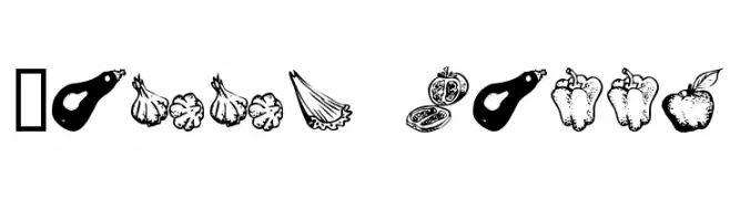
( Fonts by James Cianciaruso - Ablaze )
Hand-drawn produce illustrations replace letters and numbers.
![VEGGI TERRA Fuentes Gratis Descargar]() Descargar 179 Descargas@WebFont
Descargar 179 Descargas@WebFont -
( Fonts by Daniel Zadorozny - www.iconian.com - Free for personal use )
A playful, 3D-effect font with bold outlines and a whimsical style.
![Crappity-Crap-Crap 3D Fuentes Gratis Descargar]() Descargar 179 Descargas@WebFont
Descargar 179 Descargas@WebFont


¿Cuáles son las fuentes más populares ahora?
Poppins, Roboto, Montserrat, Open Sans y Lato son muy usadas por su forma limpia y su amplia aplicabilidad — desde identidad de marca hasta landing pages y carteles.
¿Qué fuentes se usan para logotipos?
Las sans serif geométricas (p. ej., Poppins, familias al estilo Gotham) se eligen a menudo para un branding limpio y escalable. Para un toque personal, scripts y estilos manuscritos siguen siendo clásicos. Combina un display contundente para titulares con un cuerpo neutral para reconocimiento y equilibrio.
¿Con qué frecuencia se actualiza la lista?
Se actualiza regularmente según descargas y actividad real. Vuelve a menudo para descubrir las próximas favoritas.
💡 Consejo: guarda esta página — las tendencias cambian rápido y las fuentes top de hoy podrían inspirar el rebranding de mañana.