Bienvenido a Fuentes Destacadas — donde se encuentran popularidad y calidad. Aquí están las fuentes más descargadas y utilizadas del año. Si buscas opciones seguras para logos, web o social, empieza aquí.
Cada fuente top destaca por su equilibrio, legibilidad y versatilidad. Encontrarás sans serif modernas, scripts elegantes, serifs vintage y displays minimalistas.
-
 Descargar 2939 Descargas@WebFont
 -
( Fonts by Andrew McCluskey - nalgames.com. Personal-use only. For commercial use please contact owner. )
A bold, geometric font with a modern and sleek design.
![Fingbanger Fuentes Gratis Descargar]() Descargar 2939 Descargas@WebFont
Descargar 2939 Descargas@WebFont -
( Copyright 2014 Adobe Systems Incorporated (http://www.adobe.com/), with Reserved Font Name 'Source'. All Rights Reserved. Source is a trademark of Adobe Systems Incorporated in the United States and/or other countries. )
A classic serif typeface with elegant strokes and balanced proportions.
![Source Serif Pro Regular Fuentes Gratis Descargar]() Descargar 2939 Descargas@WebFont
Descargar 2939 Descargas@WebFont -
![Old newspaper font Fuentes Gratis Descargar]() Descargar 2939 Descargas@WebFont
Descargar 2939 Descargas@WebFont -
( Fonts by Castcraft Software - opti.netii.net - check the website before use )
A bold, high-contrast serif font with strong, authoritative strokes.
![OPTIEinstein-Black Fuentes Gratis Descargar]() Descargar 2938 Descargas@WebFont
Descargar 2938 Descargas@WebFont -
-
( Fonts by Castcraft Software - opti.netii.net - check the website before use )
A bold, classic serif font with high contrast and elegant serifs.
![OPTICaslonTwo-Bold Fuentes Gratis Descargar]() Descargar 2938 Descargas@WebFont
Descargar 2938 Descargas@WebFont -
![TC _Wedding4 Fuentes Gratis Descargar]() Descargar 2938 Descargas@WebFont
Descargar 2938 Descargas@WebFont -
( Fonts by www.omniglot.com )
A modern, geometric font with clean lines and rounded edges.
![Karenni Fuentes Gratis Descargar]() Descargar 2938 Descargas
Descargar 2938 Descargas -
( Fonts by Danilo De Marco )
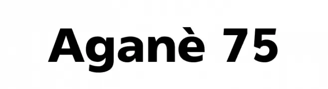
A bold, modern sans-serif font with clean lines and strong presence.
![Aganè 75 Fuentes Gratis Descargar]() Descargar 2937 Descargas@WebFont
Descargar 2937 Descargas@WebFont -
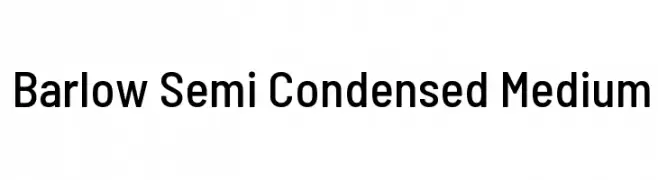
( Copyright 2017 The Barlow Project Authors (https://github.com/jpt/barlow) )
A modern, semi-condensed typeface with clean lines and uniform stroke width.
![Barlow Semi Condensed Medium Fuentes Gratis Descargar]() Descargar 2937 Descargas@WebFont
Descargar 2937 Descargas@WebFont


¿Cuáles son las fuentes más populares ahora?
Poppins, Roboto, Montserrat, Open Sans y Lato son muy usadas por su forma limpia y su amplia aplicabilidad — desde identidad de marca hasta landing pages y carteles.
¿Qué fuentes se usan para logotipos?
Las sans serif geométricas (p. ej., Poppins, familias al estilo Gotham) se eligen a menudo para un branding limpio y escalable. Para un toque personal, scripts y estilos manuscritos siguen siendo clásicos. Combina un display contundente para titulares con un cuerpo neutral para reconocimiento y equilibrio.
¿Con qué frecuencia se actualiza la lista?
Se actualiza regularmente según descargas y actividad real. Vuelve a menudo para descubrir las próximas favoritas.
💡 Consejo: guarda esta página — las tendencias cambian rápido y las fuentes top de hoy podrían inspirar el rebranding de mañana.