Bienvenido a Fuentes Destacadas — donde se encuentran popularidad y calidad. Aquí están las fuentes más descargadas y utilizadas del año. Si buscas opciones seguras para logos, web o social, empieza aquí.
Cada fuente top destaca por su equilibrio, legibilidad y versatilidad. Encontrarás sans serif modernas, scripts elegantes, serifs vintage y displays minimalistas.
-
 Descargar 190 Descargas@WebFont
 -
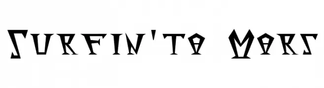
( Fonts by RudynFluffy )
A bold, angular font with a futuristic and geometric style.
![Surfinta Mars Fuentes Gratis Descargar]() Descargar 190 Descargas@WebFont
Descargar 190 Descargas@WebFont -
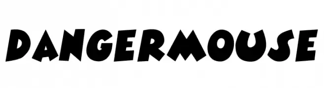
( www.kiddiefonts.com )
A bold, playful font with dynamic, comic book-inspired design.
![DANGERMOUSE Fuentes Gratis Descargar]() Descargar 190 Descargas@WebFont
Descargar 190 Descargas@WebFont -
( Fonts by Bumbayo Font Fabrik - bumbayo.blogspot.com )
A bold, Gothic-inspired font with ornate detailing and a dramatic flair.
![Grymmoire Fuentes Gratis Descargar]() Descargar 190 Descargas@WebFont
Descargar 190 Descargas@WebFont -
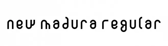
( Fonts by Adien Gunarta - fontasticindonesia.blogspot.com )
A modern geometric font with rounded edges and consistent stroke width.
![New Madura Regular Fuentes Gratis Descargar]() Descargar 190 Descargas@WebFont
Descargar 190 Descargas@WebFont -
-
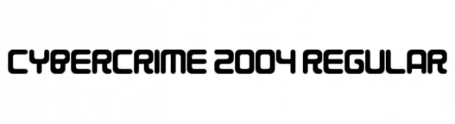
( Fonts by www.chequered.ink - Chequered Ink - Personal-use only. For commercial use please contact owner. )
A futuristic, geometric font with bold, rounded shapes and consistent stroke width.
![Cybercrime 2004 Regular Fuentes Gratis Descargar]() Descargar 190 Descargas@WebFont
Descargar 190 Descargas@WebFont -
( Fonts by Eknoji Studio )
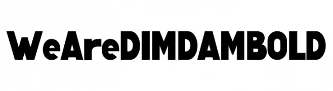
A bold, geometric sans-serif font with strong, uniform strokes.
![We Are DIMDAM BOLD Fuentes Gratis Descargar]() Descargar 190 Descargas@WebFont
Descargar 190 Descargas@WebFont -
( Fonts by Klaus Johansen - www.listemageren.dK )
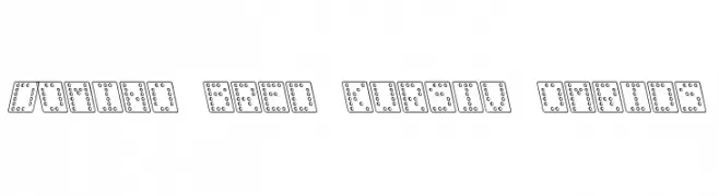
A playful, domino-themed font with italicized, outlined characters.
![Domino bred kursiv omrids Fuentes Gratis Descargar]() Descargar 190 Descargas@WebFont
Descargar 190 Descargas@WebFont -
( Fonts by bob istheowl http://luc.devroye.org/bobistheowl.html )
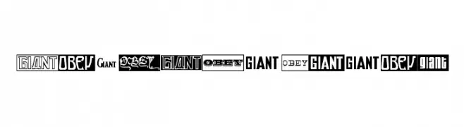
A diverse collection of bold, impactful fonts with unique styles.
![ObeyGiantPoster Fuentes Gratis Descargar]() Descargar 190 Descargas@WebFont
Descargar 190 Descargas@WebFont -
( Fonts by Manfred Klein - manfred-klein.ina-mar.com )
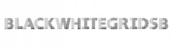
A bold, grid-patterned decorative font with a modern, digital aesthetic.
![BlackWhiteGridsB Fuentes Gratis Descargar]() Descargar 190 Descargas@WebFont
Descargar 190 Descargas@WebFont

¿Cuáles son las fuentes más populares ahora?
Poppins, Roboto, Montserrat, Open Sans y Lato son muy usadas por su forma limpia y su amplia aplicabilidad — desde identidad de marca hasta landing pages y carteles.
¿Qué fuentes se usan para logotipos?
Las sans serif geométricas (p. ej., Poppins, familias al estilo Gotham) se eligen a menudo para un branding limpio y escalable. Para un toque personal, scripts y estilos manuscritos siguen siendo clásicos. Combina un display contundente para titulares con un cuerpo neutral para reconocimiento y equilibrio.
¿Con qué frecuencia se actualiza la lista?
Se actualiza regularmente según descargas y actividad real. Vuelve a menudo para descubrir las próximas favoritas.
💡 Consejo: guarda esta página — las tendencias cambian rápido y las fuentes top de hoy podrían inspirar el rebranding de mañana.