Bienvenido a Fuentes Destacadas — donde se encuentran popularidad y calidad. Aquí están las fuentes más descargadas y utilizadas del año. Si buscas opciones seguras para logos, web o social, empieza aquí.
Cada fuente top destaca por su equilibrio, legibilidad y versatilidad. Encontrarás sans serif modernas, scripts elegantes, serifs vintage y displays minimalistas.
-
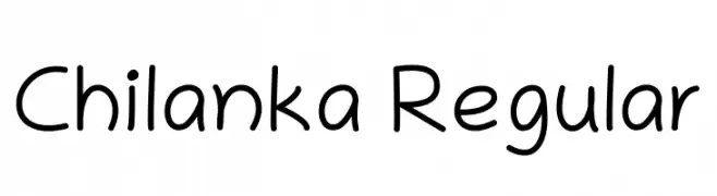
( Copyright 2019 The Chilanka Project Authors (https://gitlab.com/smc/fonts/chilanka) )
A casual, friendly handwritten font with smooth, rounded strokes.
 Descargar 3071 Descargas@WebFont
 -
( Copyright (c) 2012 by Sorkin Type Co (www.sorkintype.com), with Reserved Font Name "Molle" )
A bold, cursive script font with smooth, connected strokes and elegant slant.
![Molle Fuentes Gratis Descargar]() Descargar 3071 Descargas@WebFont
Descargar 3071 Descargas@WebFont -
![Morning Star Fuentes Gratis Descargar]() Descargar 3071 Descargas@WebFont
Descargar 3071 Descargas@WebFont -
![LCD Ultra Fuentes Gratis Descargar]() Descargar 3071 Descargas@WebFont
Descargar 3071 Descargas@WebFont -
( Fonts by Daniel Gauthier )
A bold, geometric font with outlined characters and a modern style.
![Bicycle Fuentes Gratis Descargar]() Descargar 3071 Descargas@WebFont
Descargar 3071 Descargas@WebFont -
-
( Fonts by www.Fontfabric.com )
A modern, clean sans-serif font with balanced proportions and clear readability.
![Casper Fuentes Gratis Descargar]() Descargar 3070 Descargas@WebFont
Descargar 3070 Descargas@WebFont -
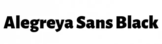
( Copyright 2013 The Alegreya Sans Project Authors (https://github.com/huertatipografica/Alegreya-Sans) )
A bold, modern sans-serif font with strong geometric shapes and thick strokes.
![Alegreya Sans Black Fuentes Gratis Descargar]() Descargar 3069 Descargas@WebFont
Descargar 3069 Descargas@WebFont -
( Fonts by www.misprintedtype.com )
A distressed, grungy font with a vintage, weathered appearance.
![Rochester Fuentes Gratis Descargar]() Descargar 3069 Descargas@WebFont
Descargar 3069 Descargas@WebFont -
( Zetafonts - www.zetafonts.com )
A bold, modern font with thick strokes and tight spacing, perfect for impactful designs.
![Heading Pro Trial ExtraBold Fuentes Gratis Descargar]() Descargar 3068 Descargas@WebFont
Descargar 3068 Descargas@WebFont -
( Fonts by a Neale Davidson - www.pixelsagas.com. Personal-use only. For commercial use please contact owner. )
A bold, dramatic serif font with a modern twist, featuring sharp serifs and a strong presence.
![Draconis Fuentes Gratis Descargar]() Descargar 3068 Descargas@WebFont
Descargar 3068 Descargas@WebFont


¿Cuáles son las fuentes más populares ahora?
Poppins, Roboto, Montserrat, Open Sans y Lato son muy usadas por su forma limpia y su amplia aplicabilidad — desde identidad de marca hasta landing pages y carteles.
¿Qué fuentes se usan para logotipos?
Las sans serif geométricas (p. ej., Poppins, familias al estilo Gotham) se eligen a menudo para un branding limpio y escalable. Para un toque personal, scripts y estilos manuscritos siguen siendo clásicos. Combina un display contundente para titulares con un cuerpo neutral para reconocimiento y equilibrio.
¿Con qué frecuencia se actualiza la lista?
Se actualiza regularmente según descargas y actividad real. Vuelve a menudo para descubrir las próximas favoritas.
💡 Consejo: guarda esta página — las tendencias cambian rápido y las fuentes top de hoy podrían inspirar el rebranding de mañana.