Bienvenido a Fuentes Destacadas — donde se encuentran popularidad y calidad. Aquí están las fuentes más descargadas y utilizadas del año. Si buscas opciones seguras para logos, web o social, empieza aquí.
Cada fuente top destaca por su equilibrio, legibilidad y versatilidad. Encontrarás sans serif modernas, scripts elegantes, serifs vintage y displays minimalistas.
-
( Fonts by Blue Vinyl - Jess Latham - www.bvfonts.com )
A playful, rounded font with a hand-drawn, whimsical style.
 Descargar 196 Descargas@WebFont
 -
![Chump Fuentes Gratis Descargar]() Descargar 196 Descargas@WebFont
Descargar 196 Descargas@WebFont -
( Fonts by Alana Morrow )
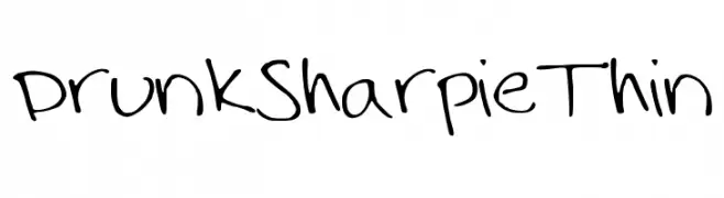
A playful, handwritten font with a casual, marker-like style.
![DrunkSharpieThin Fuentes Gratis Descargar]() Descargar 196 Descargas@WebFont
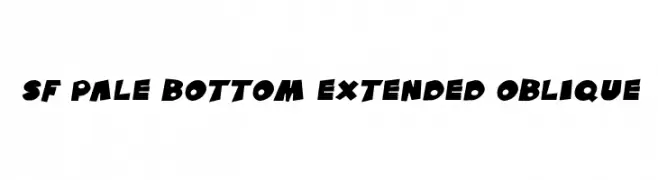
Descargar 196 Descargas@WebFont -
![SF Pale Bottom Extended Oblique Fuentes Gratis Descargar]() Descargar 196 Descargas@WebFont
Descargar 196 Descargas@WebFont -
( Fonts by Balpirick Studio - https://www.creativefabrica.com/designer/balpirick/ref/308299/ - Personal-use only. For commercial use please contact owner. )
A cursive, handwritten-style font with elegant, flowing letters.
![Barkeliy Fuentes Gratis Descargar]() Descargar 196 Descargas@WebFont
Descargar 196 Descargas@WebFont -
-
( Saridezra - creativemarket.com/saridezra )
A dynamic and fluid script font with elegant cursive letters.
![Billenia-Standard Fuentes Gratis Descargar]() Descargar 196 Descargas@WebFont
Descargar 196 Descargas@WebFont -
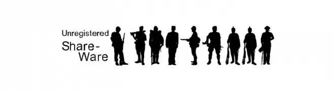
![SoldierWW2 Fuentes Gratis Descargar]() Descargar 196 Descargas@WebFont
Descargar 196 Descargas@WebFont -
( Fonts by allsuperfont.com - Personal-use only. For commercial use please contact owner. )
A bold, playful font with thick, rounded characters and a whimsical style.
![Super Avocado Fuentes Gratis Descargar]() Descargar 196 Descargas@WebFont
Descargar 196 Descargas@WebFont -
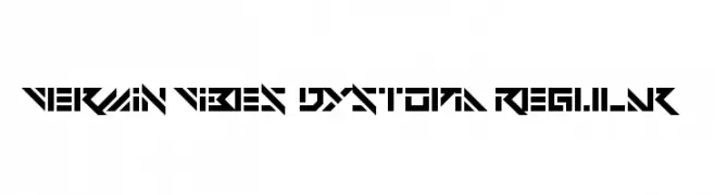
( Fonts by Andrew McCluskey - nalgames.com )
A futuristic, angular font with a bold, geometric design.
![Vermin Vibes Dystopia Regular Fuentes Gratis Descargar]() Descargar 196 Descargas@WebFont
Descargar 196 Descargas@WebFont -
( Fonts by Vladimir Nikolic - www.creativefabrica.com/designer/vladimirnikolic/ - Personal-use only. For commercial use please contact owner. )
A bold, 3D geometric font with a modern and impactful design.
![Hangout 3D Regular Fuentes Gratis Descargar]() Descargar 196 Descargas@WebFont
Descargar 196 Descargas@WebFont


¿Cuáles son las fuentes más populares ahora?
Poppins, Roboto, Montserrat, Open Sans y Lato son muy usadas por su forma limpia y su amplia aplicabilidad — desde identidad de marca hasta landing pages y carteles.
¿Qué fuentes se usan para logotipos?
Las sans serif geométricas (p. ej., Poppins, familias al estilo Gotham) se eligen a menudo para un branding limpio y escalable. Para un toque personal, scripts y estilos manuscritos siguen siendo clásicos. Combina un display contundente para titulares con un cuerpo neutral para reconocimiento y equilibrio.
¿Con qué frecuencia se actualiza la lista?
Se actualiza regularmente según descargas y actividad real. Vuelve a menudo para descubrir las próximas favoritas.
💡 Consejo: guarda esta página — las tendencias cambian rápido y las fuentes top de hoy podrían inspirar el rebranding de mañana.