Bienvenido a Fuentes Destacadas — donde se encuentran popularidad y calidad. Aquí están las fuentes más descargadas y utilizadas del año. Si buscas opciones seguras para logos, web o social, empieza aquí.
Cada fuente top destaca por su equilibrio, legibilidad y versatilidad. Encontrarás sans serif modernas, scripts elegantes, serifs vintage y displays minimalistas.
-
( Fonts by www.philing.net )
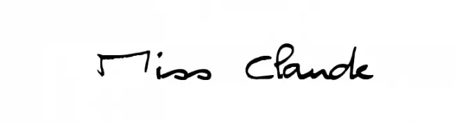
A playful, handwritten font with a casual and dynamic style.
 Descargar 222 Descargas@WebFont
 -
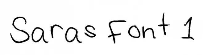
![Saras Font 1 Fuentes Gratis Descargar]() Descargar 222 Descargas@WebFont
Descargar 222 Descargas@WebFont -
Fuentes por typotopia. For commercial use please contact the owner.
( Fonts bt Typotopia - Typotopia.co - Personal Use Only, for Commercial Use, please contact us )
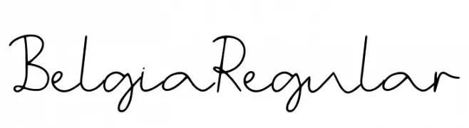
A playful and artistic script font with fluid, continuous strokes.
![Belgia Regular Fuentes Gratis Descargar]() Descargar 222 Descargas@WebFont
Descargar 222 Descargas@WebFont -
( Oliver Conte Design - www.ocdesign.com/html_pages/free_fonts.html )
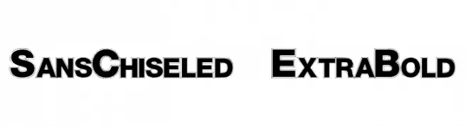
A bold, chiseled font with a three-dimensional effect, perfect for headlines.
![SansChiseled ExtraBold Fuentes Gratis Descargar]() Descargar 222 Descargas@WebFont
Descargar 222 Descargas@WebFont -
( Font by Jayvee D. Enaguas - grandchaos9000.deviantart.com )
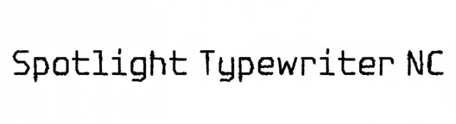
A vintage, monospaced typewriter-style font with textured, irregular strokes.
![Spotlight Typewriter NC Fuentes Gratis Descargar]() Descargar 222 Descargas@WebFont
Descargar 222 Descargas@WebFont -
-
( Fonts by Vigilante Typeface Corporation Larry Yerkes. Personal-use only. For commercial use please contact owner. )
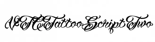
An ornate script font with intricate loops and flourishes, reminiscent of traditional calligraphy.
![VTCTattooScriptTwo Fuentes Gratis Descargar]() Descargar 222 Descargas@WebFont
Descargar 222 Descargas@WebFont -
( Fonts by Unifraktur Project )
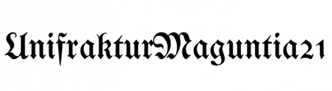
A traditional blackletter font with ornate, medieval-inspired letterforms.
![UnifrakturMaguntia21 Fuentes Gratis Descargar]() Descargar 222 Descargas@WebFont
Descargar 222 Descargas@WebFont -
( Fonts by www.lifewithouttaffy.com )
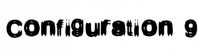
A bold, distressed font with a dynamic, grunge-like appearance.
![Configuration 9 Fuentes Gratis Descargar]() Descargar 222 Descargas@WebFont
Descargar 222 Descargas@WebFont -
( www.flickr.com/photos/digitalcodi/ )
A playful, casual handwritten font with smooth, flowing lines.
![Rodrix Fuentes Gratis Descargar]() Descargar 222 Descargas@WebFont
Descargar 222 Descargas@WebFont -
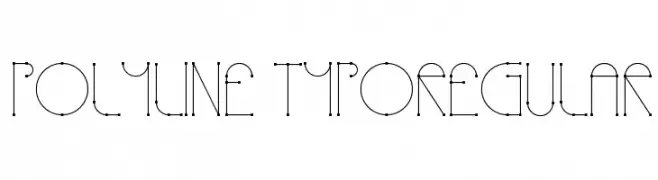
( Alejandro Londoño - www.londoarq.com )
A geometric, modern font with visible nodes and a minimalist design.
![Polyline TypoRegular Fuentes Gratis Descargar]() Descargar 222 Descargas@WebFont
Descargar 222 Descargas@WebFont

¿Cuáles son las fuentes más populares ahora?
Poppins, Roboto, Montserrat, Open Sans y Lato son muy usadas por su forma limpia y su amplia aplicabilidad — desde identidad de marca hasta landing pages y carteles.
¿Qué fuentes se usan para logotipos?
Las sans serif geométricas (p. ej., Poppins, familias al estilo Gotham) se eligen a menudo para un branding limpio y escalable. Para un toque personal, scripts y estilos manuscritos siguen siendo clásicos. Combina un display contundente para titulares con un cuerpo neutral para reconocimiento y equilibrio.
¿Con qué frecuencia se actualiza la lista?
Se actualiza regularmente según descargas y actividad real. Vuelve a menudo para descubrir las próximas favoritas.
💡 Consejo: guarda esta página — las tendencias cambian rápido y las fuentes top de hoy podrían inspirar el rebranding de mañana.