Bienvenido a Fuentes Destacadas — donde se encuentran popularidad y calidad. Aquí están las fuentes más descargadas y utilizadas del año. Si buscas opciones seguras para logos, web o social, empieza aquí.
Cada fuente top destaca por su equilibrio, legibilidad y versatilidad. Encontrarás sans serif modernas, scripts elegantes, serifs vintage y displays minimalistas.
-
( imagex - www.imagex-fonts.com )
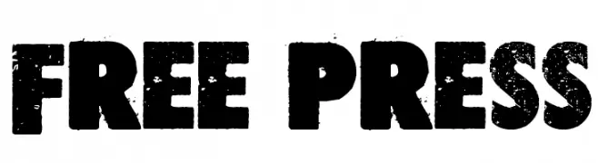
A bold, distressed font with a grunge texture and vintage appeal.
 Descargar 230 Descargas@WebFont
 -
( Fonts by Balpirick Studio - https://www.creativefabrica.com/designer/balpirick/ref/308299/ - Personal-use only. For commercial use please contact owner. )
A lively, cursive script font with a dynamic and artistic flair.
![Dancingdog Fuentes Gratis Descargar]() Descargar 230 Descargas@WebFont
Descargar 230 Descargas@WebFont -
![soda light Fuentes Gratis Descargar]() Descargar 230 Descargas@WebFont
Descargar 230 Descargas@WebFont -
( Fonts by ShyFonts )
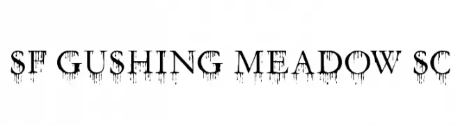
A bold, high-contrast font with a dripping effect, ideal for dramatic and spooky designs.
![SF Gushing Meadow SC Fuentes Gratis Descargar]() Descargar 230 Descargas@WebFont
Descargar 230 Descargas@WebFont -
( imagex - www.imagex-fonts.com )
A bold, brushstroke-style font with rough, jagged edges and dynamic energy.
![Them! Fuentes Gratis Descargar]() Descargar 230 Descargas@WebFont
Descargar 230 Descargas@WebFont -
-
( Fonts by pheist.net - Stefanie Koerner )
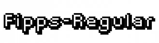
A bold, pixelated font with a retro digital aesthetic.
![Fipps-Regular Fuentes Gratis Descargar]() Descargar 230 Descargas@WebFont
Descargar 230 Descargas@WebFont -
( Fonts by Laurent Mouy )
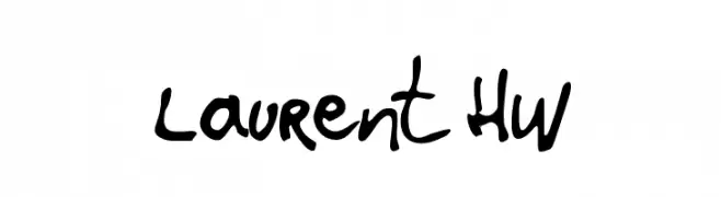
A lively, handwritten font with fluid, organic strokes and a playful yet sophisticated flair.
![Laurent HW Fuentes Gratis Descargar]() Descargar 230 Descargas@WebFont
Descargar 230 Descargas@WebFont -
( Fonts by wep - Wahyu Eka Prasetya - Personal-use only. For commercial use please contact owner. )
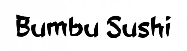
A bold, hand-drawn font with playful curves and thick strokes.
![Bumbu Sushi Fuentes Gratis Descargar]() Descargar 230 Descargas@WebFont
Descargar 230 Descargas@WebFont -
( Fonts by www.floodfonts.com )
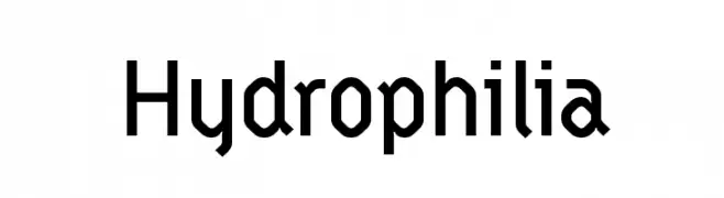
A bold, geometric font with clean lines and a modern aesthetic.
![Hydrophilia Fuentes Gratis Descargar]() Descargar 230 Descargas@WebFont
Descargar 230 Descargas@WebFont -
( Fonts by Iconian Fonts - Daniel Zadorozny )
A bold, geometric font with a 3D effect and modern, tech-inspired design.
![Gemina 3D Regular Fuentes Gratis Descargar]() Descargar 230 Descargas@WebFont
Descargar 230 Descargas@WebFont


¿Cuáles son las fuentes más populares ahora?
Poppins, Roboto, Montserrat, Open Sans y Lato son muy usadas por su forma limpia y su amplia aplicabilidad — desde identidad de marca hasta landing pages y carteles.
¿Qué fuentes se usan para logotipos?
Las sans serif geométricas (p. ej., Poppins, familias al estilo Gotham) se eligen a menudo para un branding limpio y escalable. Para un toque personal, scripts y estilos manuscritos siguen siendo clásicos. Combina un display contundente para titulares con un cuerpo neutral para reconocimiento y equilibrio.
¿Con qué frecuencia se actualiza la lista?
Se actualiza regularmente según descargas y actividad real. Vuelve a menudo para descubrir las próximas favoritas.
💡 Consejo: guarda esta página — las tendencias cambian rápido y las fuentes top de hoy podrían inspirar el rebranding de mañana.