Bienvenido a Fuentes Destacadas — donde se encuentran popularidad y calidad. Aquí están las fuentes más descargadas y utilizadas del año. Si buscas opciones seguras para logos, web o social, empieza aquí.
Cada fuente top destaca por su equilibrio, legibilidad y versatilidad. Encontrarás sans serif modernas, scripts elegantes, serifs vintage y displays minimalistas.
-
 Descargar 263 Descargas@WebFont
 -
( Fonts by www.houseoflime.com )
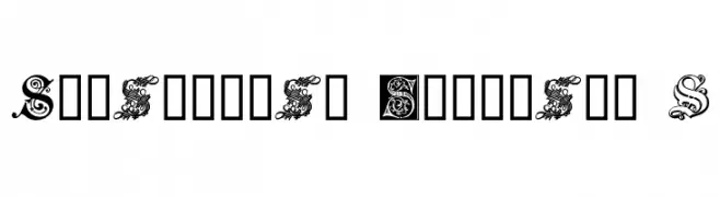
An ornate, decorative font with intricate floral embellishments, reminiscent of medieval manuscripts.
![Ornamental Initials S Fuentes Gratis Descargar]() Descargar 263 Descargas@WebFont
Descargar 263 Descargas@WebFont -
( Fonts by junkohanhero )
A bold, ornate Blackletter font with a Gothic, medieval style.
![Requiem for A Fuentes Gratis Descargar]() Descargar 263 Descargas@WebFont
Descargar 263 Descargas@WebFont -
( Fonts by Castcraft Software - opti.netii.net - check the website before use )
A bold, modern typeface with strong, impactful characters.
![OPTIActon-Heavy Fuentes Gratis Descargar]() Descargar 263 Descargas@WebFont
Descargar 263 Descargas@WebFont -
( Free on condition that you make a donation of 5€ favor of an organization dealing with global warming. http://www.sergiolelli.it )
A bold, oblique font with high contrast and tight spacing, perfect for dynamic designs.
![KarlKrausOblique Fuentes Gratis Descargar]() Descargar 263 Descargas@WebFont
Descargar 263 Descargas@WebFont -
-
( Fonts by Ali Hamidi )
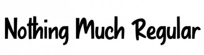
A playful, bold handwritten font with a casual style.
![Nothing Much Regular Fuentes Gratis Descargar]() Descargar 263 Descargas@WebFont
Descargar 263 Descargas@WebFont -
( Nght's Place - www.crosswinds.net/~nghtmvs/font/fonts1.html )
A circuit-inspired font with intricate, tech-themed detailing.
![101! Circuit Board Fuentes Gratis Descargar]() Descargar 263 Descargas@WebFont
Descargar 263 Descargas@WebFont -
( Fonts by Daniel Zadorozny - www.iconian.com )
A sleek, semi-italic font with a modern and dynamic style.
![Antietam Semi-Italic Fuentes Gratis Descargar]() Descargar 263 Descargas@WebFont
Descargar 263 Descargas@WebFont -
( Fonts by creativetacos )
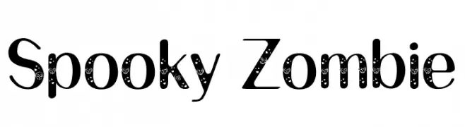
A playful, spooky font with swirling patterns and eerie textures.
![Spooky Zombie Fuentes Gratis Descargar]() Descargar 263 Descargas@WebFont
Descargar 263 Descargas@WebFont -
( Fonts by cherchercherita )
A playful, handwritten font with rounded edges and a casual style.
![Andrea Regular Fuentes Gratis Descargar]() Descargar 263 Descargas@WebFont
Descargar 263 Descargas@WebFont


¿Cuáles son las fuentes más populares ahora?
Poppins, Roboto, Montserrat, Open Sans y Lato son muy usadas por su forma limpia y su amplia aplicabilidad — desde identidad de marca hasta landing pages y carteles.
¿Qué fuentes se usan para logotipos?
Las sans serif geométricas (p. ej., Poppins, familias al estilo Gotham) se eligen a menudo para un branding limpio y escalable. Para un toque personal, scripts y estilos manuscritos siguen siendo clásicos. Combina un display contundente para titulares con un cuerpo neutral para reconocimiento y equilibrio.
¿Con qué frecuencia se actualiza la lista?
Se actualiza regularmente según descargas y actividad real. Vuelve a menudo para descubrir las próximas favoritas.
💡 Consejo: guarda esta página — las tendencias cambian rápido y las fuentes top de hoy podrían inspirar el rebranding de mañana.