Bienvenido a Fuentes Destacadas — donde se encuentran popularidad y calidad. Aquí están las fuentes más descargadas y utilizadas del año. Si buscas opciones seguras para logos, web o social, empieza aquí.
Cada fuente top destaca por su equilibrio, legibilidad y versatilidad. Encontrarás sans serif modernas, scripts elegantes, serifs vintage y displays minimalistas.
-
( Fonts by Blambot Comic Fonts - Personal-use only. For commercial use please contact owner. )
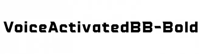
Bold, geometric font with angular lines and a modern aesthetic.
 Descargar 301 Descargas@WebFont
 -
( Fonts by a Neale Davidson - www.pixelsagas.com. Personal-use only. For commercial use please contact owner. )
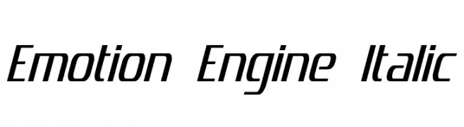
A sleek, modern italic font with a dynamic, streamlined appearance.
![Emotion Engine Italic Fuentes Gratis Descargar]() Descargar 301 Descargas@WebFont
Descargar 301 Descargas@WebFont -
![Simple Signature Fuentes Gratis Descargar]() Descargar 301 Descargas@WebFont
Descargar 301 Descargas@WebFont -
( Fonts by Apostrophic Lab )
A bold, jagged decorative font with a spiky texture.
![Halter Pinchy Fuentes Gratis Descargar]() Descargar 301 Descargas@WebFont
Descargar 301 Descargas@WebFont -
( Fonts by Allouse Studio )
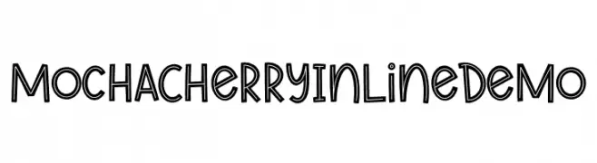
A playful, outlined font with a hand-drawn, whimsical style.
![Mocha Cherry In Line Demo Fuentes Gratis Descargar]() Descargar 301 Descargas@WebFont
Descargar 301 Descargas@WebFont -
-
( Fonts by Pizzadude )
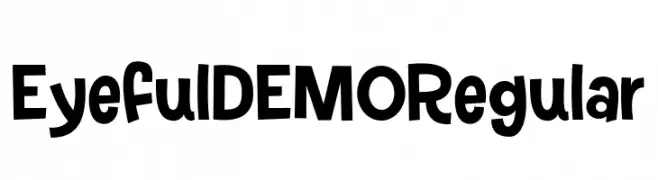
A playful and bold font with thick strokes and whimsical shapes.
![Eyeful DEMO Regular Fuentes Gratis Descargar]() Descargar 301 Descargas@WebFont
Descargar 301 Descargas@WebFont -
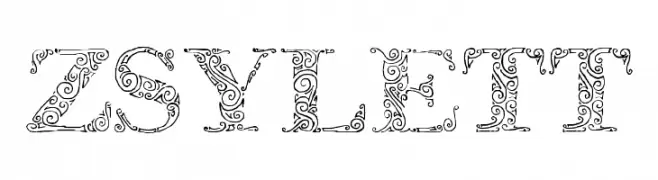
( Fonts by Eva Barabasne Olasz )
An ornate and decorative font with intricate floral patterns, perfect for vintage and artistic designs.
![Zsylett Fuentes Gratis Descargar]() Descargar 301 Descargas@WebFont
Descargar 301 Descargas@WebFont -
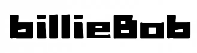
( Fonts by joeBob graff-X )
A bold, geometric font with a modern, edgy aesthetic.
![billieBob Fuentes Gratis Descargar]() Descargar 301 Descargas@WebFont
Descargar 301 Descargas@WebFont -
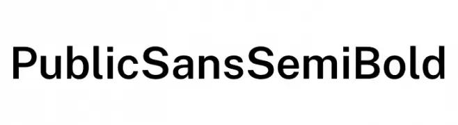
( Fonts by U.S. Web Design System )
A modern, clean sans-serif font with uniform stroke weight and excellent readability.
![Public Sans SemiBold Fuentes Gratis Descargar]() Descargar 301 Descargas@WebFont
Descargar 301 Descargas@WebFont -
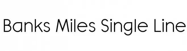
( K-Type - Keith Bates - www.k-type.com/ )
A modern, geometric sans-serif font with clean lines and uniform stroke width.
![Banks Miles Single Line Fuentes Gratis Descargar]() Descargar 301 Descargas@WebFont
Descargar 301 Descargas@WebFont


¿Cuáles son las fuentes más populares ahora?
Poppins, Roboto, Montserrat, Open Sans y Lato son muy usadas por su forma limpia y su amplia aplicabilidad — desde identidad de marca hasta landing pages y carteles.
¿Qué fuentes se usan para logotipos?
Las sans serif geométricas (p. ej., Poppins, familias al estilo Gotham) se eligen a menudo para un branding limpio y escalable. Para un toque personal, scripts y estilos manuscritos siguen siendo clásicos. Combina un display contundente para titulares con un cuerpo neutral para reconocimiento y equilibrio.
¿Con qué frecuencia se actualiza la lista?
Se actualiza regularmente según descargas y actividad real. Vuelve a menudo para descubrir las próximas favoritas.
💡 Consejo: guarda esta página — las tendencias cambian rápido y las fuentes top de hoy podrían inspirar el rebranding de mañana.