Bienvenido a Fuentes Destacadas — donde se encuentran popularidad y calidad. Aquí están las fuentes más descargadas y utilizadas del año. Si buscas opciones seguras para logos, web o social, empieza aquí.
Cada fuente top destaca por su equilibrio, legibilidad y versatilidad. Encontrarás sans serif modernas, scripts elegantes, serifs vintage y displays minimalistas.
-
( Fonts by Andrew Hart - dirt2.com )
A bold, distressed font with tall, narrow letterforms and a gritty, weathered texture.
 Descargar 331 Descargas@WebFont
 -
( Fonts by Apostrophic Lab )
A bold, wide slab serif font with strong, block-like serifs and excellent readability.
![Street Slab - Wide Fuentes Gratis Descargar]() Descargar 331 Descargas@WebFont
Descargar 331 Descargas@WebFont -
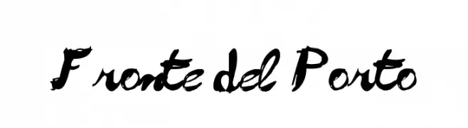
( Fonts by www.alphabetype.it )
A bold, cursive script font with dynamic strokes and fluid forms.
![Fronte del Porto Fuentes Gratis Descargar]() Descargar 331 Descargas@WebFont
Descargar 331 Descargas@WebFont -
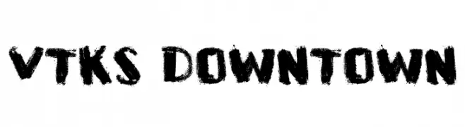
( Fonts by Douglas Vitkauskas - www.vtksdesign.com. Personal-use only. For commercial use please contact owner. )
A bold, textured font with a graffiti-like, artistic style.
![VTKS DOWNTOWN Fuentes Gratis Descargar]() Descargar 331 Descargas@WebFont
Descargar 331 Descargas@WebFont -
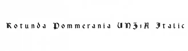
( Fonts by Peter Wiegel - www.peter-wiegel.de )
A Gothic-inspired font with intricate, angular strokes and a medieval essence.
![Rotunda Pommerania UNZ1A Italic Fuentes Gratis Descargar]() Descargar 331 Descargas@WebFont
Descargar 331 Descargas@WebFont -
-
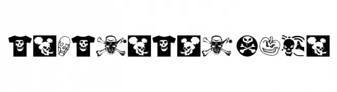
( Fonts by Manfred Klein - manfred-klein.ina-mar.com )
A bold, illustrative display font with skull and t-shirt themed icons.
![AtLastATshirt Fuentes Gratis Descargar]() Descargar 331 Descargas@WebFont
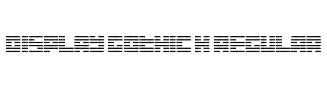
Descargar 331 Descargas@WebFont -
![Display Gothic K Regular Fuentes Gratis Descargar]() Descargar 331 Descargas@WebFont
Descargar 331 Descargas@WebFont -
( StereoType - Clément Nicolle - www.stereo-type.fr )
A dynamic, expressive handwritten font with fluid strokes and natural flow.
![Rosetta Color Fuentes Gratis Descargar]() Descargar 331 Descargas@WebFont
Descargar 331 Descargas@WebFont -
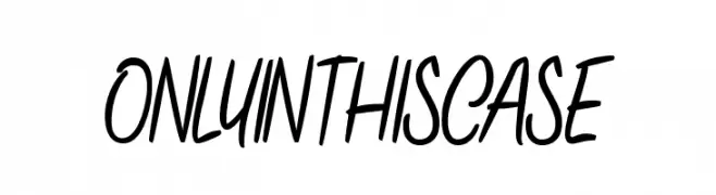
( Fonts by Maelle.K - Thomas Boucherie )
A lively, dynamic handwritten font with smooth, continuous strokes.
![ONLYINTHISCASE Fuentes Gratis Descargar]() Descargar 331 Descargas@WebFont
Descargar 331 Descargas@WebFont -
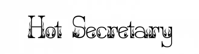
( jbensch.deviantart.com )
A bold, decorative font with integrated flame motifs for a fiery appearance.
![Hot Secretary Fuentes Gratis Descargar]() Descargar 331 Descargas@WebFont
Descargar 331 Descargas@WebFont


¿Cuáles son las fuentes más populares ahora?
Poppins, Roboto, Montserrat, Open Sans y Lato son muy usadas por su forma limpia y su amplia aplicabilidad — desde identidad de marca hasta landing pages y carteles.
¿Qué fuentes se usan para logotipos?
Las sans serif geométricas (p. ej., Poppins, familias al estilo Gotham) se eligen a menudo para un branding limpio y escalable. Para un toque personal, scripts y estilos manuscritos siguen siendo clásicos. Combina un display contundente para titulares con un cuerpo neutral para reconocimiento y equilibrio.
¿Con qué frecuencia se actualiza la lista?
Se actualiza regularmente según descargas y actividad real. Vuelve a menudo para descubrir las próximas favoritas.
💡 Consejo: guarda esta página — las tendencias cambian rápido y las fuentes top de hoy podrían inspirar el rebranding de mañana.