Bienvenido a Fuentes Destacadas — donde se encuentran popularidad y calidad. Aquí están las fuentes más descargadas y utilizadas del año. Si buscas opciones seguras para logos, web o social, empieza aquí.
Cada fuente top destaca por su equilibrio, legibilidad y versatilidad. Encontrarás sans serif modernas, scripts elegantes, serifs vintage y displays minimalistas.
-
( Fonts by Castcraft Software - opti.netii.net - check the website before use )
A bold, vintage-style font with pointed serifs and dramatic flair.
 Descargar 353 Descargas@WebFont
 -
( Fonts by weknow - Wino S Kadir )
A playful, rounded font with a whimsical and bold design.
![Sausage Fuentes Gratis Descargar]() Descargar 353 Descargas@WebFont
Descargar 353 Descargas@WebFont -
( Fonts by Erick Molina )
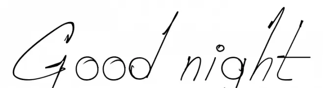
An artistic handwritten font with elongated, flowing letterforms and high contrast.
![Good night Fuentes Gratis Descargar]() Descargar 353 Descargas@WebFont
Descargar 353 Descargas@WebFont -
( imagex - www.imagex-fonts.com )
A bold, hand-drawn style font with an expressive and artistic appearance.
![Flowers Kingdom Fuentes Gratis Descargar]() Descargar 353 Descargas@WebFont
Descargar 353 Descargas@WebFont -
( Fonts by Vít Čondák )
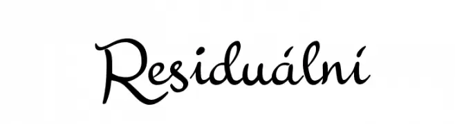
A flowing, elegant cursive font with a classic yet modern appeal.
![Residuální Fuentes Gratis Descargar]() Descargar 353 Descargas@WebFont
Descargar 353 Descargas@WebFont -
-
( Fonts by BLKBK - https://blkbk.ink - Personal-use only. For commercial use please contact owner. Comercial Fuentes )
A bold, hand-drawn font with a playful and irregular style.
![Hand Book Fuentes Gratis Descargar]() Descargar 353 Descargas
Descargar 353 Descargas -
![QLD Fuentes Gratis Descargar]() Descargar 353 Descargas@WebFont
Descargar 353 Descargas@WebFont -
( Fonts by Syaf Rizal - Khurasan - Personal-use only. For commercial use please contact owner. )
A playful, rounded font with smooth curves and a friendly appearance.
![Stimcard Fuentes Gratis Descargar]() Descargar 353 Descargas@WebFont
Descargar 353 Descargas@WebFont -
( Fonts by Jetsmax Studio )
A playful, bold, and bubbly font with a rounded, balloon-like design.
![Just Bubble Fuentes Gratis Descargar]() Descargar 353 Descargas@WebFont
Descargar 353 Descargas@WebFont -
( Dikas Studio - Andika Setiawan - creativemarket.com/?u=DikasStudio )
A bold, expressive handwritten font with a brush-like texture.
![OutistyleFreePersonalUse Fuentes Gratis Descargar]() Descargar 353 Descargas@WebFont
Descargar 353 Descargas@WebFont


¿Cuáles son las fuentes más populares ahora?
Poppins, Roboto, Montserrat, Open Sans y Lato son muy usadas por su forma limpia y su amplia aplicabilidad — desde identidad de marca hasta landing pages y carteles.
¿Qué fuentes se usan para logotipos?
Las sans serif geométricas (p. ej., Poppins, familias al estilo Gotham) se eligen a menudo para un branding limpio y escalable. Para un toque personal, scripts y estilos manuscritos siguen siendo clásicos. Combina un display contundente para titulares con un cuerpo neutral para reconocimiento y equilibrio.
¿Con qué frecuencia se actualiza la lista?
Se actualiza regularmente según descargas y actividad real. Vuelve a menudo para descubrir las próximas favoritas.
💡 Consejo: guarda esta página — las tendencias cambian rápido y las fuentes top de hoy podrían inspirar el rebranding de mañana.