Bienvenido a Fuentes Destacadas — donde se encuentran popularidad y calidad. Aquí están las fuentes más descargadas y utilizadas del año. Si buscas opciones seguras para logos, web o social, empieza aquí.
Cada fuente top destaca por su equilibrio, legibilidad y versatilidad. Encontrarás sans serif modernas, scripts elegantes, serifs vintage y displays minimalistas.
-
 Descargar 371 Descargas@WebFont
 -
( Fonts by Ferdiansyah - Personal-use only. For commercial use please contact owner. )
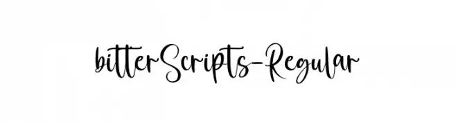
A playful and elegant script font with a handwritten appearance.
![bitterScripts-Regular Fuentes Gratis Descargar]() Descargar 371 Descargas@WebFont
Descargar 371 Descargas@WebFont -
( Iconian Fonts - Daniel Zadorozny - www.iconian.com )
A bold, italicized font with a two-tone striped effect, exuding energy and movement.
![Victory Comics Two-Tone Italic Fuentes Gratis Descargar]() Descargar 371 Descargas@WebFont
Descargar 371 Descargas@WebFont -
( Fonts by www.aenigmafonts.com )
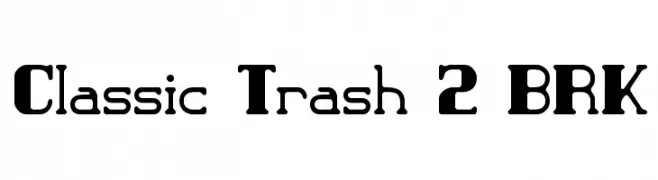
A bold, vintage-inspired serif font with a modern twist, featuring thick serifs and unique character designs.
![Classic Trash 2 BRK Fuentes Gratis Descargar]() Descargar 371 Descargas@WebFont
Descargar 371 Descargas@WebFont -
( Peter Olexa - www.dealjumbo.com )
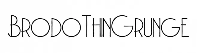
A thin, grunge-style font with a textured, vintage appearance.
![Brodo Thin Grunge Fuentes Gratis Descargar]() Descargar 371 Descargas@WebFont
Descargar 371 Descargas@WebFont -
-
( Fonts by Benoit Sjoholm - www.benoitsjoholm.com - All my fonts are for sale )
A playful, rounded font with consistent stroke width and a modern-retro vibe.
![Kanis Fuentes Gratis Descargar]() Descargar 371 Descargas@WebFont
Descargar 371 Descargas@WebFont -
( Fonts by Bride & Groom www.brideandgroomdirect.co.uk )
A playful, whimsical handwritten font with tall, narrow letters and a casual style.
![Laura-Alternate Fuentes Gratis Descargar]() Descargar 371 Descargas@WebFont
Descargar 371 Descargas@WebFont -
( Fonts by www.waltervelezart.com )
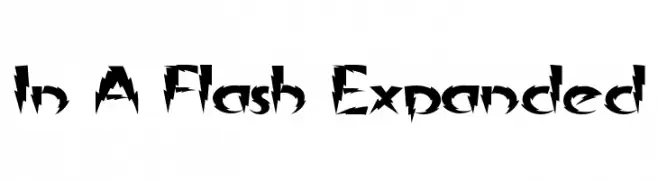
A bold, angular font with sharp, dynamic edges for a striking visual impact.
![In A Flash Expanded Fuentes Gratis Descargar]() Descargar 371 Descargas@WebFont
Descargar 371 Descargas@WebFont -
( Fonts by Galdino Otten - galdinootten.com )
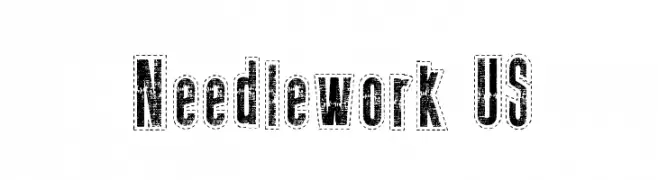
A bold, decorative font with a distressed, vintage texture and dotted outline.
![Needlework US Fuentes Gratis Descargar]() Descargar 371 Descargas@WebFont
Descargar 371 Descargas@WebFont -
( Fonts by Dieter Schumacher )
A bold, geometric font with a futuristic and modern aesthetic.
![Datacut Fuentes Gratis Descargar]() Descargar 371 Descargas@WebFont
Descargar 371 Descargas@WebFont


¿Cuáles son las fuentes más populares ahora?
Poppins, Roboto, Montserrat, Open Sans y Lato son muy usadas por su forma limpia y su amplia aplicabilidad — desde identidad de marca hasta landing pages y carteles.
¿Qué fuentes se usan para logotipos?
Las sans serif geométricas (p. ej., Poppins, familias al estilo Gotham) se eligen a menudo para un branding limpio y escalable. Para un toque personal, scripts y estilos manuscritos siguen siendo clásicos. Combina un display contundente para titulares con un cuerpo neutral para reconocimiento y equilibrio.
¿Con qué frecuencia se actualiza la lista?
Se actualiza regularmente según descargas y actividad real. Vuelve a menudo para descubrir las próximas favoritas.
💡 Consejo: guarda esta página — las tendencias cambian rápido y las fuentes top de hoy podrían inspirar el rebranding de mañana.