Bienvenido a Fuentes Destacadas — donde se encuentran popularidad y calidad. Aquí están las fuentes más descargadas y utilizadas del año. Si buscas opciones seguras para logos, web o social, empieza aquí.
Cada fuente top destaca por su equilibrio, legibilidad y versatilidad. Encontrarás sans serif modernas, scripts elegantes, serifs vintage y displays minimalistas.
-
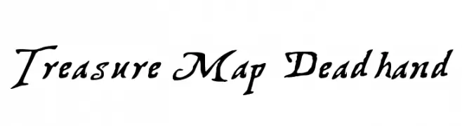
( Fonts by Graham Meade - GemFonts )
A rugged, hand-drawn font with a mysterious, adventurous style.
 Descargar 1435 Descargas@WebFont
 -
( Fonts by ShyFonts )
A bold, modern sans-serif font with clean lines and strong presence.
![SF New Republic SC Bold Fuentes Gratis Descargar]() Descargar 1435 Descargas@WebFont
Descargar 1435 Descargas@WebFont -
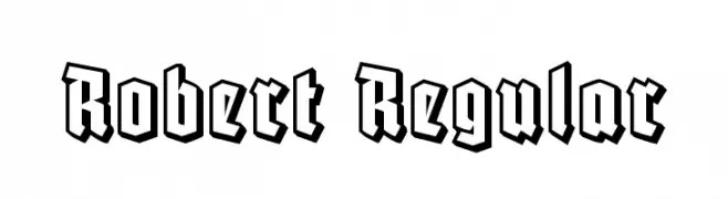
( Vladimir Nikolic - www.coroflot.com/vladimirnikolic )
A bold, angular blackletter-inspired font with a modern 3D shadow effect.
![Robert Regular Fuentes Gratis Descargar]() Descargar 1434 Descargas@WebFont
Descargar 1434 Descargas@WebFont -
( Måns Grebäck - www.mansgreback.com )
Bold, italicized font with a strong, modern presence.
![Specify PERSONAL Normal Black Italic Fuentes Gratis Descargar]() Descargar 1434 Descargas@WebFont
Descargar 1434 Descargas@WebFont -
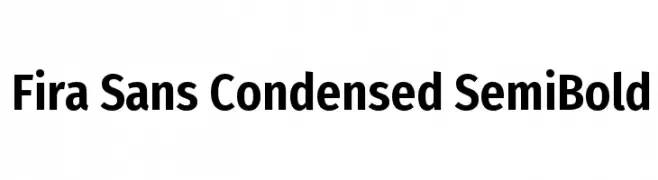
( Copyright (c) 2012-2015, The Mozilla Foundation and Telefonica S.A. )
A modern, condensed sans-serif font with semi-bold weight and minimal contrast.
![Fira Sans Condensed SemiBold Fuentes Gratis Descargar]() Descargar 1434 Descargas@WebFont
Descargar 1434 Descargas@WebFont -
( Copyright (c) 2011, Andreas Kalpakides (hello@inderesting.com) )
A modern, light, and geometric sans-serif font with low contrast.
![Advent Pro Light Fuentes Gratis Descargar]() Descargar 1434 Descargas@WebFont
Descargar 1434 Descargas@WebFont -
( Fonts by Arkandis Digital Foundry )
A bold, modern sans-serif font with clean lines and excellent readability.
![UniversalisADFStd-Bold Fuentes Gratis Descargar]() Descargar 1434 Descargas@WebFont
Descargar 1434 Descargas@WebFont -
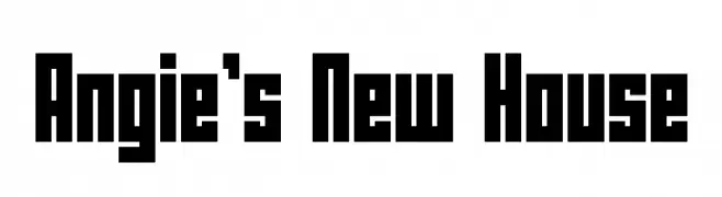
( Fonts by LeFly Fonts - lefly.vepar.nl )
A bold, geometric font with a strong, block-like appearance.
![Angie's New House Fuentes Gratis Descargar]() Descargar 1434 Descargas@WebFont
Descargar 1434 Descargas@WebFont -
( Fonts by Manfred Klein - manfred-klein.ina-mar.com )
A classic, calligraphy-inspired font with Gothic influences and sharp serifs.
![DelitschAntiqua Fuentes Gratis Descargar]() Descargar 1434 Descargas@WebFont
Descargar 1434 Descargas@WebFont -
( Fonts by Daniel Midgley )
A bold, italicized sans-serif font with a modern and dynamic style.
![Perspective Sans Black Italic Fuentes Gratis Descargar]() Descargar 1434 Descargas@WebFont
Descargar 1434 Descargas@WebFont -
( Fonts by FactoryType - Wahyu Rahmawan - Personal-use only. For commercial use please contact owner. )
A modern, bold sans-serif font with geometric structure and excellent readability.
![Beckman Free Fuentes Gratis Descargar]() Descargar 1433 Descargas@WebFont
Descargar 1433 Descargas@WebFont -
( Copyright (c) 2015, Pablo Impallari, Rodrigo Fuenzalida (Modified by Dan O. Williams and USWDS) (https://github.com/uswds/public-sans) )
A clean, modern sans-serif typeface with excellent readability.
![Public Sans Regular Fuentes Gratis Descargar]() Descargar 1433 Descargas@WebFont
Descargar 1433 Descargas@WebFont -
![Robot Reavers Italic Fuentes Gratis Descargar]() Descargar 1433 Descargas@WebFont
Descargar 1433 Descargas@WebFont -
( Fonts by CannotIntoSpaceFonts - KineticPlasma Fonts - Personal-use only. For commercial use please contact owner. )
A bold, slab serif font with strong, block-like serifs and consistent weight.
![Mechanical Bold Fuentes Gratis Descargar]() Descargar 1433 Descargas@WebFont
Descargar 1433 Descargas@WebFont -
( Copyright (c) 2015 by Rosetta Type Foundry s.r.o. (info@rosettatype.com). )
A bold serif typeface with strong strokes and classic elements.
![Yrsa Bold Fuentes Gratis Descargar]() Descargar 1433 Descargas@WebFont
Descargar 1433 Descargas@WebFont -
( Fonts by Woodcutter )
Icon-based font featuring video game devices and symbols.
![video games Fuentes Gratis Descargar]() Descargar 1433 Descargas@WebFont
Descargar 1433 Descargas@WebFont -
![NeoBulletin Semi Bold Fuentes Gratis Descargar]() Descargar 1433 Descargas@WebFont
Descargar 1433 Descargas@WebFont -
( Free for Personal Use. To use commercially please visit the www.bvfonts.com )
A clean, geometric sans-serif font with balanced spacing and clear readability.
![PrintClearlyOT Fuentes Gratis Descargar]() Descargar 1433 Descargas@WebFont
Descargar 1433 Descargas@WebFont -
![Trivial Light Fuentes Gratis Descargar]() Descargar 1433 Descargas@WebFont
Descargar 1433 Descargas@WebFont -
( Fonts by Apostrophic Lab )
A bold, playful font with rounded, slightly irregular letterforms.
![Komika Text Bold Fuentes Gratis Descargar]() Descargar 1433 Descargas@WebFont
Descargar 1433 Descargas@WebFont -
![AnonimRound Fuentes Gratis Descargar]() Descargar 1433 Descargas@WebFont
Descargar 1433 Descargas@WebFont -
( Fonts by Jacob Fisher - www.pizzadude.dk )
A futuristic, segmented font with a bold, digital aesthetic.
![Abduction2000 Fuentes Gratis Descargar]() Descargar 1433 Descargas@WebFont
Descargar 1433 Descargas@WebFont -
![gutenberg bibelschrift Fuentes Gratis Descargar]() Descargar 1433 Descargas@WebFont
Descargar 1433 Descargas@WebFont -
( Fonts by Good Java Studio )
A bold, playful font with rounded strokes and a lively, energetic style.
![Stella Fuentes Gratis Descargar]() Descargar 1432 Descargas@WebFont
Descargar 1432 Descargas@WebFont -
( Copyright 2017 The Odibee Sans Project Authors (https://github.com/barnard555/odibeesans) )
A bold, geometric sans-serif font with a modern and clean design.
![Odibee Sans Regular Fuentes Gratis Descargar]() Descargar 1432 Descargas@WebFont
Descargar 1432 Descargas@WebFont -
( Lettersiro Studio - Muhammad Sirojuddin - creativemarket.com/Lettersiro )
A bold, elegant script font with flowing, interconnected letters.
![Calling Heart Fuentes Gratis Descargar]() Descargar 1432 Descargas@WebFont
Descargar 1432 Descargas@WebFont -
( 100% Free - https://www.behance.net/string4 )
A classic serif font with elegant strokes and medium contrast.
![Ahellya Fuentes Gratis Descargar]() Descargar 1432 Descargas@WebFont
Descargar 1432 Descargas@WebFont -
( Fonts by a www.fontfabric.com. Personal-use only. For commercial use please contact owner. )
A bold, hand-painted style font with a dynamic and rebellious look.
![GUERRILLA Normal Fuentes Gratis Descargar]() Descargar 1432 Descargas@WebFont
Descargar 1432 Descargas@WebFont -
( Fonts by a Neale Davidson - www.pixelsagas.com. Personal-use only. For commercial use please contact owner. )
A bold, playful font with a comic book style and hand-drawn feel.
![Comic Book Bold Fuentes Gratis Descargar]() Descargar 1432 Descargas@WebFont
Descargar 1432 Descargas@WebFont -
( Copyright (c) 2010, Santiago Orozco (hi@typemade.mx) )
A modern, italic sans-serif font with a geometric touch and elegant style.
![Josefin Sans Italic Fuentes Gratis Descargar]() Descargar 1432 Descargas@WebFont
Descargar 1432 Descargas@WebFont -
![Bergmark Fuentes Gratis Descargar]() Descargar 1432 Descargas@WebFont
Descargar 1432 Descargas@WebFont -
![Crush47 Fuentes Gratis Descargar]() Descargar 1432 Descargas@WebFont
Descargar 1432 Descargas@WebFont -
![Maternellecolor graphisme Fuentes Gratis Descargar]() Descargar 1432 Descargas@WebFont
Descargar 1432 Descargas@WebFont -
![Reaver Fuentes Gratis Descargar]() Descargar 1432 Descargas@WebFont
Descargar 1432 Descargas@WebFont -
( Fonts by Galdino Otten Fonts - www.galdinootten.com - Personal-use only. For commercial use please contact owner. )
A playful, hand-drawn font with a whimsical and informal style.
![Cartoon Tunes Flat Fuentes Gratis Descargar]() Descargar 1431 Descargas@WebFont
Descargar 1431 Descargas@WebFont


¿Cuáles son las fuentes más populares ahora?
Poppins, Roboto, Montserrat, Open Sans y Lato son muy usadas por su forma limpia y su amplia aplicabilidad — desde identidad de marca hasta landing pages y carteles.
¿Qué fuentes se usan para logotipos?
Las sans serif geométricas (p. ej., Poppins, familias al estilo Gotham) se eligen a menudo para un branding limpio y escalable. Para un toque personal, scripts y estilos manuscritos siguen siendo clásicos. Combina un display contundente para titulares con un cuerpo neutral para reconocimiento y equilibrio.
¿Con qué frecuencia se actualiza la lista?
Se actualiza regularmente según descargas y actividad real. Vuelve a menudo para descubrir las próximas favoritas.
💡 Consejo: guarda esta página — las tendencias cambian rápido y las fuentes top de hoy podrían inspirar el rebranding de mañana.