Bienvenido a Fuentes Destacadas — donde se encuentran popularidad y calidad. Aquí están las fuentes más descargadas y utilizadas del año. Si buscas opciones seguras para logos, web o social, empieza aquí.
Cada fuente top destaca por su equilibrio, legibilidad y versatilidad. Encontrarás sans serif modernas, scripts elegantes, serifs vintage y displays minimalistas.
-
( Fonts by Khurasan )
A bold, playful font with rounded edges and a modern, whimsical style.
 Descargar 446 Descargas@WebFont
 -
( Copyright 2019 The Tomorrow Project Authors (github.com/MonicaRizzolli/Tomorrow) )
A modern, geometric sans-serif font with clean lines and balanced proportions.
![Tomorrow Medium Fuentes Gratis Descargar]() Descargar 446 Descargas@WebFont
Descargar 446 Descargas@WebFont -
![persische Keilschrift Fuentes Gratis Descargar]() Descargar 446 Descargas@WebFont
Descargar 446 Descargas@WebFont -
( Fonts by Daniel Zadorozny - www.iconian.com )
A bold, geometric, and condensed font with a modern industrial style.
![Soldier Condensed Fuentes Gratis Descargar]() Descargar 446 Descargas@WebFont
Descargar 446 Descargas@WebFont -
( Free on condition that you make a donation of 5€ favor of an organization dealing with global warming. http://www.sergiolelli.it )
A bold, oblique font with a modern and dynamic style.
![StravinskijOblique Fuentes Gratis Descargar]() Descargar 446 Descargas@WebFont
Descargar 446 Descargas@WebFont -
-
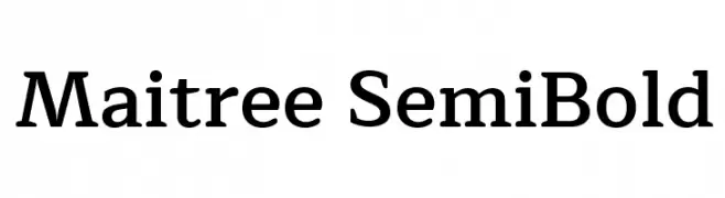
( Copyright (c) 2015, Cadson Demak (info@cadsondemak.com) )
A balanced serif font with a modern touch, offering elegance and readability.
![Maitree SemiBold Fuentes Gratis Descargar]() Descargar 446 Descargas@WebFont
Descargar 446 Descargas@WebFont -
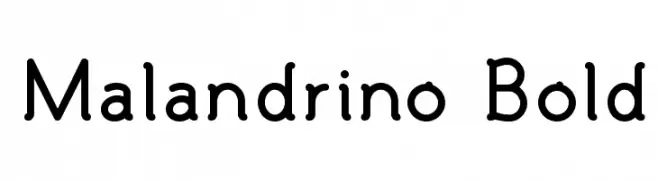
( Fonts by www.monofonts.com. Personal-use only. For commercial use please contact owner. )
A playful, rounded font with smooth curves and consistent stroke width.
![Malandrino Bold Fuentes Gratis Descargar]() Descargar 446 Descargas@WebFont
Descargar 446 Descargas@WebFont -
( Fonts by www.urbanhookupz.com )
A bold graffiti-style font with dynamic, energetic characters.
![MESTIZOS UNIDOS -URBAN HOOKUPZ Fuentes Gratis Descargar]() Descargar 446 Descargas@WebFont
Descargar 446 Descargas@WebFont -
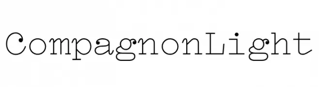
( Fonts by Velvetyne )
A light, monospaced font with subtle serifs and a modern, elegant style.
![Compagnon Light Fuentes Gratis Descargar]() Descargar 446 Descargas@WebFont
Descargar 446 Descargas@WebFont -
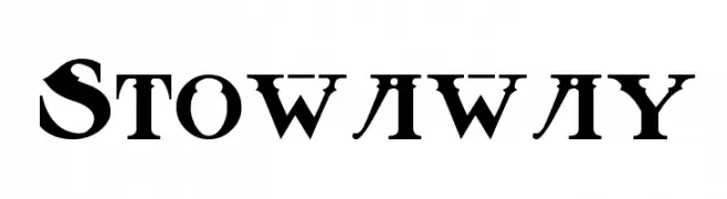
( Fonts by Rick Mueller )
A bold, vintage serif font with high contrast and dramatic serifs.
![Stowaway Fuentes Gratis Descargar]() Descargar 446 Descargas@WebFont
Descargar 446 Descargas@WebFont


¿Cuáles son las fuentes más populares ahora?
Poppins, Roboto, Montserrat, Open Sans y Lato son muy usadas por su forma limpia y su amplia aplicabilidad — desde identidad de marca hasta landing pages y carteles.
¿Qué fuentes se usan para logotipos?
Las sans serif geométricas (p. ej., Poppins, familias al estilo Gotham) se eligen a menudo para un branding limpio y escalable. Para un toque personal, scripts y estilos manuscritos siguen siendo clásicos. Combina un display contundente para titulares con un cuerpo neutral para reconocimiento y equilibrio.
¿Con qué frecuencia se actualiza la lista?
Se actualiza regularmente según descargas y actividad real. Vuelve a menudo para descubrir las próximas favoritas.
💡 Consejo: guarda esta página — las tendencias cambian rápido y las fuentes top de hoy podrían inspirar el rebranding de mañana.