Bienvenido a Fuentes Destacadas — donde se encuentran popularidad y calidad. Aquí están las fuentes más descargadas y utilizadas del año. Si buscas opciones seguras para logos, web o social, empieza aquí.
Cada fuente top destaca por su equilibrio, legibilidad y versatilidad. Encontrarás sans serif modernas, scripts elegantes, serifs vintage y displays minimalistas.
-
( Fonts by softerviews.org )
A bold, italic serif font with a classic and elegant style.
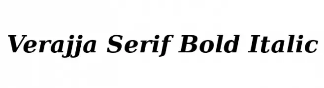 Descargar 481 Descargas@WebFont
 -
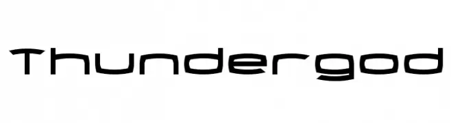
( Fonts by Daniel Zadorozny - www.iconian.com )
A futuristic, angular font with a dynamic and modern design.
![Thundergod Fuentes Gratis Descargar]() Descargar 481 Descargas@WebFont
Descargar 481 Descargas@WebFont -
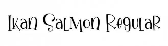
( Fonts by Gilar Studio )
A playful and whimsical font with irregular, quirky letterforms.
![Ikan Salmon Regular Fuentes Gratis Descargar]() Descargar 481 Descargas@WebFont
Descargar 481 Descargas@WebFont -
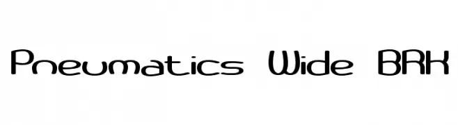
( Fonts by www.aenigmafonts.com )
A modern, wide, and rounded font with a futuristic appeal.
![Pneumatics Wide BRK Fuentes Gratis Descargar]() Descargar 481 Descargas@WebFont
Descargar 481 Descargas@WebFont -
( Fonts by a Max Infeld - XEROGRAPHER FONTS - xerographer.blogspot.com . Personal-use only. For commercial use please contact owner. )
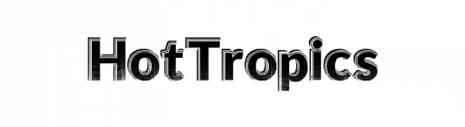
A bold, textured font with a halftone pattern, perfect for striking designs.
![HotTropics Fuentes Gratis Descargar]() Descargar 481 Descargas@WebFont
Descargar 481 Descargas@WebFont -
-
( Fonts by www.kimberlygeswein.com - Kimberly Geswein )
A playful, handwritten-style font with fluid, dynamic strokes.
![KG Over the Rainbow Fuentes Gratis Descargar]() Descargar 481 Descargas@WebFont
Descargar 481 Descargas@WebFont -
( Fonts by SDFonts - Ritzy )
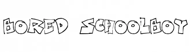
A playful, graffiti-inspired font with bold, irregular strokes and a hand-drawn look.
![Bored Schoolboy Fuentes Gratis Descargar]() Descargar 481 Descargas@WebFont
Descargar 481 Descargas@WebFont -
![Quel Fuentes Gratis Descargar]() Descargar 481 Descargas@WebFont
Descargar 481 Descargas@WebFont -
( Fonts by Manfred Klein. Free for private and charity use. Free for commercial with donation to organizations )
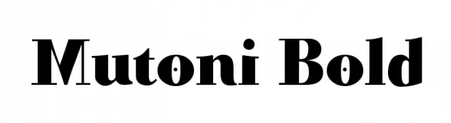
A bold, dynamic serif font with strong strokes and a modern twist.
![Mutoni Bold Fuentes Gratis Descargar]() Descargar 481 Descargas@WebFont
Descargar 481 Descargas@WebFont -
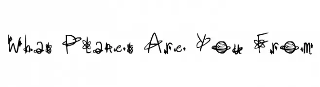
![What Planet Are You From Fuentes Gratis Descargar]() Descargar 481 Descargas@WebFont
Descargar 481 Descargas@WebFont


¿Cuáles son las fuentes más populares ahora?
Poppins, Roboto, Montserrat, Open Sans y Lato son muy usadas por su forma limpia y su amplia aplicabilidad — desde identidad de marca hasta landing pages y carteles.
¿Qué fuentes se usan para logotipos?
Las sans serif geométricas (p. ej., Poppins, familias al estilo Gotham) se eligen a menudo para un branding limpio y escalable. Para un toque personal, scripts y estilos manuscritos siguen siendo clásicos. Combina un display contundente para titulares con un cuerpo neutral para reconocimiento y equilibrio.
¿Con qué frecuencia se actualiza la lista?
Se actualiza regularmente según descargas y actividad real. Vuelve a menudo para descubrir las próximas favoritas.
💡 Consejo: guarda esta página — las tendencias cambian rápido y las fuentes top de hoy podrían inspirar el rebranding de mañana.