Bienvenido a Fuentes Destacadas — donde se encuentran popularidad y calidad. Aquí están las fuentes más descargadas y utilizadas del año. Si buscas opciones seguras para logos, web o social, empieza aquí.
Cada fuente top destaca por su equilibrio, legibilidad y versatilidad. Encontrarás sans serif modernas, scripts elegantes, serifs vintage y displays minimalistas.
-
( Fonts by Fie Clarke - bonezdesignz.com - check the website before use the fonts! Personal-use only. )
A bold, textured font with a vintage, handcrafted appearance.
 Descargar 734 Descargas@WebFont
 -
![Better Phoenix Sample Fuentes Gratis Descargar]() Descargar 734 Descargas@WebFont
Descargar 734 Descargas@WebFont -
( Fonts by deFharo )
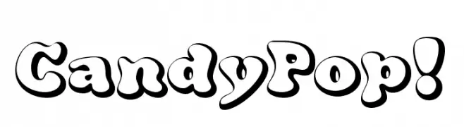
A playful, candy-inspired font with bold, rounded characters and a three-dimensional effect.
![CandyPop! Fuentes Gratis Descargar]() Descargar 734 Descargas@WebFont
Descargar 734 Descargas@WebFont -
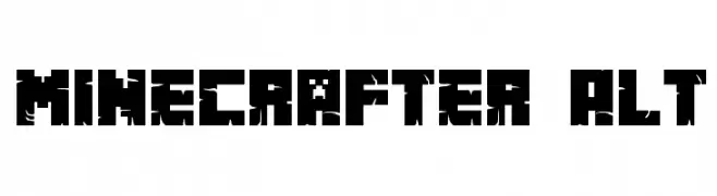
![Minecrafter Alt Fuentes Gratis Descargar]() Descargar 734 Descargas@WebFont
Descargar 734 Descargas@WebFont -
( Copyright 2016 The Chivo Project Authors (omnibus.type@gmail.com) )
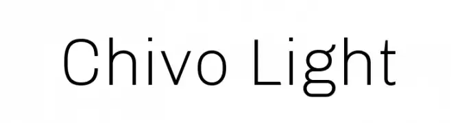
A clean, modern sans-serif font with a light weight and excellent readability.
![Chivo Light Fuentes Gratis Descargar]() Descargar 734 Descargas@WebFont
Descargar 734 Descargas@WebFont -
-
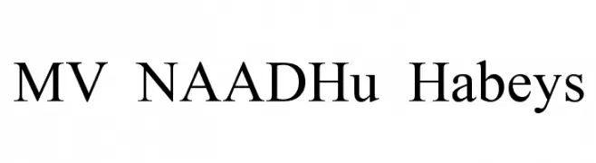
( Fonts by MuraKnockout Media + Design - muraknockout.com. Personal-use only. For commercial use please contact owner. )
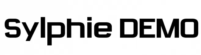
A bold, geometric font with a modern and impactful design.
![Sylphie DEMO Fuentes Gratis Descargar]() Descargar 734 Descargas@WebFont
Descargar 734 Descargas@WebFont -
![MV NAADHu Habeys Fuentes Gratis Descargar]() Descargar 734 Descargas@WebFont
Descargar 734 Descargas@WebFont -
( Fonts by Daniel Zadorozny - www.iconian.com - Free for personal use )
A modern, condensed italic font with a sleek and dynamic style.
![Concielian Condensed Italic Fuentes Gratis Descargar]() Descargar 734 Descargas@WebFont
Descargar 734 Descargas@WebFont -
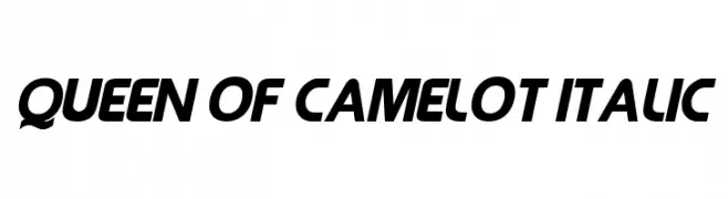
( Fonts by Sharkshock Productions----www.sharkshock.com. Personal-use only. For commercial use please contact owner. )
A bold, italicized font with medium contrast and a modern, dynamic style.
![Queen of Camelot Italic Fuentes Gratis Descargar]() Descargar 734 Descargas@WebFont
Descargar 734 Descargas@WebFont -
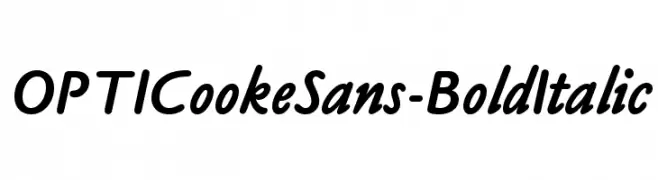
( Fonts by Castcraft Software - opti.netii.net - check the website before use )
A bold, italicized font with a smooth, flowing style.
![OPTICookeSans-BoldItalic Fuentes Gratis Descargar]() Descargar 734 Descargas@WebFont
Descargar 734 Descargas@WebFont


¿Cuáles son las fuentes más populares ahora?
Poppins, Roboto, Montserrat, Open Sans y Lato son muy usadas por su forma limpia y su amplia aplicabilidad — desde identidad de marca hasta landing pages y carteles.
¿Qué fuentes se usan para logotipos?
Las sans serif geométricas (p. ej., Poppins, familias al estilo Gotham) se eligen a menudo para un branding limpio y escalable. Para un toque personal, scripts y estilos manuscritos siguen siendo clásicos. Combina un display contundente para titulares con un cuerpo neutral para reconocimiento y equilibrio.
¿Con qué frecuencia se actualiza la lista?
Se actualiza regularmente según descargas y actividad real. Vuelve a menudo para descubrir las próximas favoritas.
💡 Consejo: guarda esta página — las tendencias cambian rápido y las fuentes top de hoy podrían inspirar el rebranding de mañana.