Bienvenido a Fuentes Destacadas — donde se encuentran popularidad y calidad. Aquí están las fuentes más descargadas y utilizadas del año. Si buscas opciones seguras para logos, web o social, empieza aquí.
Cada fuente top destaca por su equilibrio, legibilidad y versatilidad. Encontrarás sans serif modernas, scripts elegantes, serifs vintage y displays minimalistas.
-
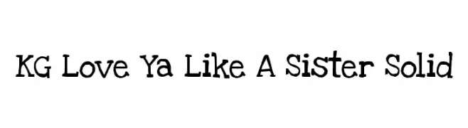
( Fonts by www.kimberlygeswein.com - Kimberly Geswein )
A playful, hand-drawn font with a whimsical and friendly style.
 Descargar 834 Descargas@WebFont
 -
( Fonts by Castcraft Software - opti.netii.net - check the website before use )
A tall, narrow font with a modern, elegant design and minimal contrast.
![OPTIHuxley-Vertical Fuentes Gratis Descargar]() Descargar 834 Descargas@WebFont
Descargar 834 Descargas@WebFont -
( Fonts by Castcraft Software - opti.netii.net - check the website before use )
A bold, condensed font with high contrast and a striking appearance.
![OPTILeLatin-NoirEtroit Fuentes Gratis Descargar]() Descargar 834 Descargas@WebFont
Descargar 834 Descargas@WebFont -
( www.hypefonts.com )
A distressed serif font with a vintage, weathered look.
![Dust Overhaul Fuentes Gratis Descargar]() Descargar 834 Descargas@WebFont
Descargar 834 Descargas@WebFont -
( Fonts by Vanessa Bays - bythebutterfly.com )
A playful, rounded font with smooth curves and a friendly appearance.
![Sweetness Fuentes Gratis Descargar]() Descargar 834 Descargas@WebFont
Descargar 834 Descargas@WebFont -
-
( Copyright (c) 2012 by Brian J. Bonislawsky DBA Astigmatic (AOETI) (astigma@astigmatic.com), with Reserved Font Names "Stint Ultra Expanded" )
A bold, wide font with a modern and impactful design.
![StintUltraExpanded-Regular Fuentes Gratis Descargar]() Descargar 834 Descargas@WebFont
Descargar 834 Descargas@WebFont -
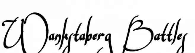
( Fonts by Mans Greback - www.mawns.com )
An artistic, cursive font with flowing, decorative elements.
![Wankstaberg Battles Fuentes Gratis Descargar]() Descargar 834 Descargas@WebFont
Descargar 834 Descargas@WebFont -
( Copyright (c) 2011 TypeSETit, LLC (typesetit@att.net) )
A graceful and flowing script font with elegant curves and smooth lines.
![Bilbo Regular Fuentes Gratis Descargar]() Descargar 834 Descargas@WebFont
Descargar 834 Descargas@WebFont -
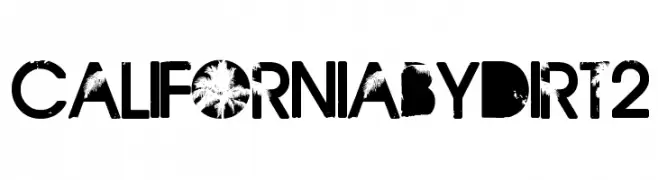
( Fonts by Andrew Hart - dirt2.com )
A bold, distressed font with a grunge aesthetic and high contrast.
![CaliforniabyDirt2 Fuentes Gratis Descargar]() Descargar 834 Descargas@WebFont
Descargar 834 Descargas@WebFont -
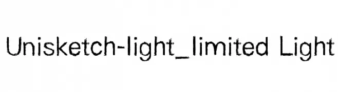
![Unisketch-light_limited Light Fuentes Gratis Descargar]() Descargar 834 Descargas@WebFont
Descargar 834 Descargas@WebFont


¿Cuáles son las fuentes más populares ahora?
Poppins, Roboto, Montserrat, Open Sans y Lato son muy usadas por su forma limpia y su amplia aplicabilidad — desde identidad de marca hasta landing pages y carteles.
¿Qué fuentes se usan para logotipos?
Las sans serif geométricas (p. ej., Poppins, familias al estilo Gotham) se eligen a menudo para un branding limpio y escalable. Para un toque personal, scripts y estilos manuscritos siguen siendo clásicos. Combina un display contundente para titulares con un cuerpo neutral para reconocimiento y equilibrio.
¿Con qué frecuencia se actualiza la lista?
Se actualiza regularmente según descargas y actividad real. Vuelve a menudo para descubrir las próximas favoritas.
💡 Consejo: guarda esta página — las tendencias cambian rápido y las fuentes top de hoy podrían inspirar el rebranding de mañana.