Bienvenido a Fuentes Destacadas — donde se encuentran popularidad y calidad. Aquí están las fuentes más descargadas y utilizadas del año. Si buscas opciones seguras para logos, web o social, empieza aquí.
Cada fuente top destaca por su equilibrio, legibilidad y versatilidad. Encontrarás sans serif modernas, scripts elegantes, serifs vintage y displays minimalistas.
-
( Fonts by Dieter Steffmann )
A bold, decorative font with a shadow effect and pronounced serifs.
 Descargar 3083 Descargas@WebFont
 -
![Amphibia Fuentes Gratis Descargar]() Descargar 3082 Descargas@WebFont
Descargar 3082 Descargas@WebFont -
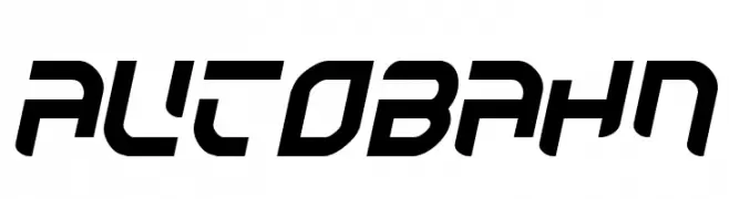
( Fonts by Jacob Fisher - www.pizzadude.dk )
A bold, futuristic font with angular, geometric shapes and a dynamic slant.
![Autobahn Fuentes Gratis Descargar]() Descargar 3082 Descargas@WebFont
Descargar 3082 Descargas@WebFont -
( Fonts by Philipp H. Poll - Personal-use only. For commercial use please contact owner. )
A bold, classic serif typeface with strong, elegant strokes.
![Libertinus Serif Bold Fuentes Gratis Descargar]() Descargar 3081 Descargas@WebFont
Descargar 3081 Descargas@WebFont -
( Måns Grebäck - www.mansgreback.com )
A flowing, cursive script font with elegant, connected strokes.
![Fondy Script PERSONAL USE ONLY Fuentes Gratis Descargar]() Descargar 3081 Descargas@WebFont
Descargar 3081 Descargas@WebFont -
( Fonts by or from www.graffitifonts.net )
A bold, graffiti-inspired font with angular, dynamic lines and a rebellious spirit.
![Zit Graffiti Fuentes Gratis Descargar]() Descargar 3081 Descargas@WebFont
Descargar 3081 Descargas@WebFont -
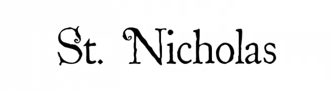
( Fonts by The Scriptorium - Dave Nalle )
A whimsical and decorative serif font with playful curls and flourishes.
![St. Nicholas Fuentes Gratis Descargar]() Descargar 3080 Descargas@WebFont
Descargar 3080 Descargas@WebFont -
![HellasFun Bold Fuentes Gratis Descargar]() Descargar 3079 Descargas
Descargar 3079 Descargas -
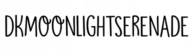
( Fonts by Hanoded )
A playful, hand-drawn font with tall, narrow characters and whimsical symbols.
![DKMoonlightSerenade Fuentes Gratis Descargar]() Descargar 3076 Descargas@WebFont
Descargar 3076 Descargas@WebFont -
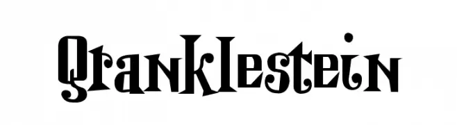
![Qranklestein Fuentes Gratis Descargar]() Descargar 3076 Descargas@WebFont
Descargar 3076 Descargas@WebFont -
![Duke Fuentes Gratis Descargar]() Descargar 3076 Descargas@WebFont
Descargar 3076 Descargas@WebFont -
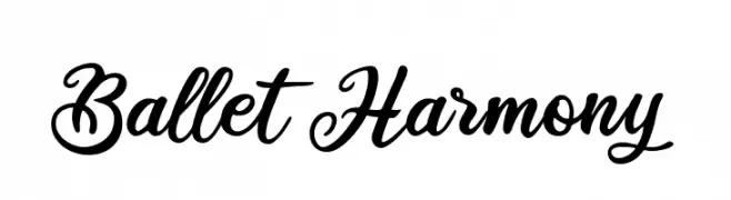
![Ballet Harmony Fuentes Gratis Descargar]() Descargar 3075 Descargas@WebFont
Descargar 3075 Descargas@WebFont -
![Mulan Fuentes Gratis Descargar]() Descargar 3075 Descargas@WebFont
Descargar 3075 Descargas@WebFont -
( Fonts by Tom Kolter - www.ghostsofbigfoot.com )
A bold, decorative font with a vintage Western style and three-dimensional effect.
![1873 Winchester Fuentes Gratis Descargar]() Descargar 3074 Descargas@WebFont
Descargar 3074 Descargas@WebFont -
![Casino Queen Normal Fuentes Gratis Descargar]() Descargar 3074 Descargas@WebFont
Descargar 3074 Descargas@WebFont -
![bubbleboddy Fuentes Gratis Descargar]() Descargar 3074 Descargas@WebFont
Descargar 3074 Descargas@WebFont -
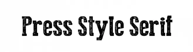
( Fonts by Galdino Otten - galdinootten.com )
A bold, distressed serif font with a vintage, textured appearance.
![Press Style Serif Fuentes Gratis Descargar]() Descargar 3073 Descargas@WebFont
Descargar 3073 Descargas@WebFont -
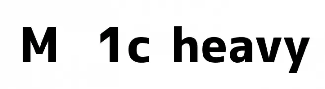
![M+ 1c heavy Fuentes Gratis Descargar]() Descargar 3072 Descargas@WebFont
Descargar 3072 Descargas@WebFont -
( Copyright (c) 2015, Christian Thalmann and the Cormorant Project Authors (github.com/CatharsisFonts/Cormorant) )
An elegant serif font with high contrast and refined letterforms.
![Cormorant Light Fuentes Gratis Descargar]() Descargar 3071 Descargas@WebFont
Descargar 3071 Descargas@WebFont -
![ReliantLimitedFreeVersion Fuentes Gratis Descargar]() Descargar 3071 Descargas@WebFont
Descargar 3071 Descargas@WebFont -
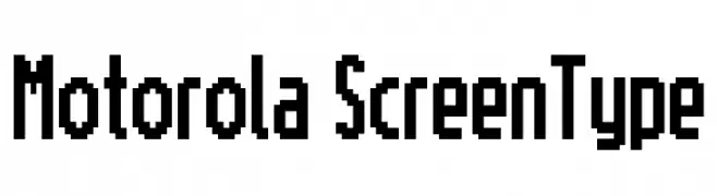
![Motorola ScreenType Fuentes Gratis Descargar]() Descargar 3071 Descargas@WebFont
Descargar 3071 Descargas@WebFont -
( Fonts by Ospiro Enterprises - Personal-use only. For commercial use please contact owner. )
A modern, bold sans-serif font with geometric precision and excellent readability.
![Gontserrat SemiBold Fuentes Gratis Descargar]() Descargar 3070 Descargas@WebFont
Descargar 3070 Descargas@WebFont -
![Airport Fuentes Gratis Descargar]() Descargar 3070 Descargas@WebFont
Descargar 3070 Descargas@WebFont -
![Nouveau IBM Fuentes Gratis Descargar]() Descargar 3070 Descargas@WebFont
Descargar 3070 Descargas@WebFont -
![Masonic Cipher & Symbols Fuentes Gratis Descargar]() Descargar 3069 Descargas@WebFont
Descargar 3069 Descargas@WebFont -
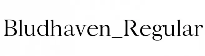
( Marco Ballarè - www.marcoballare.com )
A classic serif font with elegant curves and refined style.
![Bludhaven_Regular Fuentes Gratis Descargar]() Descargar 3067 Descargas@WebFont
Descargar 3067 Descargas@WebFont -
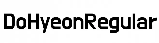
( Copyright 2018 The Do Hyeon Project Authors )
A modern, geometric sans-serif font with uniform strokes and clear readability.
![Do Hyeon Regular Fuentes Gratis Descargar]() Descargar 3067 Descargas@WebFont
Descargar 3067 Descargas@WebFont -
Fuentes por NicholasJudy456. For commercial use please contact the owner.
( Here's More of the House Fonts )
A bold, slanted font with a modern, dynamic style.
![Powerhouse Fuentes Gratis Descargar]() Descargar 3066 Descargas@WebFont
Descargar 3066 Descargas@WebFont -
![Unthrift Second Personal Fuentes Gratis Descargar]() Descargar 3065 Descargas@WebFont
Descargar 3065 Descargas@WebFont -
( Copyright (c) 2011, vernon adams (vern@newtypography.co.uk), with Reserved Font Names "Bowlby" )
A bold, heavy font with a strong, geometric style ideal for impactful headlines.
![Bowlby One SC Fuentes Gratis Descargar]() Descargar 3065 Descargas@WebFont
Descargar 3065 Descargas@WebFont -
( Fonts by Ryoichi Tsunekawa - www.dharmatype.com )
A bold, rugged font with a handcrafted, woodblock print style.
![WoodStamp Fuentes Gratis Descargar]() Descargar 3065 Descargas@WebFont
Descargar 3065 Descargas@WebFont -
( Fonts by tiagopompeu.carbonmade.com - Tiago Pompeu )
A modern, rounded sans-serif font with smooth curves and a clean, approachable design.
![abipti Fuentes Gratis Descargar]() Descargar 3065 Descargas@WebFont
Descargar 3065 Descargas@WebFont -
![Hattori Hanzo Light Fuentes Gratis Descargar]() Descargar 3065 Descargas@WebFont
Descargar 3065 Descargas@WebFont -
![Bigfish Fuentes Gratis Descargar]() Descargar 3065 Descargas@WebFont
Descargar 3065 Descargas@WebFont -
![GENERAL Fuentes Gratis Descargar]() Descargar 3065 Descargas@WebFont
Descargar 3065 Descargas@WebFont


¿Cuáles son las fuentes más populares ahora?
Poppins, Roboto, Montserrat, Open Sans y Lato son muy usadas por su forma limpia y su amplia aplicabilidad — desde identidad de marca hasta landing pages y carteles.
¿Qué fuentes se usan para logotipos?
Las sans serif geométricas (p. ej., Poppins, familias al estilo Gotham) se eligen a menudo para un branding limpio y escalable. Para un toque personal, scripts y estilos manuscritos siguen siendo clásicos. Combina un display contundente para titulares con un cuerpo neutral para reconocimiento y equilibrio.
¿Con qué frecuencia se actualiza la lista?
Se actualiza regularmente según descargas y actividad real. Vuelve a menudo para descubrir las próximas favoritas.
💡 Consejo: guarda esta página — las tendencias cambian rápido y las fuentes top de hoy podrían inspirar el rebranding de mañana.