Bienvenido a Fuentes Destacadas — donde se encuentran popularidad y calidad. Aquí están las fuentes más descargadas y utilizadas del año. Si buscas opciones seguras para logos, web o social, empieza aquí.
Cada fuente top destaca por su equilibrio, legibilidad y versatilidad. Encontrarás sans serif modernas, scripts elegantes, serifs vintage y displays minimalistas.
-
 Descargar 211 Descargas@WebFont
 -
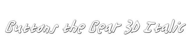
( Fonts by Daniel Zadorozny - www.iconian.com - Free for personal use )
A playful, 3D italic font with a hand-drawn style and bold outlines.
![Buttons the Bear 3D Italic Fuentes Gratis Descargar]() Descargar 211 Descargas@WebFont
Descargar 211 Descargas@WebFont -
( weknow - Wino S Kadir - www.creativefabrica.com/designer/weknow/ )
A bold, geometric font with a strong, adventurous style.
![GREAT ADVENTURE Bold Fuentes Gratis Descargar]() Descargar 211 Descargas@WebFont
Descargar 211 Descargas@WebFont -
Fuentes por defharo. For commercial use please contact the owner.
![f3Secuenciaroundffp-Italic Fuentes Gratis Descargar]() Descargar 211 Descargas@WebFont
Descargar 211 Descargas@WebFont -
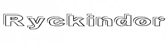
( Fonts by Graham Meade - GemFonts )
A bold, outlined font with a modern and geometric style.
![Ryckindor Fuentes Gratis Descargar]() Descargar 211 Descargas@WebFont
Descargar 211 Descargas@WebFont -
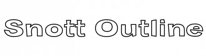
( Fonts by Graham Meade - GemFonts )
A bold, outlined font with a modern and geometric style.
![Snott Outline Fuentes Gratis Descargar]() Descargar 211 Descargas@WebFont
Descargar 211 Descargas@WebFont -
![GalaxyfaceHirReg Fuentes Gratis Descargar]() Descargar 211 Descargas@WebFont
Descargar 211 Descargas@WebFont -
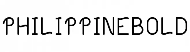
( Valentin François - www.valentinfrancois.fr )
A playful, modern font with rounded edges and a hand-drawn feel.
![Philippine Bold Fuentes Gratis Descargar]() Descargar 211 Descargas@WebFont
Descargar 211 Descargas@WebFont -
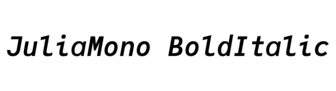
( Fonts by cormullion )
A bold, italicized monospaced font with a modern and professional style.
![JuliaMono BoldItalic Fuentes Gratis Descargar]() Descargar 211 Descargas@WebFont
Descargar 211 Descargas@WebFont -
( Iconian Fonts - Daniel Zadorozny - www.iconian.com )
A bold, italic font with a dynamic, modern style and high contrast strokes.
![U.S.A. Super-Italic Fuentes Gratis Descargar]() Descargar 211 Descargas@WebFont
Descargar 211 Descargas@WebFont -
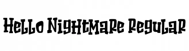
( Fonts by Bangkit Tri Setiadi )
A bold, playful font with a hand-drawn, quirky style.
![Hello Nightmare Regular Fuentes Gratis Descargar]() Descargar 211 Descargas@WebFont
Descargar 211 Descargas@WebFont -
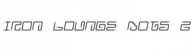
( Fonts by Jacob Fisher - www.pizzadude.dk )
A futuristic, dotted font with a digital, segmented design.
![Iron Lounge Dots 2 Fuentes Gratis Descargar]() Descargar 211 Descargas@WebFont
Descargar 211 Descargas@WebFont -
( Fonts by Alde Saputro - aldedesign - https://www.creativefabrica.com/product/the-crafty-holiday-font-bundle/ref/125925/ - Personal-use only. For commercial use please contact owner. )
A playful and elegant handwritten script font with flowing, connected letters.
![Marrisa Fuentes Gratis Descargar]() Descargar 211 Descargas@WebFont
Descargar 211 Descargas@WebFont -
( Fonts by Jacob Fisher - www.pizzadude.dk )
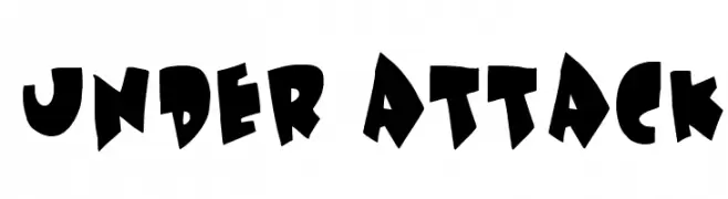
A bold, playful font with exaggerated, irregular shapes and dynamic energy.
![Under attack Fuentes Gratis Descargar]() Descargar 211 Descargas@WebFont
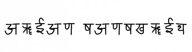
Descargar 211 Descargas@WebFont -
![ARIAN SANSKRIT Fuentes Gratis Descargar]() Descargar 211 Descargas@WebFont
Descargar 211 Descargas@WebFont -
( Fonts by dcoxy )
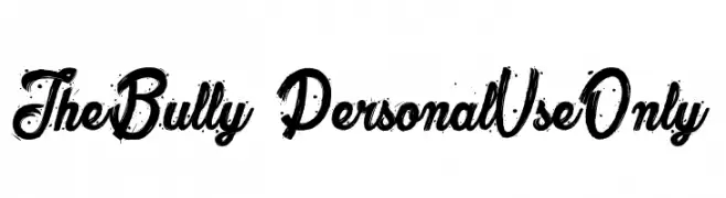
A bold, distressed script font with dynamic curves and a rugged texture.
![The Bully_PersonalUseOnly Fuentes Gratis Descargar]() Descargar 211 Descargas@WebFont
Descargar 211 Descargas@WebFont -
( Iconian Fonts - Daniel Zadorozny - www.iconian.com )
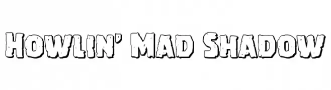
A bold, playful font with a rugged, shadowed outline and a hand-drawn feel.
![Howlin' Mad Shadow Fuentes Gratis Descargar]() Descargar 211 Descargas@WebFont
Descargar 211 Descargas@WebFont -
( Fonts by Typographer Mediengestaltung - Personal-use only. For commercial use please contact owner. )
An ornate blackletter font with intricate, decorative letterforms.
![DS Luthersche Titel Fuentes Gratis Descargar]() Descargar 211 Descargas@WebFont
Descargar 211 Descargas@WebFont -
( Fonts by Chris Vile - fontmonger.com - Personal-use only. For commercial use please contact owner. )
A bold, futuristic font with a distressed, stencil-like appearance.
![OuterspaceMilitia Fuentes Gratis Descargar]() Descargar 211 Descargas@WebFont
Descargar 211 Descargas@WebFont -
( گالری فانت فارسی پژوهش آريانا - only compatible with Farsi and Arabic )
A modern, geometric font with clean lines and high contrast.
![Canada Fuentes Gratis Descargar]() Descargar 211 Descargas@WebFont
Descargar 211 Descargas@WebFont -
Fuentes por antipixel. For commercial use please contact the owner.
![ItaloRegularItalic Fuentes Gratis Descargar]() Descargar 211 Descargas@WebFont
Descargar 211 Descargas@WebFont -
( Fonts by Chris Vile - fontmonger.com - Personal-use only. For commercial use please contact owner. )
A handwritten, casual font with tall, narrow letters and a dynamic, organic feel.
![OakLawn-Regular Fuentes Gratis Descargar]() Descargar 211 Descargas@WebFont
Descargar 211 Descargas@WebFont -
( Fonts by Johan Chalibert )
A decorative, Art Deco-inspired font with elongated, narrow letterforms and geometric elegance.
![HOTEL DES ARTS 1929 Fuentes Gratis Descargar]() Descargar 211 Descargas@WebFont
Descargar 211 Descargas@WebFont -
( Fonts by Vladimir Nikolic - https://www.creativefabrica.com/product/educated-deers/ref/144265/ - Personal-use only. For commercial use please contact owner. )
A bold, geometric font with a strong, industrial aesthetic.
![Territory Regular Fuentes Gratis Descargar]() Descargar 211 Descargas@WebFont
Descargar 211 Descargas@WebFont -
( Fonts by Khaiuns - Personal-use only. For commercial use please contact owner. )
An elegant, flowing script font with interconnected letterforms and artistic flair.
![Loffers Fuentes Gratis Descargar]() Descargar 211 Descargas@WebFont
Descargar 211 Descargas@WebFont -
( Fonts by Mocha Frappuccino - Personal-use only. For commercial use please contact owner. )
Bold, decorative font with strong outlines.
![Trequartista Fuentes Gratis Descargar]() Descargar 211 Descargas@WebFont
Descargar 211 Descargas@WebFont -
( Fonts by Daniel Zadorozny - www.iconian.com - Free for personal use )
A playful, rounded font with a hand-drawn, whimsical style.
![Magic Beans Fuentes Gratis Descargar]() Descargar 211 Descargas@WebFont
Descargar 211 Descargas@WebFont -
( www.junkohanhero.com )
A bold, playful font with thick outlines and a three-dimensional effect.
![Firebug Fuentes Gratis Descargar]() Descargar 211 Descargas@WebFont
Descargar 211 Descargas@WebFont -
( Ferdiansyah - creativemarket.com/ijemrockart )
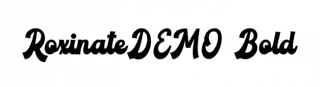
A bold, dynamic script font with sweeping curves and high contrast, ideal for vintage or retro designs.
![RoxinateDEMO-Bold Fuentes Gratis Descargar]() Descargar 211 Descargas@WebFont
Descargar 211 Descargas@WebFont -
( Fonts by Galdino Otten )
A playful, hand-drawn font with a whimsical and sketchy style.
![Little Kid Fuentes Gratis Descargar]() Descargar 211 Descargas@WebFont
Descargar 211 Descargas@WebFont -
( Fonts by Steve Cloutier - www.cloutierfontes.ca )
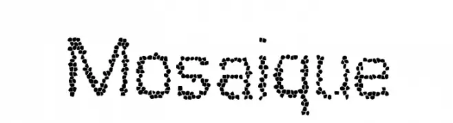
A mosaic-patterned font with characters formed by small dots, offering a textured and artistic look.
![Mosaique Fuentes Gratis Descargar]() Descargar 211 Descargas@WebFont
Descargar 211 Descargas@WebFont -
( Kinema Moon Graphics - www.kinemamoon.com/ )
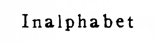
A vintage serif font with a distressed, hand-printed appearance.
![Inalphabet Fuentes Gratis Descargar]() Descargar 211 Descargas@WebFont
Descargar 211 Descargas@WebFont -
( Fonts by Vladimir Nikolic - www.creativefabrica.com/designer/vladimirnikolic/ - Personal-use only. For commercial use please contact owner. )
A bold, geometric font with a modern, industrial style.
![Archigadget Regular Fuentes Gratis Descargar]() Descargar 211 Descargas@WebFont
Descargar 211 Descargas@WebFont -
( ingoFonts - Ingo Zimmermann - www.ingofonts.com )
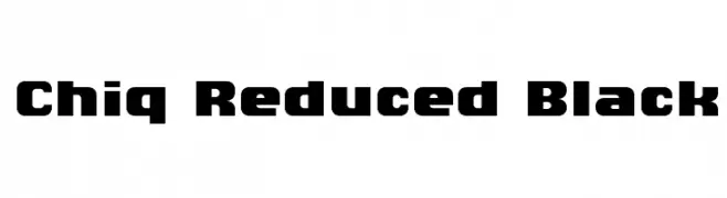
A bold, geometric font with rounded edges and minimal contrast.
![Chiq Reduced Black Fuentes Gratis Descargar]() Descargar 211 Descargas@WebFont
Descargar 211 Descargas@WebFont -
![JanmejaSort1 Fuentes Gratis Descargar]() Descargar 211 Descargas@WebFont
Descargar 211 Descargas@WebFont


¿Cuáles son las fuentes más populares ahora?
Poppins, Roboto, Montserrat, Open Sans y Lato son muy usadas por su forma limpia y su amplia aplicabilidad — desde identidad de marca hasta landing pages y carteles.
¿Qué fuentes se usan para logotipos?
Las sans serif geométricas (p. ej., Poppins, familias al estilo Gotham) se eligen a menudo para un branding limpio y escalable. Para un toque personal, scripts y estilos manuscritos siguen siendo clásicos. Combina un display contundente para titulares con un cuerpo neutral para reconocimiento y equilibrio.
¿Con qué frecuencia se actualiza la lista?
Se actualiza regularmente según descargas y actividad real. Vuelve a menudo para descubrir las próximas favoritas.
💡 Consejo: guarda esta página — las tendencias cambian rápido y las fuentes top de hoy podrían inspirar el rebranding de mañana.