Bienvenido a Fuentes Destacadas — donde se encuentran popularidad y calidad. Aquí están las fuentes más descargadas y utilizadas del año. Si buscas opciones seguras para logos, web o social, empieza aquí.
Cada fuente top destaca por su equilibrio, legibilidad y versatilidad. Encontrarás sans serif modernas, scripts elegantes, serifs vintage y displays minimalistas.
-
( Paul Lloyd Fonts )
A bold blackletter font with intricate, angular letterforms and a classic gothic style.
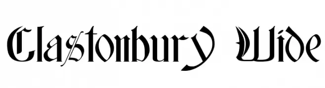 Descargar 1055 Descargas
 -
( Fonts by Niskala Huruf )
A playful, handwritten-style font with bold, irregular characters.
![Classy Flowers Regular Fuentes Gratis Descargar]() Descargar 1054 Descargas@WebFont
Descargar 1054 Descargas@WebFont -
( Fonts by Zetafonts - Personal-use only. For commercial use please contact owner. )
A textured, handwritten font with an italic slant and dynamic stroke variation.
![Berton Voyage Regular Fuentes Gratis Descargar]() Descargar 1054 Descargas@WebFont
Descargar 1054 Descargas@WebFont -
( Fonts by Dan P. Lyons - Personal-use only. For commercial use please contact owner. )
A playful, hand-drawn font with rounded edges and a friendly appearance.
![Memories Fuentes Gratis Descargar]() Descargar 1054 Descargas@WebFont
Descargar 1054 Descargas@WebFont -
![NCAA Baylor Bear Claw Fuentes Gratis Descargar]() Descargar 1054 Descargas@WebFont
Descargar 1054 Descargas@WebFont -
-
( Fonts by Vanessa Bays - bythebutterfly.com )
A modern, rounded sans-serif font with clean lines and balanced spacing.
![Alexis Marie Fuentes Gratis Descargar]() Descargar 1054 Descargas@WebFont
Descargar 1054 Descargas@WebFont -
![South African Personal Use Fuentes Gratis Descargar]() Descargar 1054 Descargas@WebFont
Descargar 1054 Descargas@WebFont -
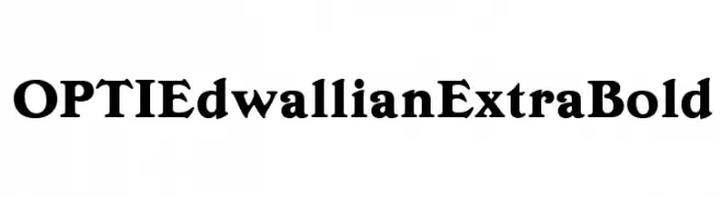
( Fonts by Castcraft Software - opti.netii.net - check the website before use )
A bold, serif typeface with strong, authoritative strokes and pronounced serifs.
![OPTIEdwallianExtraBold Fuentes Gratis Descargar]() Descargar 1054 Descargas@WebFont
Descargar 1054 Descargas@WebFont -
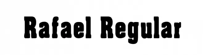
( www.cloutierfontes.ca/ )
A bold, robust font with thick strokes and a strong presence.
![Rafael Regular Fuentes Gratis Descargar]() Descargar 1054 Descargas@WebFont
Descargar 1054 Descargas@WebFont -
( Fonts by Rodrigo German - RASDESIGN )
A mixed-style, decorative font with bold, hand-drawn, and illustrated elements.
![l de A Fuentes Gratis Descargar]() Descargar 1054 Descargas@WebFont
Descargar 1054 Descargas@WebFont


¿Cuáles son las fuentes más populares ahora?
Poppins, Roboto, Montserrat, Open Sans y Lato son muy usadas por su forma limpia y su amplia aplicabilidad — desde identidad de marca hasta landing pages y carteles.
¿Qué fuentes se usan para logotipos?
Las sans serif geométricas (p. ej., Poppins, familias al estilo Gotham) se eligen a menudo para un branding limpio y escalable. Para un toque personal, scripts y estilos manuscritos siguen siendo clásicos. Combina un display contundente para titulares con un cuerpo neutral para reconocimiento y equilibrio.
¿Con qué frecuencia se actualiza la lista?
Se actualiza regularmente según descargas y actividad real. Vuelve a menudo para descubrir las próximas favoritas.
💡 Consejo: guarda esta página — las tendencias cambian rápido y las fuentes top de hoy podrían inspirar el rebranding de mañana.