Bienvenido a Fuentes Destacadas — donde se encuentran popularidad y calidad. Aquí están las fuentes más descargadas y utilizadas del año. Si buscas opciones seguras para logos, web o social, empieza aquí.
Cada fuente top destaca por su equilibrio, legibilidad y versatilidad. Encontrarás sans serif modernas, scripts elegantes, serifs vintage y displays minimalistas.
-
( Fonts by The Font Emporium )
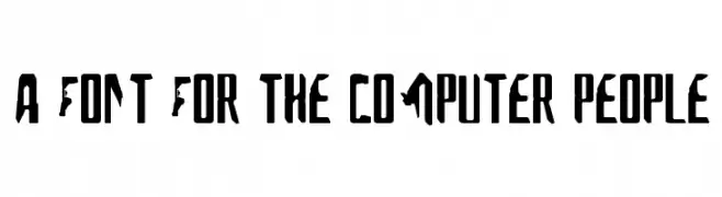
A bold, angular font with a modern, tech-inspired aesthetic.
 Descargar 1179 Descargas@WebFont
 -
( Fonts by www.freakyfonts.de )
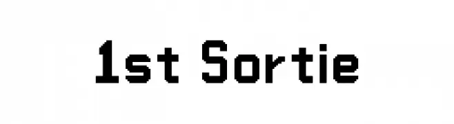
A bold, pixelated font with a retro digital aesthetic.
![1st Sortie Fuentes Gratis Descargar]() Descargar 1179 Descargas
Descargar 1179 Descargas -
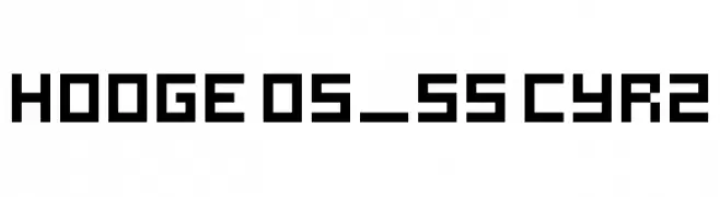
![hooge 05_55 Cyr2 Fuentes Gratis Descargar]() Descargar 1179 Descargas@WebFont
Descargar 1179 Descargas@WebFont -
( Fonts by Jester Font Studio )
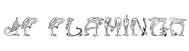
A decorative font with letters formed by stylized flamingo illustrations.
![JF Flamingo Fuentes Gratis Descargar]() Descargar 1179 Descargas@WebFont
Descargar 1179 Descargas@WebFont -
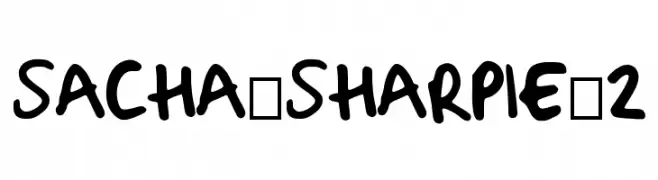
( Fonts by Sacha Hills. Free ONLY FOR personal use. For commercial use please contact sachahills[a-t]live.com . )
A bold, playful handwritten font with rounded, consistent strokes.
![Sacha_Sharpie_2 Fuentes Gratis Descargar]() Descargar 1178 Descargas@WebFont
Descargar 1178 Descargas@WebFont -
-
( Fonts by Ding Bang )
Bold geometric sans-serif with clean, modern lines.
![Brasileirão Fuentes Gratis Descargar]() Descargar 1178 Descargas@WebFont
Descargar 1178 Descargas@WebFont -
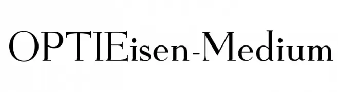
( Fonts by Castcraft Software - opti.netii.net - check the website before use )
A classic serif font with elegant strokes and balanced proportions.
![OPTIEisen-Medium Fuentes Gratis Descargar]() Descargar 1178 Descargas@WebFont
Descargar 1178 Descargas@WebFont -
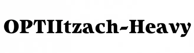
( Fonts by Castcraft Software - opti.netii.net - check the website before use )
A bold, heavy serif font with a strong, authoritative presence.
![OPTIItzach-Heavy Fuentes Gratis Descargar]() Descargar 1178 Descargas@WebFont
Descargar 1178 Descargas@WebFont -
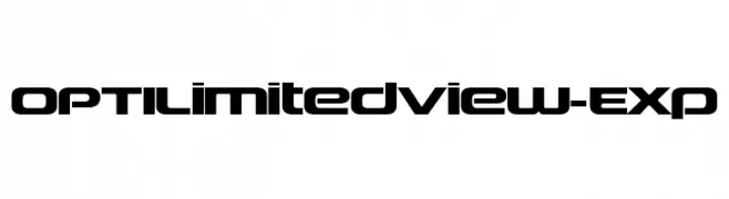
( Fonts by Castcraft Software - opti.netii.net - check the website before use )
A bold, futuristic font with geometric shapes and rounded edges.
![OPTILimitedView-Exp Fuentes Gratis Descargar]() Descargar 1178 Descargas@WebFont
Descargar 1178 Descargas@WebFont -
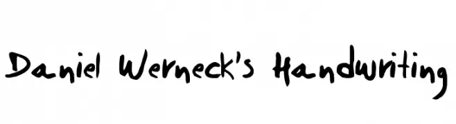
( Fonts by Daniel Werneck )
A bold, expressive handwritten font with a casual, personal style.
![Daniel Werneck's Handwriting Fuentes Gratis Descargar]() Descargar 1178 Descargas@WebFont
Descargar 1178 Descargas@WebFont

¿Cuáles son las fuentes más populares ahora?
Poppins, Roboto, Montserrat, Open Sans y Lato son muy usadas por su forma limpia y su amplia aplicabilidad — desde identidad de marca hasta landing pages y carteles.
¿Qué fuentes se usan para logotipos?
Las sans serif geométricas (p. ej., Poppins, familias al estilo Gotham) se eligen a menudo para un branding limpio y escalable. Para un toque personal, scripts y estilos manuscritos siguen siendo clásicos. Combina un display contundente para titulares con un cuerpo neutral para reconocimiento y equilibrio.
¿Con qué frecuencia se actualiza la lista?
Se actualiza regularmente según descargas y actividad real. Vuelve a menudo para descubrir las próximas favoritas.
💡 Consejo: guarda esta página — las tendencias cambian rápido y las fuentes top de hoy podrían inspirar el rebranding de mañana.