Bienvenido a Fuentes Destacadas — donde se encuentran popularidad y calidad. Aquí están las fuentes más descargadas y utilizadas del año. Si buscas opciones seguras para logos, web o social, empieza aquí.
Cada fuente top destaca por su equilibrio, legibilidad y versatilidad. Encontrarás sans serif modernas, scripts elegantes, serifs vintage y displays minimalistas.
-
( Fonts by Dan P. Lyons - Personal-use only. For commercial use please contact owner. )
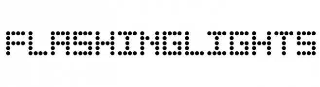
A dot matrix font with a modern, digital display style.
 Descargar 266 Descargas@WebFont
 -
( ingoFonts - Ingo Zimmermann - www.ingofonts.com )
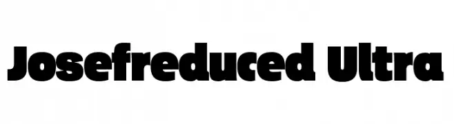
A bold, heavy font with wide character spacing and a modern aesthetic.
![Josefreduced-Ultra Fuentes Gratis Descargar]() Descargar 266 Descargas@WebFont
Descargar 266 Descargas@WebFont -
( Font by Jonathan Harris - www.tattoowoo.com )
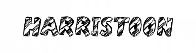
A bold, sketch-like font with a playful and dynamic style.
![Harristoon Fuentes Gratis Descargar]() Descargar 266 Descargas@WebFont
Descargar 266 Descargas@WebFont -
( Fonts by Pablo Impallari, Andres Torresi, & Cristiano Sobral - Personal-use only. For commercial use please contact owner. )
A modern, semi-bold sans-serif font with clean lines and excellent readability.
![Plata Sans SemiBold Fuentes Gratis Descargar]() Descargar 266 Descargas@WebFont
Descargar 266 Descargas@WebFont -
![KBCaterpillar Fuentes Gratis Descargar]() Descargar 266 Descargas@WebFont
Descargar 266 Descargas@WebFont -
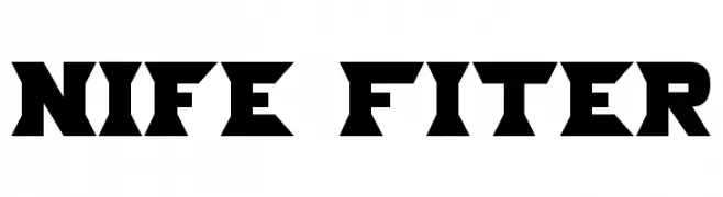
![Nife Fiter Fuentes Gratis Descargar]() Descargar 266 Descargas
Descargar 266 Descargas -
( www.tattoowoo.com )
A whimsical, hand-drawn style font with playful, elongated letterforms and artistic flair.
![Squicky Fuentes Gratis Descargar]() Descargar 266 Descargas@WebFont
Descargar 266 Descargas@WebFont -
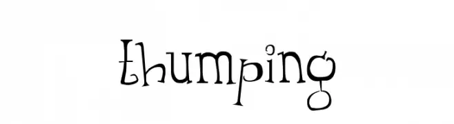
![Thumping Fuentes Gratis Descargar]() Descargar 266 Descargas@WebFont
Descargar 266 Descargas@WebFont -
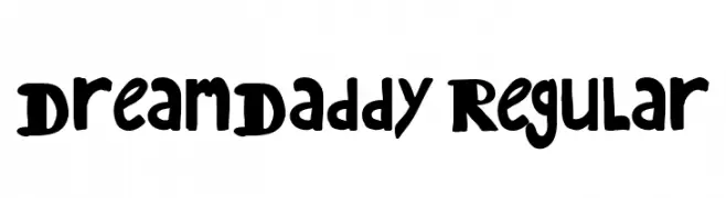
![DreamDaddy Regular Fuentes Gratis Descargar]() Descargar 266 Descargas@WebFont
Descargar 266 Descargas@WebFont -
![SA-Serif Fuentes Gratis Descargar]() Descargar 266 Descargas@WebFont
Descargar 266 Descargas@WebFont -
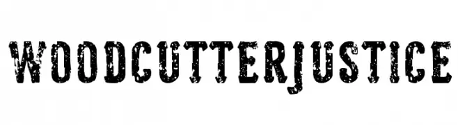
( Fonts by Woodcutter )
A bold, distressed font with a vintage, grunge aesthetic.
![Woodcutter Justice Fuentes Gratis Descargar]() Descargar 266 Descargas@WebFont
Descargar 266 Descargas@WebFont -
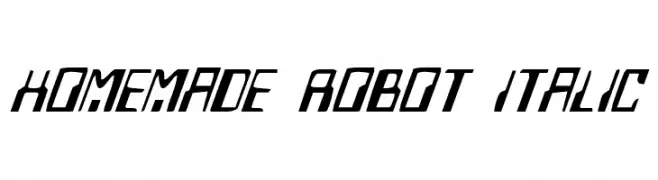
( Fonts by Daniel Zadorozny - www.iconian.com )
A futuristic, italicized font with sharp, angular lines and a robotic feel.
![Homemade Robot Italic Fuentes Gratis Descargar]() Descargar 266 Descargas@WebFont
Descargar 266 Descargas@WebFont -
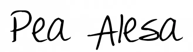
( Free for a personal use. For a commercial use please visit www.kevinandamanda.com )
A playful, handwritten font with a casual and friendly vibe.
![Pea Alesa Fuentes Gratis Descargar]() Descargar 266 Descargas@WebFont
Descargar 266 Descargas@WebFont -
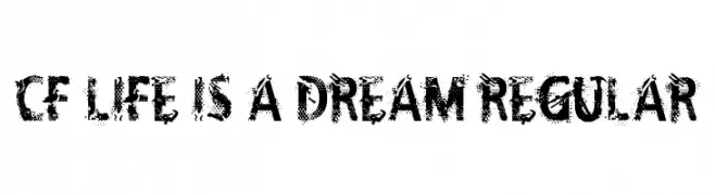
( Fonts by Steve Cloutier - www.cloutierfontes.ca )
A bold, distressed font with a grunge aesthetic and textured, worn-out edges.
![CF Life Is A Dream Regular Fuentes Gratis Descargar]() Descargar 266 Descargas@WebFont
Descargar 266 Descargas@WebFont -
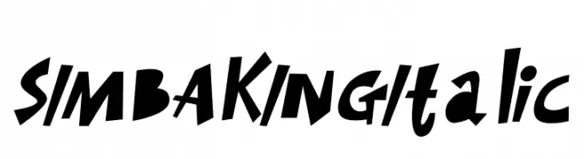
( Fonts by Letterena Studios )
A bold, italicized font with a playful and dynamic style.
![SIMBA KING Italic Fuentes Gratis Descargar]() Descargar 266 Descargas@WebFont
Descargar 266 Descargas@WebFont -
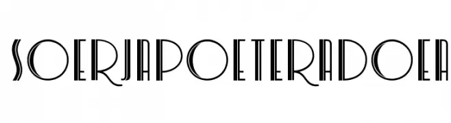
![SoerjapoeteraDoea Fuentes Gratis Descargar]() Descargar 266 Descargas@WebFont
Descargar 266 Descargas@WebFont -
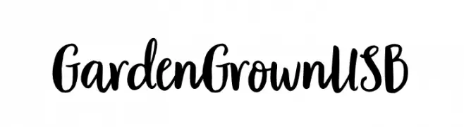
( Fonts by Garden Grown Fonts - Personal-use only. For commercial use please contact owner. )
A playful, organic handwritten font with dynamic strokes and a lively spirit.
![Garden Grown US B Fuentes Gratis Descargar]() Descargar 266 Descargas@WebFont
Descargar 266 Descargas@WebFont -
( Fonts by Brixdee - jack-oatley.com - Personal-use only. For commercial use please contact owner. )
A futuristic, geometric font with circular and angular elements.
![Orbital Fuentes Gratis Descargar]() Descargar 266 Descargas@WebFont
Descargar 266 Descargas@WebFont -
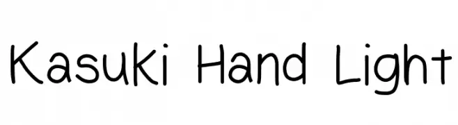
( Free )
A playful, handwritten font with smooth, rounded edges and consistent stroke thickness.
![Kasuki Hand Light Fuentes Gratis Descargar]() Descargar 266 Descargas@WebFont
Descargar 266 Descargas@WebFont -
( Fonts by Noah Type - noahtype.com - Personal-use only. For commercial use please contact owner. )
A bold, geometric font with sharp angles and tight spacing, perfect for impactful designs.
![Reversed Demo Bold Fuentes Gratis Descargar]() Descargar 266 Descargas@WebFont
Descargar 266 Descargas@WebFont -
( Fonts by Edric Studio - Personal-use only. For commercial use please contact owner. )
A modern, geometric sans-serif font with excellent readability.
![Airframe Demo Fuentes Gratis Descargar]() Descargar 266 Descargas@WebFont
Descargar 266 Descargas@WebFont -
( Fonts by Jovanny Lemonad - Personal-use only. For commercial use please contact owner. )
A bold, geometric font with thick strokes and sharp edges.
![Bender-Black Fuentes Gratis Descargar]() Descargar 266 Descargas@WebFont
Descargar 266 Descargas@WebFont -
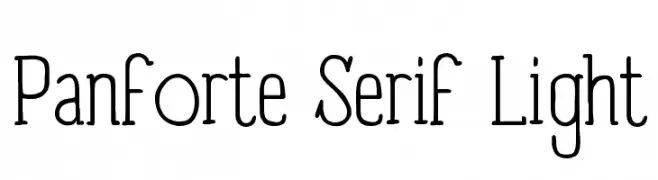
( Fonts by a kmzero font foundry - www.zetafonts.com. Personal-use only. For commercial use please contact owner. )
A light, modern serif font with elegant, elongated characters and subtle serifs.
![Panforte Serif Light Fuentes Gratis Descargar]() Descargar 266 Descargas@WebFont
Descargar 266 Descargas@WebFont -
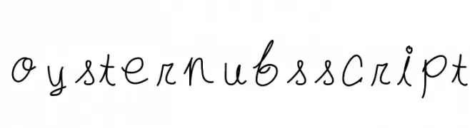
( Fonts by Dayan Marquina )
A playful and whimsical script font with fluid, cursive strokes.
![oysternubsscript Fuentes Gratis Descargar]() Descargar 266 Descargas@WebFont
Descargar 266 Descargas@WebFont -
( Fonts by Daniel Zadorozny - www.iconian.com - Free for personal use )
A bold, shadowed font with rounded, italicized characters for a playful look.
![Miss Amanda Shadow Ital Fuentes Gratis Descargar]() Descargar 266 Descargas@WebFont
Descargar 266 Descargas@WebFont -
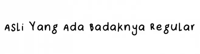
( Fonts by Asli Yang ada badaknya )
Playful handwritten font with rounded edges.
![Asli Yang Ada Badaknya Regular Fuentes Gratis Descargar]() Descargar 266 Descargas@WebFont
Descargar 266 Descargas@WebFont -
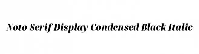
( Noto is a trademark of Google Inc. Noto fonts are open source. All Noto fonts are published under the SIL Open Font License, Version 1.1 )
Elegant, condensed serif font with bold, italic style and high contrast.
![Noto Serif Display Condensed Black Italic Fuentes Gratis Descargar]() Descargar 266 Descargas@WebFont
Descargar 266 Descargas@WebFont -
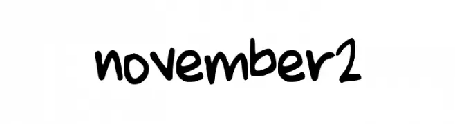
( November Clark )
A playful, bold handwritten font with a casual and friendly style.
![november2 Fuentes Gratis Descargar]() Descargar 266 Descargas@WebFont
Descargar 266 Descargas@WebFont -
( Fonts by Jacob Fisher - www.pizzadude.dk )
A playful, handwritten font with irregular strokes and a casual vibe.
![Nerdproof Fuentes Gratis Descargar]() Descargar 266 Descargas@WebFont
Descargar 266 Descargas@WebFont -
![Structure Sans Regular Fuentes Gratis Descargar]() Descargar 266 Descargas@WebFont
Descargar 266 Descargas@WebFont -
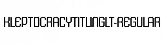
( Typodermic Fonts - Ray Larabie - www.typodermicfonts.com/ )
A modern, geometric font with clean lines and uniform stroke width.
![KleptocracyTitlingLt-Regular Fuentes Gratis Descargar]() Descargar 266 Descargas@WebFont
Descargar 266 Descargas@WebFont -
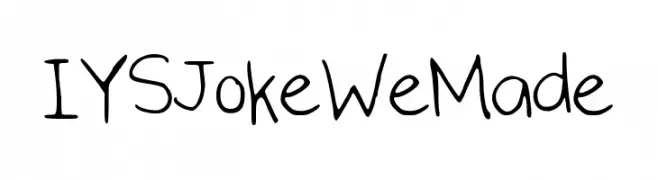
( iloveyourhandshake.tumblr.com )
A playful, handwritten font with a casual and whimsical style.
![IYSJokeWeMade Fuentes Gratis Descargar]() Descargar 266 Descargas@WebFont
Descargar 266 Descargas@WebFont -
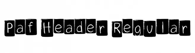
( Fonts by Simone Guggiari )
A playful, hand-drawn font with a chalkboard style, enclosed in squares.
![Paf Header Regular Fuentes Gratis Descargar]() Descargar 266 Descargas@WebFont
Descargar 266 Descargas@WebFont -
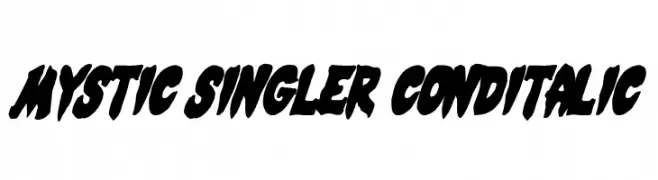
( Fonts by Daniel Zadorozny - www.iconian.com - Free for personal use )
A bold, italicized, and condensed font with dynamic and edgy characteristics.
![Mystic Singler CondItalic Fuentes Gratis Descargar]() Descargar 266 Descargas@WebFont
Descargar 266 Descargas@WebFont -
( Roger White - web.archive.org/web/20120416090521/www.rogersfonts.org.uk/ )
A bold, calligraphic font with sharp, angular strokes and a traditional flair.
![Libra Fuentes Gratis Descargar]() Descargar 266 Descargas@WebFont
Descargar 266 Descargas@WebFont


¿Cuáles son las fuentes más populares ahora?
Poppins, Roboto, Montserrat, Open Sans y Lato son muy usadas por su forma limpia y su amplia aplicabilidad — desde identidad de marca hasta landing pages y carteles.
¿Qué fuentes se usan para logotipos?
Las sans serif geométricas (p. ej., Poppins, familias al estilo Gotham) se eligen a menudo para un branding limpio y escalable. Para un toque personal, scripts y estilos manuscritos siguen siendo clásicos. Combina un display contundente para titulares con un cuerpo neutral para reconocimiento y equilibrio.
¿Con qué frecuencia se actualiza la lista?
Se actualiza regularmente según descargas y actividad real. Vuelve a menudo para descubrir las próximas favoritas.
💡 Consejo: guarda esta página — las tendencias cambian rápido y las fuentes top de hoy podrían inspirar el rebranding de mañana.