Bienvenido a Fuentes Destacadas — donde se encuentran popularidad y calidad. Aquí están las fuentes más descargadas y utilizadas del año. Si buscas opciones seguras para logos, web o social, empieza aquí.
Cada fuente top destaca por su equilibrio, legibilidad y versatilidad. Encontrarás sans serif modernas, scripts elegantes, serifs vintage y displays minimalistas.
-
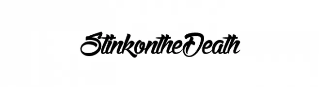
( Fonts by Maelle.K - Thomas Boucherie )
A dynamic and flowing script font with elegant, cursive letterforms.
 Descargar 1367 Descargas@WebFont
 -
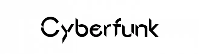
![Cyberfunk Fuentes Gratis Descargar]() Descargar 1367 Descargas@WebFont
Descargar 1367 Descargas@WebFont -
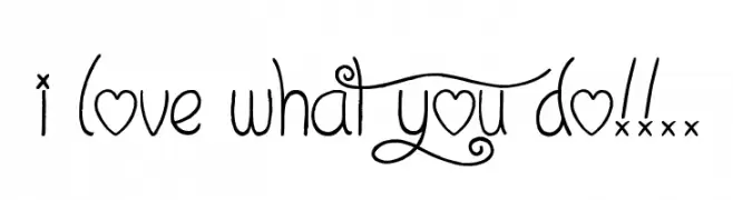
( Font by Jonathan Harris - www.tattoowoo.com )
A whimsical, decorative font with playful swirls and heart motifs.
![I Love What You Do!!.. Fuentes Gratis Descargar]() Descargar 1367 Descargas@WebFont
Descargar 1367 Descargas@WebFont -
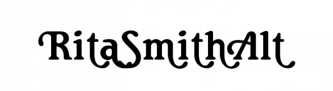
( Fonts by a Claude Pelletier . Personal-use only. For commercial use please contact owner. )
A playful and decorative font with bold, curvy strokes and whimsical elements.
![RitaSmithAlt Fuentes Gratis Descargar]() Descargar 1367 Descargas@WebFont
Descargar 1367 Descargas@WebFont -
( Fonts by Nomo Studio - bybu.es - Personal-use only. For commercial use please contact owner. )
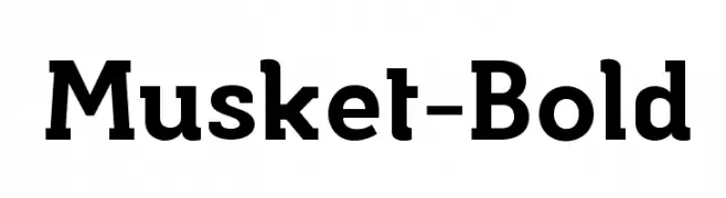
A bold and robust font with strong, thick strokes and a touch of elegance.
![Musket-Bold Fuentes Gratis Descargar]() Descargar 1366 Descargas@WebFont
Descargar 1366 Descargas@WebFont -
-
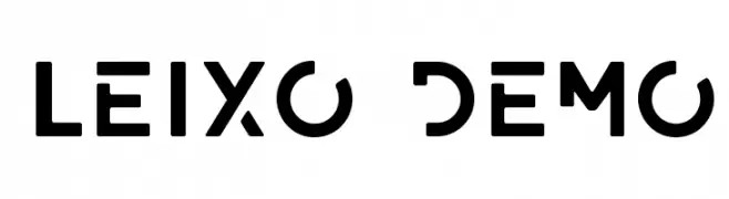
( Phitradesign - Philip Trautmann - www.phitradesign-fonts.com )
A bold, geometric font with a modern and technical design.
![LEIXO DEMO Fuentes Gratis Descargar]() Descargar 1366 Descargas@WebFont
Descargar 1366 Descargas@WebFont -
![Rhaikane Fuentes Gratis Descargar]() Descargar 1366 Descargas@WebFont
Descargar 1366 Descargas@WebFont -
![H74 East Zombie High Fuentes Gratis Descargar]() Descargar 1366 Descargas@WebFont
Descargar 1366 Descargas@WebFont -
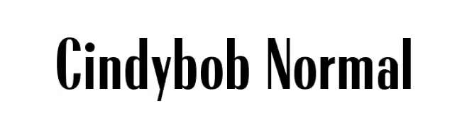
( Fonts by www.TomzWeb.com - Thomas E. Harvey - NOT free - Commercial use requires license )
A bold, modern font with tall, narrow characters and high contrast strokes.
![Cindybob Normal Fuentes Gratis Descargar]() Descargar 1366 Descargas@WebFont
Descargar 1366 Descargas@WebFont -
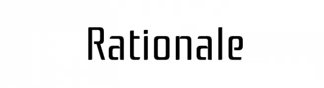
( Copyright (c) 2011, Cyreal (www.cyreal.org) )
A modern, geometric sans-serif font with clean lines and uniform stroke width.
![Rationale Fuentes Gratis Descargar]() Descargar 1366 Descargas@WebFont
Descargar 1366 Descargas@WebFont
¿Cuáles son las fuentes más populares ahora?
Poppins, Roboto, Montserrat, Open Sans y Lato son muy usadas por su forma limpia y su amplia aplicabilidad — desde identidad de marca hasta landing pages y carteles.
¿Qué fuentes se usan para logotipos?
Las sans serif geométricas (p. ej., Poppins, familias al estilo Gotham) se eligen a menudo para un branding limpio y escalable. Para un toque personal, scripts y estilos manuscritos siguen siendo clásicos. Combina un display contundente para titulares con un cuerpo neutral para reconocimiento y equilibrio.
¿Con qué frecuencia se actualiza la lista?
Se actualiza regularmente según descargas y actividad real. Vuelve a menudo para descubrir las próximas favoritas.
💡 Consejo: guarda esta página — las tendencias cambian rápido y las fuentes top de hoy podrían inspirar el rebranding de mañana.