Bienvenido a Fuentes Destacadas — donde se encuentran popularidad y calidad. Aquí están las fuentes más descargadas y utilizadas del año. Si buscas opciones seguras para logos, web o social, empieza aquí.
Cada fuente top destaca por su equilibrio, legibilidad y versatilidad. Encontrarás sans serif modernas, scripts elegantes, serifs vintage y displays minimalistas.
-
( Fonts by Heath Kane OFF SITE )
An edgy, thorn-like font with a distressed and chaotic appearance.
 Descargar 1441 Descargas
 -
( Fonts by Cumberland Fontworks - http://www222.pair.com/sjohn/fonts.htm - S. John Ross )
A rustic, hand-drawn font with bold, uneven strokes and a whimsical style.
![Hultog Fuentes Gratis Descargar]() Descargar 1441 Descargas@WebFont
Descargar 1441 Descargas@WebFont -
( mlkwsn - Malik Wisnu )
A bold, brush-style font with dynamic, handcrafted strokes.
![stronger Fuentes Gratis Descargar]() Descargar 1440 Descargas@WebFont
Descargar 1440 Descargas@WebFont -
( Fonts by Jonathan S. Harris )
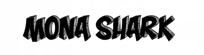
A bold, dynamic font with a hand-drawn, graffiti-like style.
![Mona Shark Fuentes Gratis Descargar]() Descargar 1440 Descargas@WebFont
Descargar 1440 Descargas@WebFont -
( Fonts by www.smeltery.net )
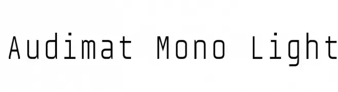
A modern, geometric monospaced font with a sleek, minimalistic design.
![Audimat Mono Light Fuentes Gratis Descargar]() Descargar 1440 Descargas@WebFont
Descargar 1440 Descargas@WebFont -
-
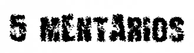
![5+MENTARIOS Fuentes Gratis Descargar]() Descargar 1440 Descargas@WebFont
Descargar 1440 Descargas@WebFont -
( Fonts by Marty Bee - www.martybee.com )
A bold, angular font with sharp serifs and high contrast, perfect for dramatic headlines.
![Stiletto Fuentes Gratis Descargar]() Descargar 1440 Descargas@WebFont
Descargar 1440 Descargas@WebFont -
( Fonts by EssentialsStudio - Personal-use only. For commercial use please contact owner. )
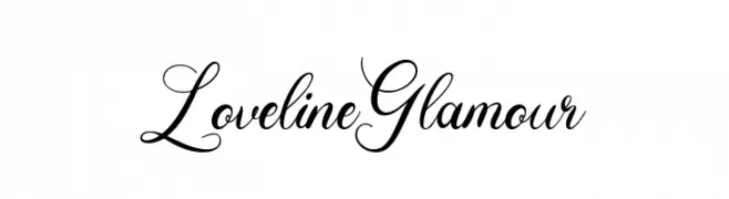
An elegant script font with graceful, flowing lines and sophisticated flair.
![Loveline Glamour Fuentes Gratis Descargar]() Descargar 1439 Descargas@WebFont
Descargar 1439 Descargas@WebFont -
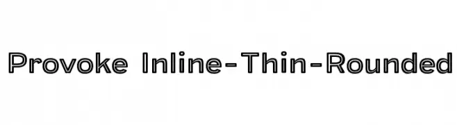
( Parker Creative - Alan Parker - fontbundles.net/parker-creative )
A modern, thin, rounded inline font with a sleek and geometric design.
![Provoke Inline-Thin-Rounded Fuentes Gratis Descargar]() Descargar 1439 Descargas@WebFont
Descargar 1439 Descargas@WebFont -
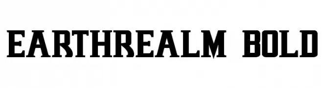
( Fonts by Daniel Zadorozny - www.iconian.com - Free for personal use )
A bold, slab serif font with strong, thick strokes and a modern yet classic appeal.
![Earthrealm Bold Fuentes Gratis Descargar]() Descargar 1439 Descargas@WebFont
Descargar 1439 Descargas@WebFont


¿Cuáles son las fuentes más populares ahora?
Poppins, Roboto, Montserrat, Open Sans y Lato son muy usadas por su forma limpia y su amplia aplicabilidad — desde identidad de marca hasta landing pages y carteles.
¿Qué fuentes se usan para logotipos?
Las sans serif geométricas (p. ej., Poppins, familias al estilo Gotham) se eligen a menudo para un branding limpio y escalable. Para un toque personal, scripts y estilos manuscritos siguen siendo clásicos. Combina un display contundente para titulares con un cuerpo neutral para reconocimiento y equilibrio.
¿Con qué frecuencia se actualiza la lista?
Se actualiza regularmente según descargas y actividad real. Vuelve a menudo para descubrir las próximas favoritas.
💡 Consejo: guarda esta página — las tendencias cambian rápido y las fuentes top de hoy podrían inspirar el rebranding de mañana.