Bienvenido a Fuentes Destacadas — donde se encuentran popularidad y calidad. Aquí están las fuentes más descargadas y utilizadas del año. Si buscas opciones seguras para logos, web o social, empieza aquí.
Cada fuente top destaca por su equilibrio, legibilidad y versatilidad. Encontrarás sans serif modernas, scripts elegantes, serifs vintage y displays minimalistas.
-
( Fonts by Grzegorz l - www.glukfonts.pl )
A classic serif font with high contrast and elegant curves.
 Descargar 1741 Descargas@WebFont
 -
( SDFonts. http://www.angelfire.com/scifi2/sdfonts/index.html )
A bold, pixelated font with an 80s cyberpunk vibe.
![80's Cyberpunk Revival Fuentes Gratis Descargar]() Descargar 1741 Descargas@WebFont
Descargar 1741 Descargas@WebFont -
![Grunge Fuentes Gratis Descargar]() Descargar 1741 Descargas
Descargar 1741 Descargas -
( Fonts by Paul Lloyd )
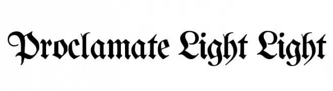
A classic blackletter font with ornate and dramatic letterforms.
![Proclamate Light Light Fuentes Gratis Descargar]() Descargar 1741 Descargas@WebFont
Descargar 1741 Descargas@WebFont -
( Fonts by Dave Fabik - home.teleport.com/~dfabik/ )
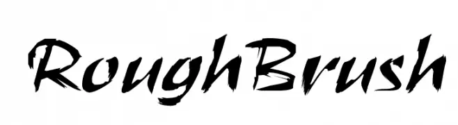
A bold, expressive brush-style font with dynamic, hand-painted strokes.
![RoughBrush Fuentes Gratis Descargar]() Descargar 1741 Descargas@WebFont
Descargar 1741 Descargas@WebFont -
-
( Fonts by Vladimir Nikolic )
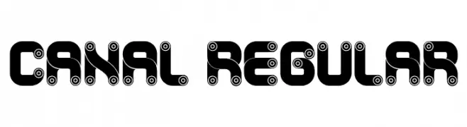
A bold, mechanical-themed decorative font with circular gear-like elements.
![Canal Regular Fuentes Gratis Descargar]() Descargar 1740 Descargas@WebFont
Descargar 1740 Descargas@WebFont -
( Copyright (c) 2015, Pablo Impallari, Rodrigo Fuenzalida (Modified by Dan O. Williams and USWDS) (https://github.com/uswds/public-sans) )
A bold, modern typeface with clean lines and strong visual impact.
![Public Sans Black Fuentes Gratis Descargar]() Descargar 1740 Descargas@WebFont
Descargar 1740 Descargas@WebFont -
( imagex - www.imagex-fonts.com )
A bold, manga-inspired font with dynamic brush stroke effects.
![Manga Style Fuentes Gratis Descargar]() Descargar 1740 Descargas@WebFont
Descargar 1740 Descargas@WebFont -
( Fonts by www.studiotypo.com - Personal-use only. For commercial use please contact owner. )
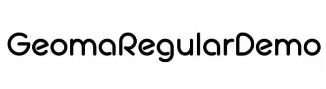
A modern, geometric sans-serif font with rounded edges and uniform stroke width.
![Geoma Regular Demo Fuentes Gratis Descargar]() Descargar 1740 Descargas@WebFont
Descargar 1740 Descargas@WebFont -
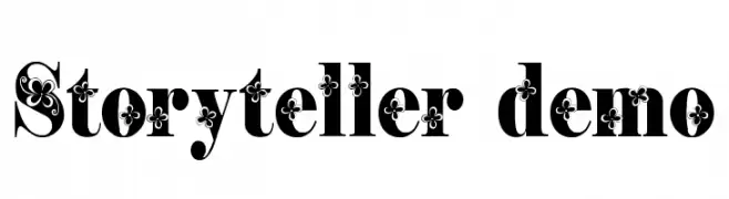
( Fonts by EvasUniqueFonts )
A bold, decorative serif font with floral embellishments.
![Storyteller Demo Fuentes Gratis Descargar]() Descargar 1740 Descargas@WebFont
Descargar 1740 Descargas@WebFont


¿Cuáles son las fuentes más populares ahora?
Poppins, Roboto, Montserrat, Open Sans y Lato son muy usadas por su forma limpia y su amplia aplicabilidad — desde identidad de marca hasta landing pages y carteles.
¿Qué fuentes se usan para logotipos?
Las sans serif geométricas (p. ej., Poppins, familias al estilo Gotham) se eligen a menudo para un branding limpio y escalable. Para un toque personal, scripts y estilos manuscritos siguen siendo clásicos. Combina un display contundente para titulares con un cuerpo neutral para reconocimiento y equilibrio.
¿Con qué frecuencia se actualiza la lista?
Se actualiza regularmente según descargas y actividad real. Vuelve a menudo para descubrir las próximas favoritas.
💡 Consejo: guarda esta página — las tendencias cambian rápido y las fuentes top de hoy podrían inspirar el rebranding de mañana.