Bienvenido a Fuentes Destacadas — donde se encuentran popularidad y calidad. Aquí están las fuentes más descargadas y utilizadas del año. Si buscas opciones seguras para logos, web o social, empieza aquí.
Cada fuente top destaca por su equilibrio, legibilidad y versatilidad. Encontrarás sans serif modernas, scripts elegantes, serifs vintage y displays minimalistas.
-
( Fonts by www.peter-wiegel.de. Personal-use only. For commercial use please contact owner. )
A bold, decorative font with intricate, flowing lines and artistic flair.
 Descargar 84 Descargas@WebFont
 -
( Fonts by www.woodcutter.es - woodcutter Manero - Personal-use only. For commercial use please contact owner. )
A bold pictogram font with laundry and wash-care symbols.
![wash care Fuentes Gratis Descargar]() Descargar 84 Descargas@WebFont
Descargar 84 Descargas@WebFont -
( Copyright 2018 The Krub Project Authors (https://github.com/cadsondemak/Krub) )
A modern, medium-weight italic sans-serif font with a clean and dynamic style.
![Krub Medium Italic Fuentes Gratis Descargar]() Descargar 84 Descargas@WebFont
Descargar 84 Descargas@WebFont -
( Fonts by Almarkhatype Studio )
A bold, geometric font with angular shapes and a strong presence.
![Elcatraz Fuentes Gratis Descargar]() Descargar 84 Descargas@WebFont
Descargar 84 Descargas@WebFont -
( Fonts by Iconian Fonts - Daniel Zadorozny - Personal-use only. For commercial use please contact owner. )
A bold, geometric font with strong, uniform strokes and high contrast.
![Force Runner Fuentes Gratis Descargar]() Descargar 84 Descargas@WebFont
Descargar 84 Descargas@WebFont -
-
( Fonts by Koplexs Studio )
An elegant script font with flowing, cursive letterforms and high contrast strokes.
![Amsterline Fuentes Gratis Descargar]() Descargar 84 Descargas@WebFont
Descargar 84 Descargas@WebFont -
( Fonts by Chairul Art - Personal-use only. For commercial use please contact owner. )
An elegant script font with flowing cursive letters and intricate swashes.
![delaney Fuentes Gratis Descargar]() Descargar 84 Descargas@WebFont
Descargar 84 Descargas@WebFont -
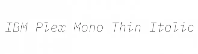
( Copyright © 2017 IBM Corp. with Reserved Font Name "Plex" )
A modern, thin, monospaced italic font with clean lines and high legibility.
![IBM Plex Mono Thin Italic Fuentes Gratis Descargar]() Descargar 84 Descargas@WebFont
Descargar 84 Descargas@WebFont -
( imagex - www.imagex-fonts.com )
A bold, distressed graffiti-style font with textured, paint-splattered characters.
![Stenstreet Fuentes Gratis Descargar]() Descargar 84 Descargas@WebFont
Descargar 84 Descargas@WebFont -
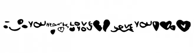
![LoveShock Fuentes Gratis Descargar]() Descargar 84 Descargas@WebFont
Descargar 84 Descargas@WebFont


¿Cuáles son las fuentes más populares ahora?
Poppins, Roboto, Montserrat, Open Sans y Lato son muy usadas por su forma limpia y su amplia aplicabilidad — desde identidad de marca hasta landing pages y carteles.
¿Qué fuentes se usan para logotipos?
Las sans serif geométricas (p. ej., Poppins, familias al estilo Gotham) se eligen a menudo para un branding limpio y escalable. Para un toque personal, scripts y estilos manuscritos siguen siendo clásicos. Combina un display contundente para titulares con un cuerpo neutral para reconocimiento y equilibrio.
¿Con qué frecuencia se actualiza la lista?
Se actualiza regularmente según descargas y actividad real. Vuelve a menudo para descubrir las próximas favoritas.
💡 Consejo: guarda esta página — las tendencias cambian rápido y las fuentes top de hoy podrían inspirar el rebranding de mañana.