Bienvenido a Fuentes Nuevas — una selección curada de los tipos recién añadidos a FFonts.net. Seas diseñador, desarrollador o amante de la tipografía, esta página te mantiene al día con las tendencias.
Cada fuente nueva tiene su personalidad: desde sans serif modernas y limpias hasta scripts expresivas y displays llamativas. Actualizamos la lista con frecuencia para que puedas previsualizar y descargar gratis.
-
( Fonts by Vladimir Nikolic )
A bold, dynamic font with a 3D shadow effect and tight spacing.
 Descargar 189 Descargas@WebFont
 -
( Fonts by Creatype Studio )
A playful, wavy, hand-drawn font with bold, rounded characters.
![Wigglye Regular Fuentes Gratis Descargar]() Descargar 265 Descargas@WebFont
Descargar 265 Descargas@WebFont -
( Fonts by Vladimir Nikolic )
Bold, outlined uppercase font with a dynamic, three-dimensional effect.
![Lister Regular Fuentes Gratis Descargar]() Descargar 156 Descargas@WebFont
Descargar 156 Descargas@WebFont -
( Fonts by Vladimir Nikolic )
A bold, three-dimensional font with a hollow interior and dynamic slant.
![Lister Hollow Regular Fuentes Gratis Descargar]() Descargar 214 Descargas@WebFont
Descargar 214 Descargas@WebFont -
( Fonts by Faris Graphic Art )
A bold, rounded font with smooth curves and uniform stroke width.
![Create Fuentes Gratis Descargar]() Descargar 300 Descargas@WebFont
Descargar 300 Descargas@WebFont -
-
( Fonts by Regulerstudio )
A bold, playful font with rounded, whimsical letterforms.
![BIRTHDAY HOLIDAY Fuentes Gratis Descargar]() Descargar 96 Descargas@WebFont
Descargar 96 Descargas@WebFont -
( Fonts by Denny Subagja )
A playful, bubbly font with bold, rounded characters and whimsical cutouts.
![Candy Jelly Fuentes Gratis Descargar]() Descargar 184 Descargas@WebFont
Descargar 184 Descargas@WebFont -
( Fonts by StringLabs )
A playful, bold, and rounded font with a hand-drawn aesthetic.
![Sandy Kids Fuentes Gratis Descargar]() Descargar 139 Descargas@WebFont
Descargar 139 Descargas@WebFont -
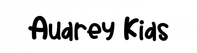
( Fonts by StringLabs )
A playful, bold font with rounded, bubbly characters and a hand-drawn feel.
![Audrey Kids Fuentes Gratis Descargar]() Descargar 99 Descargas@WebFont
Descargar 99 Descargas@WebFont -
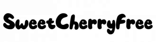
( Fonts by Typefactoryco )
A bold, playful typeface with rounded, bubbly characters.
![Sweet Cherry Free Fuentes Gratis Descargar]() Descargar 187 Descargas@WebFont
Descargar 187 Descargas@WebFont


Preguntas Frecuentes — Fuentes Nuevas
¿Cuál es la fuente nueva que todos usan?
Las tendencias cambian rápido, pero hoy dominan las sans serif minimalistas y las displays expresivas — perfectas para contenido móvil y branding moderno.
¿Cuáles son cinco fuentes nuevas recomendadas?
Entre las favoritas recientes: Poppins, Roboto, Montserrat, Open Sans y Lato. Equilibran claridad y personalidad; sirven para marcas tecnológicas, editoriales y redes sociales.
¿Cómo probar antes de descargar?
Usa la vista previa en vivo: escribe tu texto en la página de la fuente para comprobar peso, espaciado y legibilidad en distintos tamaños. Si te convence, descarga los archivos TTF/OTF.