Bienvenido a Fuentes Nuevas — una selección curada de los tipos recién añadidos a FFonts.net. Seas diseñador, desarrollador o amante de la tipografía, esta página te mantiene al día con las tendencias.
Cada fuente nueva tiene su personalidad: desde sans serif modernas y limpias hasta scripts expresivas y displays llamativas. Actualizamos la lista con frecuencia para que puedas previsualizar y descargar gratis.
-
( Fonts by Tony Thai )
A sleek, futuristic oblique font with a modern, high-tech aesthetic.
 Descargar 15 Descargas@WebFont
 -
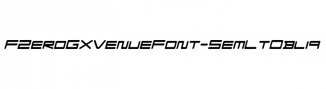
( Fonts by Tony Thai )
A bold, oblique font with a futuristic and dynamic style.
![FZeroGXMenuFont-BoldOblique Fuentes Gratis Descargar]() Descargar 24 Descargas@WebFont
Descargar 24 Descargas@WebFont -
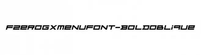
( Fonts by Tony Thai )
A sleek, futuristic oblique font with thin, elongated characters and sharp angles.
![FZeroGXMenuFont-ThinOblique Fuentes Gratis Descargar]() Descargar 14 Descargas@WebFont
Descargar 14 Descargas@WebFont -
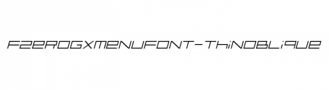
( Fonts by Bryson Stohr )
A bold, geometric font with a modern, blocky aesthetic.
![Conform F.S. Regular Fuentes Gratis Descargar]() Descargar 31 Descargas@WebFont
Descargar 31 Descargas@WebFont -
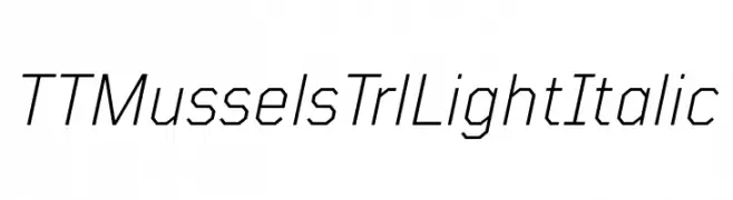
( Fonts by TypeType Foundry )
A geometric, light, and italic font with a modern and technical design.
![TT Mussels Trl Light Italic Fuentes Gratis Descargar]() Descargar 42 Descargas@WebFont
Descargar 42 Descargas@WebFont -
-
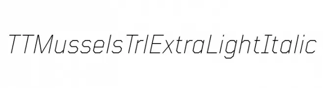
( Fonts by TypeType Foundry )
A modern, geometric italic font with thin strokes and sharp angles.
![TT Mussels Trl ExtraLight Italic Fuentes Gratis Descargar]() Descargar 30 Descargas@WebFont
Descargar 30 Descargas@WebFont -
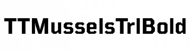
( Fonts by TypeType Foundry )
A bold, geometric font with angular lines and a modern look.
![TT Mussels Trl Bold Fuentes Gratis Descargar]() Descargar 88 Descargas@WebFont
Descargar 88 Descargas@WebFont -
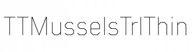
( Fonts by TypeType Foundry )
A geometric, angular font with thin, consistent strokes and a modern, minimalist style.
![TT Mussels Trl Thin Fuentes Gratis Descargar]() Descargar 29 Descargas@WebFont
Descargar 29 Descargas@WebFont -
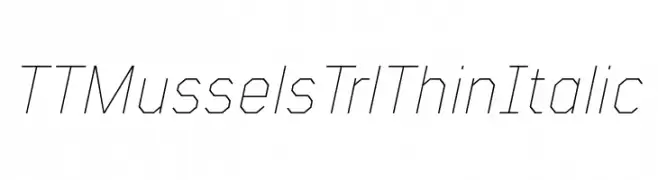
( Fonts by TypeType Foundry )
A thin, angular, and italic font with a geometric and modern design.
![TT Mussels Trl Thin Italic Fuentes Gratis Descargar]() Descargar 23 Descargas@WebFont
Descargar 23 Descargas@WebFont -
( Fonts by TypeType Foundry )
A geometric, modern font with an octagonal structure and uniform stroke width.
![TT Mussels Trl Light Fuentes Gratis Descargar]() Descargar 29 Descargas@WebFont
Descargar 29 Descargas@WebFont

Preguntas Frecuentes — Fuentes Nuevas
¿Cuál es la fuente nueva que todos usan?
Las tendencias cambian rápido, pero hoy dominan las sans serif minimalistas y las displays expresivas — perfectas para contenido móvil y branding moderno.
¿Cuáles son cinco fuentes nuevas recomendadas?
Entre las favoritas recientes: Poppins, Roboto, Montserrat, Open Sans y Lato. Equilibran claridad y personalidad; sirven para marcas tecnológicas, editoriales y redes sociales.
¿Cómo probar antes de descargar?
Usa la vista previa en vivo: escribe tu texto en la página de la fuente para comprobar peso, espaciado y legibilidad en distintos tamaños. Si te convence, descarga los archivos TTF/OTF.