Bienvenido a Fuentes Nuevas — una selección curada de los tipos recién añadidos a FFonts.net. Seas diseñador, desarrollador o amante de la tipografía, esta página te mantiene al día con las tendencias.
Cada fuente nueva tiene su personalidad: desde sans serif modernas y limpias hasta scripts expresivas y displays llamativas. Actualizamos la lista con frecuencia para que puedas previsualizar y descargar gratis.
-
( Fonts by Reguler Studio )
A bold, playful font with rounded, hand-drawn characters.
 Descargar 297 Descargas@WebFont
 -
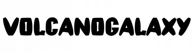
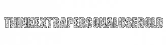
( Fonts by Billy Argel Fonts ® )
A bold, decorative font with intricate brain-like patterns.
![THINK EXTRA PERSONAL USE Bold Fuentes Gratis Descargar]() Descargar 195 Descargas@WebFont
Descargar 195 Descargas@WebFont -
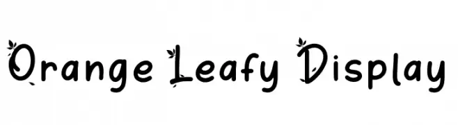
( Fonts by Attype Studio )
A playful, decorative font with leaf embellishments on uppercase letters.
![Orange Leafy Display Fuentes Gratis Descargar]() Descargar 2441 Descargas@WebFont
Descargar 2441 Descargas@WebFont -
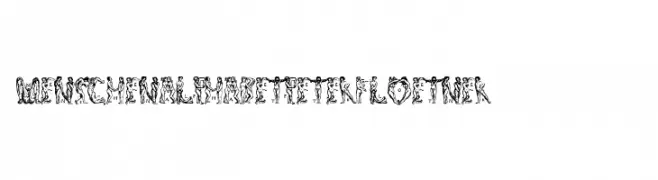
( Fonts by ingoFonts )
A decorative font made from human figures forming each letter and character.
![MenschenalphabetPeterFloetner1534 Fuentes Gratis Descargar]() Descargar 168 Descargas@WebFont
Descargar 168 Descargas@WebFont -
( Fonts by wep )
A bold, abstract font with a liquid-like, decorative style.
![Curug Fuentes Gratis Descargar]() Descargar 232 Descargas@WebFont
Descargar 232 Descargas@WebFont -
-
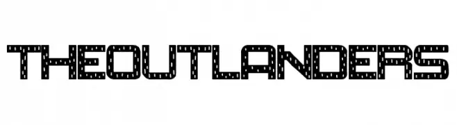
( Fonts by Woodcutter )
A bold, decorative font with an industrial, mechanical aesthetic featuring dotted and lined patterns.
![The Outlanders Fuentes Gratis Descargar]() Descargar 268 Descargas@WebFont
Descargar 268 Descargas@WebFont -
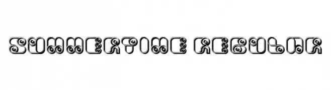
( Fonts by Vladimir Nikolic )
A playful, retro-inspired font with bold, rounded characters and spiral details.
![Summertime Regular Fuentes Gratis Descargar]() Descargar 132 Descargas@WebFont
Descargar 132 Descargas@WebFont -
( Fonts by Vladimir Nikolic )
A bold, decorative font with a 3D shadow effect and vintage texture.
![Kitchen Knife Regular Fuentes Gratis Descargar]() Descargar 315 Descargas@WebFont
Descargar 315 Descargas@WebFont -
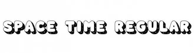
( Fonts by Lauren Ashpole )
A bold, space-themed font with starry patterns and rounded characters.
![Space Time Regular Fuentes Gratis Descargar]() Descargar 1831 Descargas@WebFont
Descargar 1831 Descargas@WebFont -
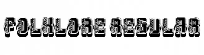
( Fonts by Vladimir Nikolic )
A bold, decorative font with intricate patterns and a three-dimensional effect.
![Folklore Regular Fuentes Gratis Descargar]() Descargar 208 Descargas@WebFont
Descargar 208 Descargas@WebFont


Preguntas Frecuentes — Fuentes Nuevas
¿Cuál es la fuente nueva que todos usan?
Las tendencias cambian rápido, pero hoy dominan las sans serif minimalistas y las displays expresivas — perfectas para contenido móvil y branding moderno.
¿Cuáles son cinco fuentes nuevas recomendadas?
Entre las favoritas recientes: Poppins, Roboto, Montserrat, Open Sans y Lato. Equilibran claridad y personalidad; sirven para marcas tecnológicas, editoriales y redes sociales.
¿Cómo probar antes de descargar?
Usa la vista previa en vivo: escribe tu texto en la página de la fuente para comprobar peso, espaciado y legibilidad en distintos tamaños. Si te convence, descarga los archivos TTF/OTF.