Bienvenido a Fuentes Nuevas — una selección curada de los tipos recién añadidos a FFonts.net. Seas diseñador, desarrollador o amante de la tipografía, esta página te mantiene al día con las tendencias.
Cada fuente nueva tiene su personalidad: desde sans serif modernas y limpias hasta scripts expresivas y displays llamativas. Actualizamos la lista con frecuencia para que puedas previsualizar y descargar gratis.
-
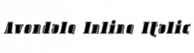
( Fonts by Apostrophic Lab )
A bold, italic, inline font with sharp serifs and dynamic style.
 Descargar 128 Descargas@WebFont
 -
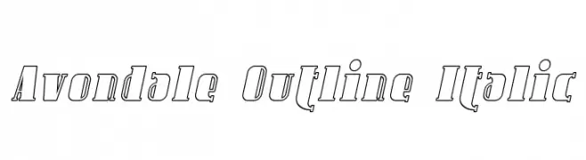
( Fonts by Apostrophic Lab )
An elegant italic outline font with a modern yet classic appeal.
![Avondale Outline Italic Fuentes Gratis Descargar]() Descargar 131 Descargas@WebFont
Descargar 131 Descargas@WebFont -
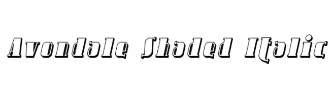
( Fonts by Apostrophic Lab )
A bold, shaded italic font with a three-dimensional effect, perfect for decorative use.
![Avondale Shaded Italic Fuentes Gratis Descargar]() Descargar 115 Descargas@WebFont
Descargar 115 Descargas@WebFont -
( Fonts by Apostrophic Lab )
A bold, decorative font with vintage appeal and strong vertical lines.
![Avondale Fuentes Gratis Descargar]() Descargar 366 Descargas@WebFont
Descargar 366 Descargas@WebFont -
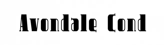
( Fonts by Apostrophic Lab )
A bold, condensed font with high contrast and sharp serifs, perfect for impactful headlines.
![Avondale Cond Fuentes Gratis Descargar]() Descargar 180 Descargas@WebFont
Descargar 180 Descargas@WebFont -
-
( Fonts by Daniel Gauthier )
A bold, geometric font with a modern and futuristic style.
![ZootAllures Fuentes Gratis Descargar]() Descargar 361 Descargas@WebFont
Descargar 361 Descargas@WebFont -
( Fonts by Jonathan Paterson )
A bold, expressive font with dynamic curves and sharp edges.
![French Grotesque Fuentes Gratis Descargar]() Descargar 1222 Descargas@WebFont
Descargar 1222 Descargas@WebFont -
( Fonts by Nick Curtis - www.nicksfonts.com )
A tall, narrow font with a vintage style and elegant curves.
![Namesake NF Fuentes Gratis Descargar]() Descargar 692 Descargas@WebFont
Descargar 692 Descargas@WebFont -
( Fonts by Bright Ideas )
A bold, gothic blackletter font with sharp, angular lines and dramatic flourishes.
![Griffin Fuentes Gratis Descargar]() Descargar 840 Descargas@WebFont
Descargar 840 Descargas@WebFont -
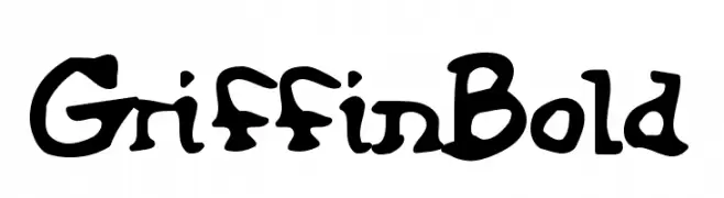
( Fonts by Daniel Gauthier )
A bold, playful, and hand-drawn style font with a whimsical touch.
![GriffinBold Fuentes Gratis Descargar]() Descargar 246 Descargas@WebFont
Descargar 246 Descargas@WebFont


Preguntas Frecuentes — Fuentes Nuevas
¿Cuál es la fuente nueva que todos usan?
Las tendencias cambian rápido, pero hoy dominan las sans serif minimalistas y las displays expresivas — perfectas para contenido móvil y branding moderno.
¿Cuáles son cinco fuentes nuevas recomendadas?
Entre las favoritas recientes: Poppins, Roboto, Montserrat, Open Sans y Lato. Equilibran claridad y personalidad; sirven para marcas tecnológicas, editoriales y redes sociales.
¿Cómo probar antes de descargar?
Usa la vista previa en vivo: escribe tu texto en la página de la fuente para comprobar peso, espaciado y legibilidad en distintos tamaños. Si te convence, descarga los archivos TTF/OTF.