Bienvenido a Fuentes Nuevas — una selección curada de los tipos recién añadidos a FFonts.net. Seas diseñador, desarrollador o amante de la tipografía, esta página te mantiene al día con las tendencias.
Cada fuente nueva tiene su personalidad: desde sans serif modernas y limpias hasta scripts expresivas y displays llamativas. Actualizamos la lista con frecuencia para que puedas previsualizar y descargar gratis.
-
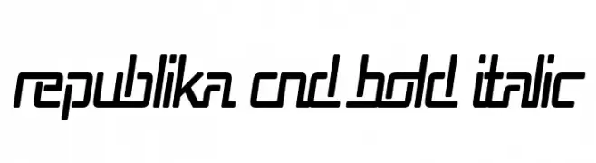
( Fonts by Apostrophic Lab )
A bold, italicized font with a futuristic and geometric design.
 Descargar 103 Descargas@WebFont
 -
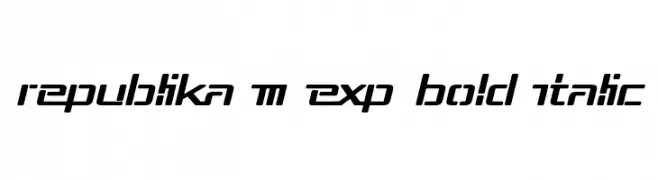
( Fonts by Apostrophic Lab )
A bold, italic, and condensed font with a modern, futuristic style.
![Republika Cnd Bold Italic Fuentes Gratis Descargar]() Descargar 103 Descargas@WebFont
Descargar 103 Descargas@WebFont -
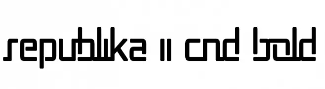
( Fonts by Apostrophic Lab )
A bold, geometric font with a modern and futuristic style.
![Republika II Cnd Bold Fuentes Gratis Descargar]() Descargar 98 Descargas@WebFont
Descargar 98 Descargas@WebFont -
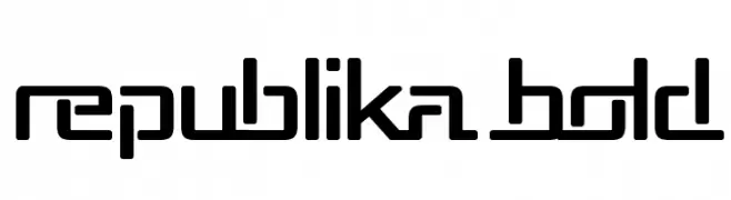
( Fonts by Apostrophic Lab )
A bold, geometric font with a modern and futuristic style.
![Republika Bold Fuentes Gratis Descargar]() Descargar 422 Descargas@WebFont
Descargar 422 Descargas@WebFont -
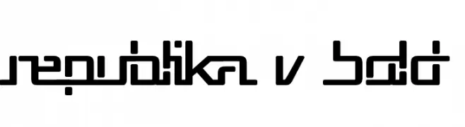
( Fonts by Apostrophic Lab )
A bold, geometric font with a futuristic and technical aesthetic.
![Republika V Bold Fuentes Gratis Descargar]() Descargar 99 Descargas@WebFont
Descargar 99 Descargas@WebFont -
-
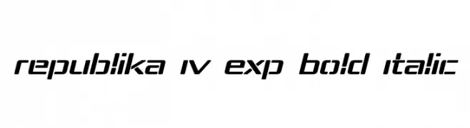
( Fonts by Apostrophic Lab )
A bold, italicized font with a futuristic and dynamic design.
![Republika IV Exp Bold Italic Fuentes Gratis Descargar]() Descargar 491 Descargas@WebFont
Descargar 491 Descargas@WebFont -
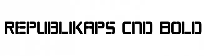
( Fonts by Apostrophic Lab )
A bold, condensed, and geometric font with uniform stroke widths.
![Republikaps Cnd Bold Fuentes Gratis Descargar]() Descargar 1014 Descargas@WebFont
Descargar 1014 Descargas@WebFont -
( Fonts by Apostrophic Lab )
A bold, italicized font with a modern, geometric design and tight character spacing.
![Republika III Bold Italic Fuentes Gratis Descargar]() Descargar 79 Descargas@WebFont
Descargar 79 Descargas@WebFont -
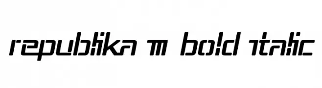
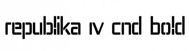
( Fonts by Apostrophic Lab )
A bold, geometric, and modern font with rounded edges and a condensed width.
![Republika IV Cnd Bold Fuentes Gratis Descargar]() Descargar 214 Descargas@WebFont
Descargar 214 Descargas@WebFont -
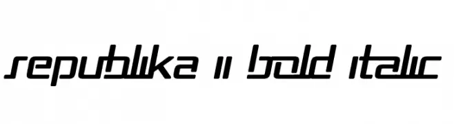
( Fonts by Apostrophic Lab )
A bold, italicized font with a modern, futuristic style and sharp geometric lines.
![Republika II Bold Italic Fuentes Gratis Descargar]() Descargar 134 Descargas@WebFont
Descargar 134 Descargas@WebFont
Preguntas Frecuentes — Fuentes Nuevas
¿Cuál es la fuente nueva que todos usan?
Las tendencias cambian rápido, pero hoy dominan las sans serif minimalistas y las displays expresivas — perfectas para contenido móvil y branding moderno.
¿Cuáles son cinco fuentes nuevas recomendadas?
Entre las favoritas recientes: Poppins, Roboto, Montserrat, Open Sans y Lato. Equilibran claridad y personalidad; sirven para marcas tecnológicas, editoriales y redes sociales.
¿Cómo probar antes de descargar?
Usa la vista previa en vivo: escribe tu texto en la página de la fuente para comprobar peso, espaciado y legibilidad en distintos tamaños. Si te convence, descarga los archivos TTF/OTF.