Bienvenido a Fuentes Nuevas — una selección curada de los tipos recién añadidos a FFonts.net. Seas diseñador, desarrollador o amante de la tipografía, esta página te mantiene al día con las tendencias.
Cada fuente nueva tiene su personalidad: desde sans serif modernas y limpias hasta scripts expresivas y displays llamativas. Actualizamos la lista con frecuencia para que puedas previsualizar y descargar gratis.
-
( Fonts by www.omniglot.com )
A geometric and abstract font with a futuristic, cryptic design.
 Descargar 81 Descargas@WebFont
 -
( Fonts by www.omniglot.com )
A bold, geometric font with high contrast and decorative elements.
![Gimbutas Fuentes Gratis Descargar]() Descargar 184 Descargas@WebFont
Descargar 184 Descargas@WebFont -
( Fonts by www.omniglot.com )
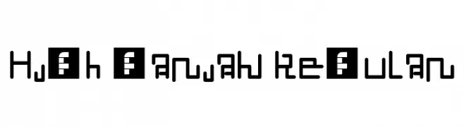
A bold, angular font with a tribal and geometric style.
![Liron Script Fuentes Gratis Descargar]() Descargar 282 Descargas@WebFont
Descargar 282 Descargas@WebFont -
( Fonts by www.omniglot.com )
An elegant script font with calligraphic influences and smooth, flowing curves.
![Linglese Fuentes Gratis Descargar]() Descargar 111 Descargas@WebFont
Descargar 111 Descargas@WebFont -
( Fonts by www.omniglot.com )
A modern, geometric font with clean lines and a minimalist aesthetic.
![SunsheeW Fuentes Gratis Descargar]() Descargar 245 Descargas@WebFont
Descargar 245 Descargas@WebFont -
-
( Fonts by www.omniglot.com )
A traditional Blackletter font with bold, angular strokes and high contrast.
![Gorwelion Fuentes Gratis Descargar]() Descargar 105 Descargas@WebFont
Descargar 105 Descargas@WebFont -
( Fonts by www.omniglot.com )
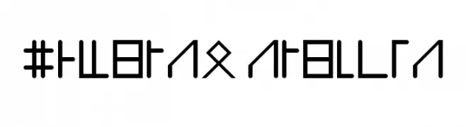
A bold, geometric font with a futuristic and runic appearance.
![Utrusken Fuentes Gratis Descargar]() Descargar 84 Descargas@WebFont
Descargar 84 Descargas@WebFont -
( Fonts by www.omniglot.com )
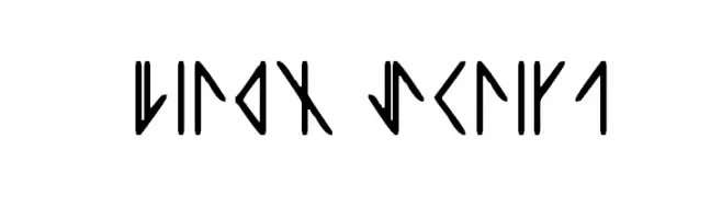
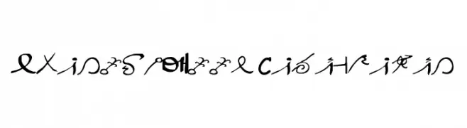
A geometric, angular font with a runic, ancient script style.
![Fehti Martonersi Regular Fuentes Gratis Descargar]() Descargar 101 Descargas@WebFont
Descargar 101 Descargas@WebFont -
( Fonts by www.omniglot.com )
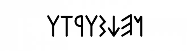
A decorative, calligraphic font with a futuristic and artistic style.
![SpaceInKees Caligrafic Fuentes Gratis Descargar]() Descargar 84 Descargas@WebFont
Descargar 84 Descargas@WebFont -
( Fonts by www.omniglot.com )
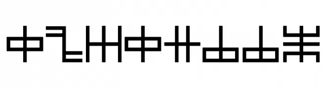
A futuristic, geometric font with consistent stroke width and uniform height.
![High öarian Regular Fuentes Gratis Descargar]() Descargar 104 Descargas@WebFont
Descargar 104 Descargas@WebFont


Preguntas Frecuentes — Fuentes Nuevas
¿Cuál es la fuente nueva que todos usan?
Las tendencias cambian rápido, pero hoy dominan las sans serif minimalistas y las displays expresivas — perfectas para contenido móvil y branding moderno.
¿Cuáles son cinco fuentes nuevas recomendadas?
Entre las favoritas recientes: Poppins, Roboto, Montserrat, Open Sans y Lato. Equilibran claridad y personalidad; sirven para marcas tecnológicas, editoriales y redes sociales.
¿Cómo probar antes de descargar?
Usa la vista previa en vivo: escribe tu texto en la página de la fuente para comprobar peso, espaciado y legibilidad en distintos tamaños. Si te convence, descarga los archivos TTF/OTF.