Bienvenido a Fuentes Nuevas — una selección curada de los tipos recién añadidos a FFonts.net. Seas diseñador, desarrollador o amante de la tipografía, esta página te mantiene al día con las tendencias.
Cada fuente nueva tiene su personalidad: desde sans serif modernas y limpias hasta scripts expresivas y displays llamativas. Actualizamos la lista con frecuencia para que puedas previsualizar y descargar gratis.
-
( Fonts by www.26plus-zeichen.de )
A bold, geometric font with a strong vertical emphasis and angular design.
 Descargar 904 Descargas@WebFont
 -
( Fonts by www.26plus-zeichen.de )
A bold, geometric font inspired by origami, featuring sharp angles and a modern aesthetic.
![RealOrigami Fuentes Gratis Descargar]() Descargar 104 Descargas@WebFont
Descargar 104 Descargas@WebFont -
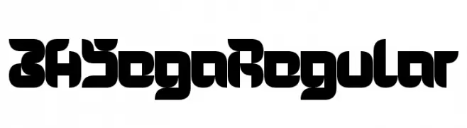
( Fonts by www.26plus-zeichen.de )
A bold, geometric font with a futuristic and cohesive design.
![3HSegaRegular Fuentes Gratis Descargar]() Descargar 238 Descargas@WebFont
Descargar 238 Descargas@WebFont -
( Fonts by www.26plus-zeichen.de )
A bold, impactful font with thick, block-like letters for strong visual presence.
![SayItFat Fuentes Gratis Descargar]() Descargar 607 Descargas@WebFont
Descargar 607 Descargas@WebFont -
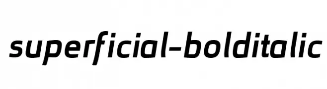
( Fonts by www.26plus-zeichen.de )
A bold, italicized font with a modern and sleek appearance.
![superficial-bolditalic Fuentes Gratis Descargar]() Descargar 267 Descargas@WebFont
Descargar 267 Descargas@WebFont -
-
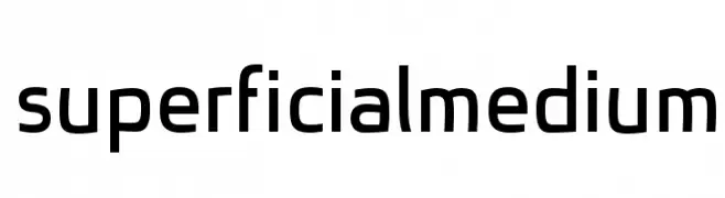
( Fonts by www.26plus-zeichen.de )
A modern, geometric sans-serif font with clean lines and balanced proportions.
![superficialmedium Fuentes Gratis Descargar]() Descargar 576 Descargas@WebFont
Descargar 576 Descargas@WebFont -
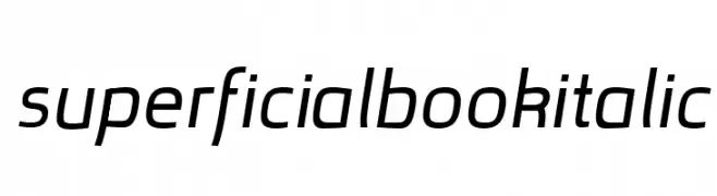
( Fonts by www.26plus-zeichen.de )
A modern sans-serif font with geometric shapes and uniform strokes.
![superficialbook Fuentes Gratis Descargar]() Descargar 364 Descargas@WebFont
Descargar 364 Descargas@WebFont -
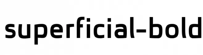
( Fonts by www.26plus-zeichen.de )
A bold, modern sans-serif font with geometric lines and strong presence.
![superficial-bold Fuentes Gratis Descargar]() Descargar 636 Descargas@WebFont
Descargar 636 Descargas@WebFont -
( Fonts by www.26plus-zeichen.de )
A modern, italic sans-serif font with a sleek and dynamic appearance.
![superficialbookitalic Fuentes Gratis Descargar]() Descargar 398 Descargas@WebFont
Descargar 398 Descargas@WebFont -
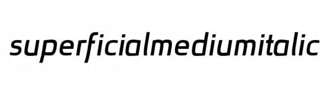
( Fonts by www.26plus-zeichen.de )
A modern, italic font with clean lines and a dynamic appearance.
![superficialmediumitalic Fuentes Gratis Descargar]() Descargar 282 Descargas@WebFont
Descargar 282 Descargas@WebFont


Preguntas Frecuentes — Fuentes Nuevas
¿Cuál es la fuente nueva que todos usan?
Las tendencias cambian rápido, pero hoy dominan las sans serif minimalistas y las displays expresivas — perfectas para contenido móvil y branding moderno.
¿Cuáles son cinco fuentes nuevas recomendadas?
Entre las favoritas recientes: Poppins, Roboto, Montserrat, Open Sans y Lato. Equilibran claridad y personalidad; sirven para marcas tecnológicas, editoriales y redes sociales.
¿Cómo probar antes de descargar?
Usa la vista previa en vivo: escribe tu texto en la página de la fuente para comprobar peso, espaciado y legibilidad en distintos tamaños. Si te convence, descarga los archivos TTF/OTF.